\n
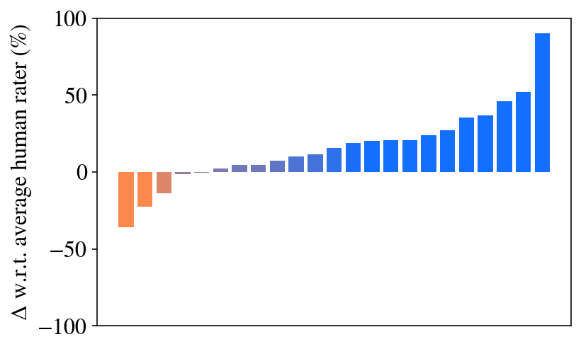
## Bar Chart: Delta w.r.t. Average Human Rater
### Overview
The image presents a bar chart illustrating the delta (Δ) with respect to the average human rater, expressed as a percentage. The chart displays a series of bars, predominantly blue, with a few initial orange bars indicating negative deltas. The x-axis is implicit, representing a sequence of data points, while the y-axis represents the percentage delta.
### Components/Axes
* **Y-axis Title:** Δ w.r.t. average human rater (%)
* **X-axis:** Implicit, representing a sequence of data points (likely iterations or categories).
* **Y-axis Scale:** Ranges from approximately -100% to 100%. The scale is linear with markings at -100, 0, 50, and 100.
* **Bar Colors:** Two distinct colors are used: orange for negative deltas and blue for positive or zero deltas.
### Detailed Analysis
The chart consists of a series of vertical bars. The initial bars (approximately the first 3) are orange, indicating negative deltas. The remaining bars are blue, indicating positive or zero deltas.
Here's an approximate breakdown of the data points, reading from left to right:
1. **Bar 1 (Orange):** Approximately -20%
2. **Bar 2 (Orange):** Approximately -10%
3. **Bar 3 (Orange):** Approximately -5%
4. **Bar 4 (Blue):** Approximately 0%
5. **Bar 5 (Blue):** Approximately 5%
6. **Bar 6 (Blue):** Approximately 10%
7. **Bar 7 (Blue):** Approximately 15%
8. **Bar 8 (Blue):** Approximately 20%
9. **Bar 9 (Blue):** Approximately 25%
10. **Bar 10 (Blue):** Approximately 35%
11. **Bar 11 (Blue):** Approximately 40%
12. **Bar 12 (Blue):** Approximately 50%
13. **Bar 13 (Blue):** Approximately 60%
14. **Bar 14 (Blue):** Approximately 75%
15. **Bar 15 (Blue):** Approximately 90%
The trend is initially negative, crossing over to positive around the fourth bar. The positive bars exhibit a generally increasing trend, with a steeper increase towards the end of the sequence.
### Key Observations
* The chart shows a clear transition from negative deltas to positive deltas.
* The magnitude of the positive deltas increases significantly towards the end of the sequence, indicating a growing difference compared to the average human rater.
* The initial negative deltas suggest that, in the early stages, the system being evaluated performed worse than the average human rater.
### Interpretation
The data suggests an improvement in performance over time or iterations. Initially, the system under evaluation lagged behind the average human rater, as indicated by the negative deltas. However, as the sequence progresses, the system's performance surpasses that of the average human rater, with the difference becoming increasingly pronounced. This could represent a learning curve, optimization process, or the effect of improvements made to the system. The steep increase in the final bars suggests a particularly significant improvement in the later stages. The chart demonstrates a positive correlation between the sequence (likely iterations or time) and the performance delta relative to human raters.