\n
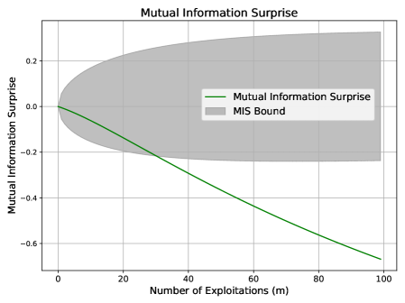
## Line Chart: Mutual Information Surprise
### Overview
The image presents a line chart illustrating the relationship between the number of exploitations (m) and the mutual information surprise. A shaded region represents the MIS bound. The chart aims to visualize how the mutual information surprise changes as the number of exploitations increases.
### Components/Axes
* **Title:** Mutual Information Surprise (centered at the top)
* **X-axis:** Number of Exploitations (m) - ranging from 0 to 100, with gridlines at intervals of 10.
* **Y-axis:** Mutual Information Surprise - ranging from -0.5 to 0.2, with gridlines at intervals of 0.1.
* **Data Series:**
* "Mutual Information Surprise" - represented by a green line.
* **Legend:** Located in the top-right corner.
* "Mutual Information Surprise" - Green line
* "MIS Bound" - Gray shaded area
### Detailed Analysis
The green line representing "Mutual Information Surprise" starts at approximately 0.0 when the number of exploitations is 0. The line exhibits a consistent downward trend, becoming increasingly negative as the number of exploitations increases.
Here's an approximate reconstruction of data points:
* (0, 0.0)
* (10, -0.15)
* (20, -0.25)
* (30, -0.35)
* (40, -0.4)
* (50, -0.45)
* (60, -0.5)
* (70, -0.55)
* (80, -0.6)
* (90, -0.65)
* (100, -0.7)
The "MIS Bound" is represented by a gray shaded region. It starts above the x-axis at x=0, reaching a maximum height of approximately 0.2. As the number of exploitations increases, the upper bound of the shaded region decreases, eventually settling around -0.2 at x=100. The lower bound of the shaded region remains relatively constant around -0.3.
### Key Observations
* The Mutual Information Surprise decreases linearly with the number of exploitations.
* The MIS Bound provides a range within which the Mutual Information Surprise is expected to fall.
* The line representing Mutual Information Surprise consistently remains within the MIS Bound.
* The rate of decrease in Mutual Information Surprise appears constant throughout the range of exploitations.
### Interpretation
The chart suggests that as the number of exploitations increases, the "surprise" or unexpectedness associated with each exploitation decreases. This is likely due to the fact that with more exploitations, the system becomes more predictable, and the information gained from each new exploitation is less novel.
The MIS Bound likely represents a confidence interval or a range of plausible values for the Mutual Information Surprise. The fact that the line consistently falls within this bound suggests that the observed relationship between exploitations and surprise is statistically significant and reliable.
The linear trend indicates a consistent and predictable relationship. There are no apparent outliers or anomalies in the data. The chart provides a clear visualization of how information gain diminishes with repeated exploitation, which could be relevant in fields like security, machine learning, or game theory.