## Heatmap/Bar Chart: Importance Score Across Reasoning Steps
### Overview
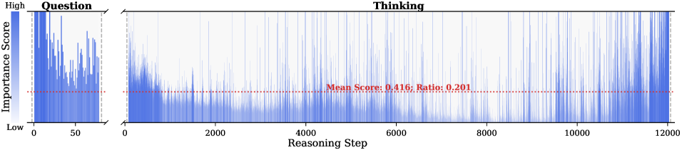
The image displays a two-panel chart visualizing the "Importance Score" of different "Reasoning Steps" during a process, split into a "Question" phase and a "Thinking" phase. The chart uses vertical blue bars to represent scores, with a horizontal red dashed line indicating a mean threshold. The overall trend shows high importance in early steps, which generally diminishes as the reasoning step count increases, particularly in the "Thinking" phase.
### Components/Axes
* **Y-Axis (Vertical):** Labeled **"Importance Score"**. It is a continuous scale from **"Low"** at the bottom to **"High"** at the top. No numerical markers are provided on this axis.
* **X-Axis (Horizontal):** Labeled **"Reasoning Step"**. It is a numerical scale.
* **Left Panel ("Question"):** The scale runs from **0** to approximately **50** (the last visible tick is 50, but the data extends slightly beyond).
* **Right Panel ("Thinking"):** The scale runs from **0** to **12000**, with major ticks at 0, 2000, 4000, 6000, 8000, 10000, and 12000.
* **Panel Titles:**
* Left Panel: **"Question"** (positioned top-left of its chart area).
* Right Panel: **"Thinking"** (positioned top-center of its chart area).
* **Key Annotation:** A horizontal red dashed line spans both panels. Centered above this line in the "Thinking" panel is red text: **"Mean Score: 0.416, Ratio: 0.201"**.
* **Data Representation:** Vertical blue bars. The height of each bar corresponds to the Importance Score for that specific Reasoning Step. The density and height of these bars vary across the x-axis.
* **Background:** The "Thinking" panel has a subtle light blue gradient background behind the bars, which is absent in the "Question" panel.
### Detailed Analysis
**1. "Question" Panel (Left, Steps 0-~50):**
* **Trend:** The importance scores are consistently high and densely packed. The highest scores appear very early, near step 0. There is significant fluctuation, but the bars rarely drop to the lower third of the y-axis range.
* **Data Points (Approximate):** The scores appear to range mostly between the upper half and the top of the "High" scale. The red mean line (0.416) sits in the lower-middle portion of this panel's data range, indicating the average score here is above the overall mean.
**2. "Thinking" Panel (Right, Steps 0-12000):**
* **Trend:** A clear decaying trend is visible. Scores are highest in the first ~2000 steps, with dense, tall bars. After step 2000, both the density and average height of the bars decrease markedly. From step ~6000 to 12000, the bars become very sparse and are predominantly low, indicating most reasoning steps in this late phase have low importance.
* **Data Points (Approximate):** The highest scores in the first 2000 steps reach the top of the scale. The red mean line at 0.416 cuts through the lower section of the dense early data and sits above the sparse late data. The stated **"Ratio: 0.201"** likely refers to the proportion of steps (or total importance) that meet or exceed this mean threshold.
**3. Cross-Reference & Spatial Grounding:**
* The red dashed line is positioned at a constant y-value (Importance Score = 0.416) across the entire width of both panels.
* The text **"Mean Score: 0.416, Ratio: 0.201"** is placed in the upper-middle area of the "Thinking" panel, directly above the red line it describes.
* The blue color of the bars is consistent across both panels, representing the same metric (Importance Score).
### Key Observations
1. **Phase Disparity:** The "Question" phase (first ~50 steps) is characterized by uniformly high importance. The "Thinking" phase (up to 12000 steps) shows a long tail of low-importance steps.
2. **Critical Early Window:** The most important reasoning occurs very early in the process—within the first 50 "Question" steps and the first 2000 "Thinking" steps.
3. **Efficiency Metric:** The **"Ratio: 0.201"** suggests that only about 20.1% of the reasoning steps (or their cumulative weight) are above the mean importance score of 0.416, highlighting a potential inefficiency or natural filtering in the later stages.
4. **Visual Density as Data:** The fading density of blue bars in the later "Thinking" steps is as informative as their height, visually reinforcing the scarcity of important steps.
### Interpretation
This chart likely visualizes the output of an AI or cognitive model's reasoning process. It demonstrates a **"front-loaded" importance distribution**.
* **What it suggests:** The core, high-value reasoning is concentrated at the beginning. The initial "Question" phase and the early "Thinking" phase are where the model dedicates its most significant processing or where the most decisive information is handled. The vast majority of subsequent "Thinking" steps (from ~2000 to 12000) contribute minimally to the final outcome, as measured by this "Importance Score."
* **How elements relate:** The two panels show a continuous process split for clarity. The red mean line acts as a benchmark, separating "high-importance" from "low-importance" work. The ratio quantifies the efficiency of the process.
* **Notable implications:** This pattern could indicate a model that quickly converges on a solution or key insight and then spends considerable resources on verification, refinement, or exploration of low-yield paths. For optimization, one might investigate whether the long tail of low-importance steps in the "Thinking" phase can be truncated or pruned without affecting the quality of the final output, thereby improving computational efficiency. The chart provides a clear visual argument for where attention should be focused in analyzing or improving the underlying system.