## Line Chart: Shannon and Bayesian Surprises
### Overview
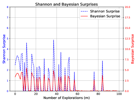
This is a dual-axis line chart comparing two metrics, "Shannon Surprise" and "Bayesian Surprise," plotted against the "Number of Explorations (m)." The chart displays how these two measures of surprise or information gain evolve over a sequence of exploratory actions.
### Components/Axes
* **Chart Title:** "Shannon and Bayesian Surprises" (centered at the top).
* **X-Axis:**
* **Label:** "Number of Explorations (m)"
* **Scale:** Linear, ranging from 0 to 100 with major tick marks every 20 units (0, 20, 40, 60, 80, 100).
* **Primary Y-Axis (Left):**
* **Label:** "Shannon Surprise"
* **Scale:** Linear, ranging from 0 to 8 with major tick marks every 1 unit.
* **Associated Data Series:** Blue dashed line.
* **Secondary Y-Axis (Right):**
* **Label:** "Bayesian Surprise"
* **Scale:** Linear, ranging from 0.0 to 20.0 with major tick marks every 2.5 units.
* **Associated Data Series:** Red solid line.
* **Legend:** Located in the top-right corner of the plot area.
* **Blue dashed line:** "Shannon Surprise"
* **Red solid line:** "Bayesian Surprise"
* **Grid:** A light gray grid is present, aligned with the major ticks of both the x-axis and the primary (left) y-axis.
### Detailed Analysis
**Data Series Trends and Key Points:**
1. **Shannon Surprise (Blue Dashed Line, Left Axis):**
* **Trend:** The series exhibits high volatility with frequent, sharp spikes, particularly in the first half of the exploration sequence (m=0 to m=60). The magnitude of the spikes generally decreases as the number of explorations increases. After approximately m=60, the values drop significantly and remain low, with only a few minor spikes.
* **Key Data Points (Approximate):**
* Initial value at m=0: ~2.8
* Major peaks:
* m ≈ 10: ~4.5
* m ≈ 35: ~4.8 (highest peak)
* m ≈ 45: ~3.7
* m ≈ 85: ~2.8
* Values after m=60 are predominantly below 1.0, often near 0.
2. **Bayesian Surprise (Red Solid Line, Right Axis):**
* **Trend:** This series also shows spiky behavior, with peaks that are temporally correlated with the peaks in Shannon Surprise. However, its overall magnitude (on its own scale) is lower relative to its axis maximum. The trend shows a more pronounced decline after the initial explorations, approaching and staying near zero from approximately m=60 onward.
* **Key Data Points (Approximate):**
* Initial value at m=0: ~3.5
* Major peaks (correlated with Shannon peaks):
* m ≈ 10: ~5.0
* m ≈ 35: ~4.0
* m ≈ 45: ~3.5
* m ≈ 85: ~3.5
* Values after m=60 are consistently very low, frequently at or near 0.0.
**Spatial and Visual Correlation:**
The peaks of both lines are closely aligned along the x-axis, indicating that events causing a high Shannon Surprise also cause a high Bayesian Surprise. The red line (Bayesian) appears to have a slightly smoother baseline between spikes compared to the blue line (Shannon).
### Key Observations
1. **Strong Correlation:** The most notable pattern is the tight temporal correlation between spikes in Shannon Surprise and Bayesian Surprise. They rise and fall together.
2. **Diminishing Surprise:** Both metrics show a clear overall trend of diminishing magnitude as the number of explorations (m) increases. The most significant "surprises" occur early in the process.
3. **Phase Transition:** There is a distinct change in behavior around m=60. After this point, both surprise measures become quiescent, suggesting the system or model has largely assimilated the environment or data, leading to few new surprises.
4. **Scale Difference:** While correlated, the absolute values are measured on different scales. A Shannon Surprise of ~4.8 corresponds to a Bayesian Surprise of ~4.0 at m≈35.
### Interpretation
This chart likely visualizes the learning or adaptation process of an agent or model in an unknown environment. "Surprise" quantifies the discrepancy between expectation and observation.
* **What the data suggests:** The early exploratory phase (m < 60) is characterized by frequent, significant updates to the model's beliefs, as evidenced by high surprise values. Each exploration provides substantial new information. The perfect correlation between the two surprise metrics indicates they are capturing related, though mathematically distinct, aspects of information gain. Shannon Surprise is rooted in information theory (reduction in entropy), while Bayesian Surprise measures the divergence between prior and posterior belief distributions.
* **How elements relate:** The x-axis represents time or experience. The dual y-axes allow the comparison of two different quantitative measures of the same conceptual phenomenon ("surprise") on their native scales. The decline in both lines demonstrates the principle of learning: as the agent explores, its predictions become more accurate, and observations become less surprising.
* **Notable anomalies/implications:** The near-zero values after m=60 are critical. They imply the learning process has converged or the environment has become predictable. The few late spikes (e.g., at m≈85) could represent rare, novel events or a change in the environment that temporarily reintroduces uncertainty. The chart effectively argues that both Shannon and Bayesian surprise are valid, correlated signals for guiding exploration, with the most informative explorations happening early on.