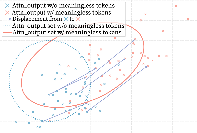
## Scatter Plot: Attention Output Displacement
### Overview
This image presents a scatter plot comparing the attention output with and without meaningless tokens. The plot visualizes the displacement between these two outputs, indicated by arrows connecting corresponding points. Two curved lines approximate the general trend of each data set.
### Components/Axes
* **X-axis:** The x-axis is not explicitly labeled, but represents a numerical value ranging approximately from 0 to 10. The scale is linear with markers at integer values.
* **Y-axis:** The y-axis is also not explicitly labeled, but represents a numerical value ranging approximately from 0 to 6. The scale is linear with markers at integer values.
* **Legend:** Located in the top-left corner, the legend defines the following:
* Blue 'x' markers: "Attn\_output w/o meaningless tokens"
* Red 'x' markers: "Attn\_output w/ meaningless tokens"
* Blue dashed arrows: "Displacement from x to x"
* Blue dotted line: "Attn\_output set w/o meaningless tokens"
* Red solid line: "Attn\_output set w/ meaningless tokens"
### Detailed Analysis
The plot contains two sets of scattered data points, one in blue and one in red. Each point represents an attention output value. Arrows connect corresponding points in the two sets, illustrating the displacement caused by the inclusion of meaningless tokens. Two curved lines approximate the trend of each data set.
**Blue Data (w/o meaningless tokens):**
The blue data points (Attn\_output w/o meaningless tokens) generally follow an upward trend, starting from approximately (0.5, 0.5) and reaching approximately (9.5, 5.5). The blue dotted line (Attn\_output set w/o meaningless tokens) provides a smoothed representation of this trend.
* Approximate data points (x, y): (0.5, 0.5), (1.5, 1.0), (2.5, 1.5), (3.5, 2.0), (4.5, 2.5), (5.5, 3.0), (6.5, 3.5), (7.5, 4.0), (8.5, 4.5), (9.5, 5.5).
**Red Data (w/ meaningless tokens):**
The red data points (Attn\_output w/ meaningless tokens) also exhibit an upward trend, but are generally shifted to the right and slightly above the blue data. The red solid line (Attn\_output set w/ meaningless tokens) represents this trend.
* Approximate data points (x, y): (1.0, 1.0), (2.0, 1.5), (3.0, 2.5), (4.0, 3.0), (5.0, 3.5), (6.0, 4.0), (7.0, 4.5), (8.0, 5.0), (9.0, 5.5), (10.0, 6.0).
**Displacement Arrows:**
The blue dashed arrows indicate the direction and magnitude of the displacement between corresponding blue and red points. The arrows generally point upwards and to the right, indicating that the inclusion of meaningless tokens increases both the x and y values of the attention output.
Two large, roughly elliptical shapes are drawn around the data. One encompasses the blue data, and the other the red data.
### Key Observations
* The inclusion of meaningless tokens consistently shifts the attention output to higher values.
* The displacement is not uniform; the magnitude of the shift varies across the range of x-values.
* The trend lines suggest a roughly linear relationship between the attention output and the presence/absence of meaningless tokens.
* The elliptical shapes highlight the overall distribution and spread of the data for each condition.
### Interpretation
The plot demonstrates the impact of meaningless tokens on attention output. The consistent upward and rightward displacement suggests that these tokens introduce a bias, inflating the attention scores. This could be problematic in applications where accurate attention weights are crucial, as it might lead to the model focusing on irrelevant information. The trend lines provide a visual summary of this effect, while the individual data points and displacement arrows reveal the variability in the impact of meaningless tokens. The elliptical shapes suggest that the data is somewhat clustered, but also exhibits some degree of spread, indicating that the effect of meaningless tokens is not entirely consistent. The visualization strongly suggests that removing meaningless tokens is beneficial for obtaining more accurate and reliable attention outputs.