## Scatter Plot: Effect of Meaningless Tokens on Attention Output Distribution
### Overview
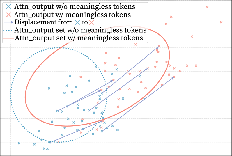
The image is a scatter plot visualizing the distribution of attention output vectors in a two-dimensional space. It compares two conditions: attention outputs without meaningless tokens (blue 'x' markers) and attention outputs with meaningless tokens (red 'x' markers). The plot includes displacement vectors showing the shift for specific points and ellipses representing the overall set distributions for each condition.
### Components/Axes
* **Legend (Top-Left Corner):**
* `Attn_output w/o meaningless tokens`: Blue 'x' marker.
* `Attn_output w/ meaningless tokens`: Red 'x' marker.
* `Displacement from ✕ to ✕`: Blue arrow (from a blue 'x' to a red 'x').
* `Attn_output set w/o meaningless tokens`: Blue dotted ellipse.
* `Attn_output set w/ meaningless tokens`: Red solid ellipse.
* **Axes:** The plot has a grid background but **no labeled X or Y axes**. The axes represent an abstract, two-dimensional projection of the attention output vectors. No numerical scales or units are provided.
* **Data Series:**
1. **Blue 'x' Series:** Approximately 30-40 data points representing attention outputs without meaningless tokens. They are clustered primarily in the lower-left to central region of the plot.
2. **Red 'x' Series:** Approximately 30-40 data points representing attention outputs with meaningless tokens. They are more dispersed and shifted towards the upper-right relative to the blue cluster.
* **Annotations:**
* **Displacement Arrows:** Five distinct blue arrows originate from specific blue 'x' points and point towards corresponding red 'x' points. They indicate the direction and magnitude of shift for individual data points when meaningless tokens are introduced.
* **Distribution Ellipses:**
* A **blue dotted ellipse** encircles the main cluster of blue 'x' points. It is oriented diagonally from lower-left to upper-right.
* A **red solid ellipse** encircles the main cluster of red 'x' points. It is larger, more circular, and positioned further to the upper-right compared to the blue ellipse.
### Detailed Analysis
* **Data Point Distribution:**
* The **blue 'x' points (w/o meaningless tokens)** form a relatively tight, elongated cluster. The densest region is near the center-left of the plot.
* The **red 'x' points (w/ meaningless tokens)** are more scattered. While some overlap with the blue cluster, a significant number are displaced towards the top and right edges of the plot.
* **Displacement Vectors:** The five visible arrows all point from the blue cluster towards the red cluster, generally in a **north-east (upper-right) direction**. The lengths of the arrows vary, suggesting different magnitudes of shift for different data points. The longest arrow originates from the lower-left portion of the blue cluster and extends to the upper-right region.
* **Set Ellipses (Spatial Grounding):**
* The **blue dotted ellipse** is centered roughly in the lower-middle-left area. It encompasses the majority of the blue 'x' markers.
* The **red solid ellipse** is centered further to the upper-right. Its larger area visually confirms the greater variance/spread of the red data points. The two ellipses overlap in the central region of the plot.
### Key Observations
1. **Systematic Shift:** There is a clear, systematic displacement of data points from the lower-left/central region (blue) towards the upper-right region (red) when meaningless tokens are added.
2. **Increased Dispersion:** The set of outputs with meaningless tokens (red) exhibits significantly higher variance or dispersion than the set without them (blue), as shown by the larger red ellipse and the more scattered red 'x' markers.
3. **Directional Consistency:** The displacement arrows are all oriented in a similar north-east direction, indicating a consistent directional bias in the effect of adding meaningless tokens.
4. **Overlap Region:** A subset of points, particularly in the central area of the plot, shows less displacement, resulting in an overlap between the two distributions.
### Interpretation
This chart demonstrates the **destabilizing and distorting effect of meaningless tokens on a model's attention mechanism**.
* **What the data suggests:** The introduction of meaningless tokens does not simply add random noise. Instead, it causes a **systematic drift** in the representation space of attention outputs (the shift to the upper-right). This could imply that the model's internal processing is being consistently biased or "pulled" in a specific direction by these tokens.
* **How elements relate:** The displacement arrows provide a microscopic view of this effect on individual data points, while the ellipses offer a macroscopic view of the overall distribution change. The increased size of the red ellipse indicates that meaningless tokens make the model's outputs less consistent and more unpredictable.
* **Notable implications:** In a technical context, this visualization argues that meaningless tokens are not benign. They can corrupt the semantic representation space, potentially leading to less reliable or focused model outputs. The systematic nature of the shift (rather than pure random scattering) might be particularly concerning, as it suggests a predictable form of interference. The lack of axis labels means the exact semantic meaning of the shift (e.g., towards more generic or off-topic representations) cannot be determined from the plot alone, but the directional consistency is a strong signal of a non-random effect.