## Scatter Plot: PPL Degradation vs. Compression Ratio
### Overview
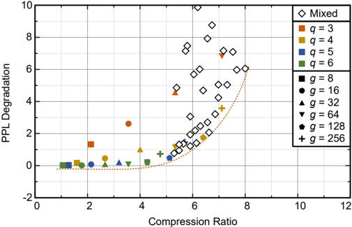
The image is a scatter plot comparing **PPL Degradation** (y-axis) against **Compression Ratio** (x-axis). Data points are categorized by two parameters: **q** (number of categories) and **g** (model size). A dashed orange trend line indicates a general upward trend in PPL degradation as compression ratio increases. The legend on the right maps symbols and colors to specific **q** and **g** values.
---
### Components/Axes
- **X-axis (Compression Ratio)**: Ranges from 0 to 12, with gridlines at integer intervals.
- **Y-axis (PPL Degradation)**: Ranges from -2 to 10, with gridlines at integer intervals.
- **Legend**: Located in the top-right corner. Symbols and colors represent:
- **q values**:
- Orange square: q = 3
- Yellow circle: q = 4
- Blue diamond: q = 5
- Green triangle: q = 6
- **g values**:
- Black square: g = 8
- Black circle: g = 16
- Black triangle: g = 32
- Black inverted triangle: g = 64
- Black pentagon: g = 128
- Black plus: g = 256
- **Mixed**: White diamond (no explicit **q** or **g** label).
---
### Detailed Analysis
#### Data Series Trends
1. **Mixed (White Diamonds)**:
- Scattered across the plot, with concentrations at compression ratios 5–8 and PPL degradation 4–8.
- Example points: (5, 5), (6, 6), (7, 7), (8, 8).
2. **q = 3 (Orange Squares)**:
- Two points: (2, 1) and (4, 3).
- Lower PPL degradation compared to other **q** values at similar compression ratios.
3. **q = 4 (Yellow Circles)**:
- Points at (3, 0.5), (4, 1), and (5, 2).
- Moderate degradation, increasing with compression ratio.
4. **q = 5 (Blue Diamonds)**:
- Points at (4, 1.5), (5, 2.5), and (6, 4).
- Higher degradation than **q = 3** and **q = 4** at similar compression ratios.
5. **q = 6 (Green Triangles)**:
- Points at (3, 0.2), (4, 0.5), and (5, 1).
- Lowest degradation among **q** values.
6. **g = 8 (Black Squares)**:
- Points at (1, 0), (2, 0.5), and (3, 1).
- Minimal degradation, suggesting smaller model size mitigates degradation.
7. **g = 16 (Black Circles)**:
- Points at (2, 0.3), (3, 0.6), and (4, 1.2).
- Slightly higher degradation than **g = 8**.
8. **g = 32 (Black Triangles)**:
- Points at (3, 0.8), (4, 1.5), and (5, 2.5).
- Moderate degradation, increasing with compression ratio.
9. **g = 64 (Black Inverted Triangles)**:
- Points at (4, 2), (5, 3.5), and (6, 5).
- Higher degradation than smaller **g** values.
10. **g = 128 (Black Pentagons)**:
- Points at (5, 4), (6, 5.5), and (7, 7).
- Significant degradation, especially at higher compression ratios.
11. **g = 256 (Black Plus)**:
- Points at (6, 6), (7, 7.5), and (8, 9).
- Highest degradation, with a steep upward trend.
#### Trend Line
- The dashed orange line curves upward, indicating a **non-linear relationship** between compression ratio and PPL degradation. The slope steepens as compression ratio increases, suggesting diminishing returns in compression efficiency at higher ratios.
---
### Key Observations
1. **Compression Ratio Impact**:
- PPL degradation generally increases with compression ratio, but the relationship is not strictly linear.
- At compression ratios >6, degradation accelerates sharply (e.g., **g = 256** at (8, 9)).
2. **q vs. g Interaction**:
- Higher **q** values (e.g., q = 6) show lower degradation than lower **q** values (e.g., q = 3) at similar compression ratios.
- Larger **g** values (e.g., g = 256) exhibit significantly higher degradation, implying model size exacerbates degradation.
3. **Outliers**:
- The **q = 3** point at (4, 3) is an outlier, as it has higher degradation than other **q = 3** points at similar compression ratios.
- The **g = 256** point at (8, 9) is the highest degradation observed, far exceeding other data points.
---
### Interpretation
The plot demonstrates that **PPL degradation** is influenced by both **compression ratio** and **model size (g)**. Higher compression ratios correlate with increased degradation, but the effect is non-linear, with a steep rise at higher ratios. Larger models (higher **g**) exacerbate degradation, suggesting that compression techniques may disproportionately harm larger models. The **q** parameter (number of categories) also plays a role: lower **q** values (e.g., q = 3) show higher degradation than higher **q** values (e.g., q = 6) at similar compression ratios, indicating that simpler categorization schemes may be less robust to compression. The **Mixed** category’s variability suggests that real-world data (with mixed **q** and **g** values) experiences degradation across a wide range. This highlights the trade-off between compression efficiency and model performance, with no single optimal configuration.