## Line Chart: Latency per Token vs. Number of Tokens
### Overview
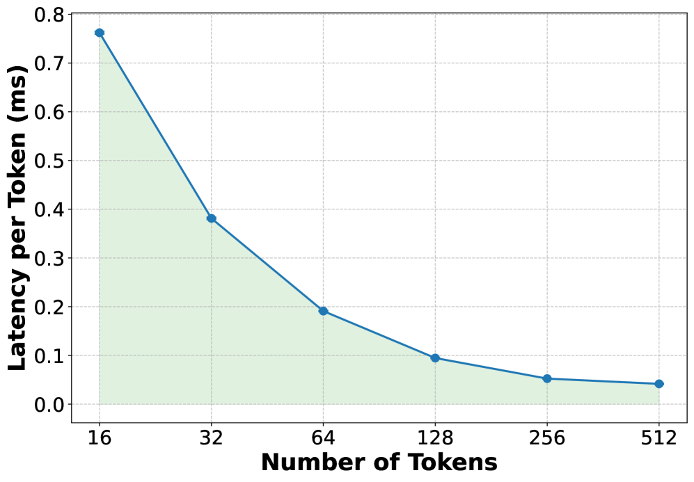
This image is a line chart illustrating the relationship between the number of tokens processed and the latency per token (measured in milliseconds). The chart displays a clear inverse relationship, where latency decreases significantly as the number of tokens increases.
### Components/Axes
* **X-Axis (Horizontal):** Labeled "Number of Tokens". The scale is non-linear (logarithmic), with markers at 16, 32, 64, 128, 256, and 512.
* **Y-Axis (Vertical):** Labeled "Latency per Token (ms)". The scale is linear, ranging from 0.0 to 0.8 in increments of 0.1.
* **Data Series:** A single blue line connecting circular data points.
* **Visual Styling:** A light green shaded area fills the region between the blue line and the X-axis. A light gray grid is overlaid on the chart area to assist with reading values.
### Detailed Analysis
The trend is a steep downward curve, indicating that as the workload (number of tokens) increases, the time taken to process each individual token decreases rapidly before leveling off.
**Data Point Extraction (Approximate values):**
* **16 Tokens:** The latency is approximately **0.76 ms**.
* **32 Tokens:** The latency is approximately **0.38 ms**.
* **64 Tokens:** The latency is approximately **0.19 ms**.
* **128 Tokens:** The latency is approximately **0.095 ms**.
* **256 Tokens:** The latency is approximately **0.05 ms**.
* **512 Tokens:** The latency is approximately **0.04 ms**.
### Key Observations
* **Exponential Decay:** The latency drops by roughly 50% for each doubling of the token count between 16 and 128 tokens.
* **Diminishing Returns:** The rate of latency reduction slows significantly after 128 tokens. The difference between 256 and 512 tokens is minimal (approx. 0.01 ms), suggesting the system is approaching a performance floor or steady-state throughput.
* **Grid Alignment:** The data points are plotted precisely at the intersection of the vertical grid lines corresponding to the X-axis labels.
### Interpretation
This chart is characteristic of performance benchmarking for Large Language Model (LLM) inference or similar sequence-processing systems.
* **Amortization of Overhead:** The high latency at low token counts (16 tokens) suggests that there is a fixed "cost" or overhead associated with processing a request (e.g., model initialization, memory access, or kernel launch overhead). As the number of tokens increases, this fixed cost is amortized over more tokens, driving the "per-token" latency down.
* **Steady-State Throughput:** The plateauing of the curve after 128 tokens indicates that the system has reached its maximum efficient throughput. Beyond this point, adding more tokens does not significantly improve the per-token latency, likely because the system is operating at its peak hardware utilization or memory bandwidth capacity.
* **Optimization Implications:** For a developer or engineer, this graph suggests that processing very short sequences is inefficient. To maximize hardware utilization, batching or grouping requests to ensure a higher token count per inference pass would be the optimal strategy.