\n
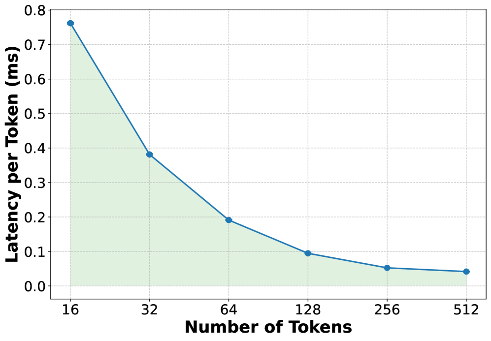
## Line Chart: Latency per Token vs. Number of Tokens
### Overview
The image displays a line chart illustrating the relationship between the number of tokens processed and the latency per token, measured in milliseconds (ms). The chart demonstrates a clear inverse relationship: as the number of tokens increases, the latency per token decreases significantly. The data is presented as a single series with a blue line and circular markers, with the area beneath the line shaded in a light green.
### Components/Axes
* **Chart Type:** Line chart with a filled area.
* **X-Axis (Horizontal):**
* **Title:** "Number of Tokens"
* **Scale:** Logarithmic (base 2), with major tick marks at 16, 32, 64, 128, 256, and 512.
* **Y-Axis (Vertical):**
* **Title:** "Latency per Token (ms)"
* **Scale:** Linear, ranging from 0.0 to 0.8 ms, with major tick marks at intervals of 0.1 ms.
* **Data Series:** A single series represented by a solid blue line with circular markers at each data point.
* **Legend:** None present (only one data series).
* **Grid:** A light gray grid is present for both axes to aid in reading values.
* **Language:** All text in the chart is in English.
### Detailed Analysis
The chart plots six distinct data points. The visual trend is a steep, downward-sloping curve that flattens as the number of tokens increases.
**Data Points (Approximate Values):**
1. **At 16 Tokens:** Latency per Token ≈ 0.76 ms. This is the highest point on the chart.
2. **At 32 Tokens:** Latency per Token ≈ 0.38 ms. The value drops by approximately half from the previous point.
3. **At 64 Tokens:** Latency per Token ≈ 0.19 ms. The value again drops by approximately half.
4. **At 128 Tokens:** Latency per Token ≈ 0.095 ms. The rate of decrease begins to slow.
5. **At 256 Tokens:** Latency per Token ≈ 0.05 ms.
6. **At 512 Tokens:** Latency per Token ≈ 0.04 ms. This is the lowest point, showing minimal further decrease from 256 tokens.
**Trend Verification:** The blue line exhibits a consistent, monotonic downward slope from left to right, confirming the inverse relationship. The curve is convex, indicating that the rate of improvement (reduction in latency) diminishes as the token count grows.
### Key Observations
1. **Diminishing Returns:** The most dramatic reduction in per-token latency occurs when increasing the token count from 16 to 64. The improvement from 256 to 512 tokens is marginal.
2. **Performance Scaling:** The chart suggests that processing tokens in larger batches (higher "Number of Tokens") is more efficient on a per-token basis, likely due to amortized overhead costs.
3. **Visual Emphasis:** The light green shaded area under the line visually emphasizes the total "latency cost" and how it shrinks with larger batch sizes.
### Interpretation
This chart demonstrates a fundamental principle in computing and systems performance: **amortization of fixed costs**. The "Latency per Token" likely includes both a fixed overhead component (e.g., model loading, kernel launch, memory allocation) and a variable component that scales with the number of tokens.
* **At low token counts (e.g., 16)**, the fixed overhead dominates the per-token latency, resulting in high values.
* **As the token count increases**, this fixed overhead is distributed across more tokens, causing the per-token latency to drop sharply.
* **At very high token counts (e.g., 256, 512)**, the variable processing time becomes the dominant factor, and the curve flattens, approaching the theoretical minimum latency per token for the given hardware and model.
The practical implication is that for this system, batching requests or processing longer sequences is highly beneficial for throughput and efficiency. The "sweet spot" for balancing latency and efficiency appears to be in the range of 64 to 128 tokens, where significant gains have been realized before the curve plateaus. The chart provides a clear visual argument for optimizing batch sizes in machine learning inference or similar computational workloads.