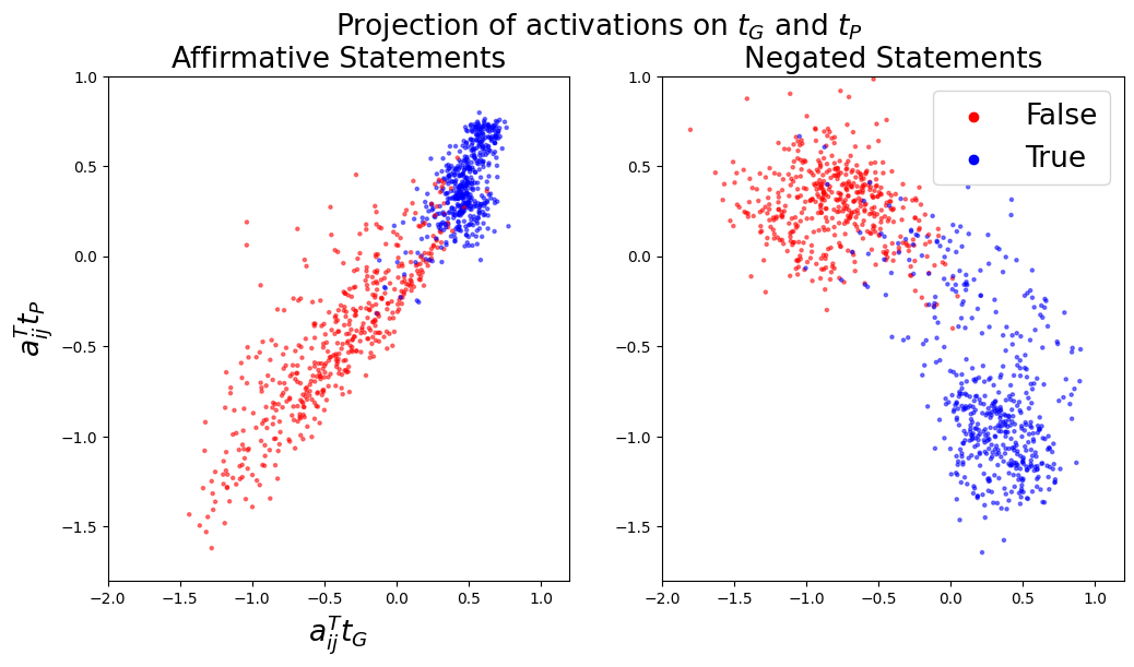
## Scatter Plot: Projection of activations on tG and tP
### Overview
The image contains two scatter plots side-by-side, displaying the projection of activations on tG and tP. The left plot represents "Affirmative Statements," and the right plot represents "Negated Statements." Each plot shows data points colored red (False) or blue (True). The x-axis represents aij^T tG, and the y-axis represents aij^T tP.
### Components/Axes
* **Title:** Projection of activations on tG and tP
* **Left Subplot Title:** Affirmative Statements
* **Right Subplot Title:** Negated Statements
* **X-axis (both plots):** aij^T tG. Scale ranges from approximately -2.0 to 1.0, with tick marks at -1.5, -1.0, -0.5, 0.0, 0.5, and 1.0.
* **Y-axis (both plots):** aij^T tP. Scale ranges from approximately -2.0 to 1.0, with tick marks at -1.5, -1.0, -0.5, 0.0, 0.5, and 1.0.
* **Legend (top-right):**
* Red dots: False
* Blue dots: True
### Detailed Analysis
**Affirmative Statements (Left Plot):**
* **Red (False) Data Points:** These points are primarily clustered in the lower-left quadrant, with a general trend sloping upwards and to the right. The x-values range from approximately -2.0 to 0.5, and the y-values range from approximately -1.75 to 0.25.
* **Blue (True) Data Points:** These points are clustered in the upper-right quadrant, with x-values ranging from approximately 0.0 to 1.0 and y-values ranging from approximately 0.2 to 0.8.
**Negated Statements (Right Plot):**
* **Red (False) Data Points:** These points are clustered in the upper-left quadrant, with x-values ranging from approximately -1.75 to 0.25 and y-values ranging from approximately 0.0 to 0.75.
* **Blue (True) Data Points:** These points are clustered in the lower-right quadrant, forming a curve. The x-values range from approximately -0.5 to 1.0, and the y-values range from approximately -1.5 to 0.0.
### Key Observations
* In the "Affirmative Statements" plot, there is a clear separation between the "True" and "False" data points, with "True" points generally having higher x and y values.
* In the "Negated Statements" plot, the "True" and "False" data points are more separated than in the "Affirmative Statements" plot. The "True" points form a distinct curve in the lower-right quadrant.
* The distribution of data points differs significantly between "Affirmative Statements" and "Negated Statements," suggesting that negation has a substantial impact on the activations.
### Interpretation
The plots visualize how activations are projected onto tG and tP for affirmative and negated statements. The separation between "True" and "False" data points suggests that these projections can be used to distinguish between the truth values of the statements. The different distributions observed in the "Affirmative Statements" and "Negated Statements" plots indicate that the negation operation alters the representation of the statements in the activation space. The clustering and trends suggest that the model is learning to represent the semantic meaning of the statements and how negation affects that meaning. The curved shape of the "True" data points in the "Negated Statements" plot might indicate a non-linear relationship between the activations and the truth value in the context of negation.