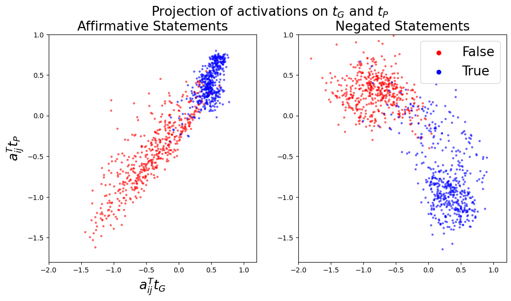
## Scatter Plot: Projection of Activations on t_G and t_P
### Overview
The image displays two side-by-side scatter plots under the main title "Projection of activations on t_G and t_P." The plots visualize the distribution of data points projected onto two dimensions, labeled `a_ij^T t_G` (x-axis) and `a_ij^T t_P` (y-axis). The data is categorized by statement type (Affirmative vs. Negated) and truth value (False vs. True).
### Components/Axes
* **Main Title:** "Projection of activations on t_G and t_P"
* **Subplot Titles:**
* Left Plot: "Affirmative Statements"
* Right Plot: "Negated Statements"
* **Axes (Both Plots):**
* **X-axis Label:** `a_ij^T t_G`
* **Y-axis Label:** `a_ij^T t_P`
* **X-axis Scale:** Ranges from -2.0 to 1.0, with major ticks at -2.0, -1.5, -1.0, -0.5, 0.0, 0.5, 1.0.
* **Y-axis Scale:** Ranges from -1.5 to 1.0, with major ticks at -1.5, -1.0, -0.5, 0.0, 0.5, 1.0.
* **Legend (Located in the top-right corner of the "Negated Statements" plot):**
* **Red Dot:** "False"
* **Blue Dot:** "True"
### Detailed Analysis
**1. Left Plot: "Affirmative Statements"**
* **Trend Verification:** The overall data cloud shows a clear positive correlation. Points trend from the lower-left quadrant towards the upper-right quadrant.
* **Data Series Analysis:**
* **"False" (Red Points):** Primarily clustered in the lower-left quadrant. The densest region is approximately between x = -1.5 to -0.5 and y = -1.5 to -0.5. The cluster extends with a positive slope towards the center of the plot.
* **"True" (Blue Points):** Primarily clustered in the upper-right quadrant. The densest region is approximately between x = 0.0 to 0.7 and y = 0.0 to 0.8. This cluster also follows the overall positive slope.
* **Overlap:** There is a region of moderate overlap between the two clusters near the center of the plot, roughly around coordinates (0.0, -0.2).
**2. Right Plot: "Negated Statements"**
* **Trend Verification:** The overall data cloud shows a clear negative correlation. Points trend from the upper-left quadrant towards the lower-right quadrant.
* **Data Series Analysis:**
* **"False" (Red Points):** Primarily clustered in the upper-left quadrant. The densest region is approximately between x = -1.5 to -0.5 and y = 0.0 to 0.8. The cluster extends with a negative slope towards the center.
* **"True" (Blue Points):** Primarily clustered in the lower-right quadrant. The densest region is approximately between x = 0.0 to 0.8 and y = -1.5 to -0.5. This cluster follows the overall negative slope.
* **Overlap:** The separation between the "False" and "True" clusters is more distinct than in the Affirmative plot. There is minimal overlap, primarily near the center around coordinates (-0.2, -0.2).
### Key Observations
1. **Polarity-Dependent Correlation:** The relationship between the two projection dimensions (`a_ij^T t_G` and `a_ij^T t_P`) flips sign based on statement polarity. Affirmative statements show a positive correlation, while Negated statements show a negative correlation.
2. **Truth Value Separation:** In both plots, the "True" (blue) and "False" (red) data points form distinct clusters. The separation is clearer in the "Negated Statements" plot.
3. **Spatial Distribution:** For Affirmative statements, "False" is associated with low values on both axes, and "True" with high values. For Negated statements, "False" is associated with low `t_G` and high `t_P`, while "True" is associated with high `t_G` and low `t_P`.
### Interpretation
This visualization demonstrates how a model's internal activations (projected onto directions `t_G` and `t_P`) encode both the **truth value** and the **polarity** (affirmative vs. negated) of a statement.
* **Underlying Mechanism:** The distinct clustering suggests the model has learned separate representational patterns for true and false statements. The flip in correlation direction indicates that the model's processing of truth is fundamentally different for affirmative versus negated statements. It likely involves a transformation or inversion of the relationship between the two underlying dimensions (`t_G` and `t_P`).
* **Peircean Investigative Reading:** The plots act as a "sign" of the model's internal logic. The **iconic** similarity is the clustering itself (like groups with like). The **indexical** relationship is the direct link between a point's position and its label (True/False, Affirmative/Negated). The **symbolic** interpretation is that the model has constructed a coherent, geometry-based system for representing truth, where the meaning of the axes (`t_G`, `t_P`) is defined by their relationship to these linguistic categories. The clear separation, especially in the negated case, suggests the model's representation is robust and not merely guessing.
* **Notable Anomaly:** The region of overlap in the "Affirmative Statements" plot represents cases where the model's activation pattern is ambiguous with respect to truth value. These could be more complex, nuanced, or potentially erroneous examples in the dataset. The cleaner separation in the "Negated Statements" plot might indicate that negation creates a stronger, more distinct signal in the model's activation space.