## Grouped Bar Chart: Performance Metrics (F1 and BLEU-1) vs. k Values
### Overview
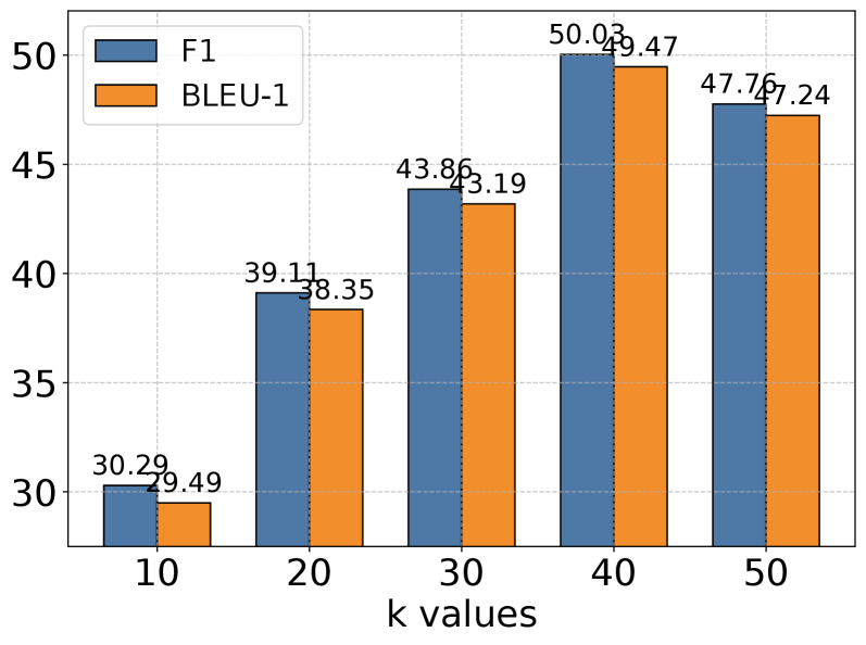
The image displays a grouped bar chart comparing two performance metrics, F1 and BLEU-1, across five different "k values" (10, 20, 30, 40, 50). The chart illustrates how these metrics change as the parameter `k` increases, showing a general upward trend that peaks at k=40 before a slight decline at k=50.
### Components/Axes
* **Chart Type:** Grouped (clustered) bar chart.
* **X-Axis:** Labeled "k values". It has five categorical tick marks: `10`, `20`, `30`, `40`, `50`.
* **Y-Axis:** Numerical scale representing the metric score. The axis is labeled with major ticks at `30`, `35`, `40`, `45`, `50`. The scale appears to start at approximately 28 and extend to just above 50.
* **Legend:** Located in the top-left corner of the plot area.
* A blue rectangle is labeled **F1**.
* An orange rectangle is labeled **BLEU-1**.
* **Data Series & Labels:** Each "k value" category contains two bars. The exact numerical value is printed above each bar.
* **F1 Series (Blue Bars, Left in each group):**
* k=10: 30.29
* k=20: 39.11
* k=30: 43.86
* k=40: 50.03
* k=50: 47.76
* **BLEU-1 Series (Orange Bars, Right in each group):**
* k=10: 29.49
* k=20: 38.35
* k=30: 43.19
* k=40: 49.47
* k=50: 47.24
### Detailed Analysis
The chart presents paired data for each k value. The visual trend for both series is a consistent increase from k=10 to k=40, followed by a decrease at k=50.
* **At k=10:** F1 (30.29) is slightly higher than BLEU-1 (29.49).
* **At k=20:** Both metrics show significant growth. F1 (39.11) remains higher than BLEU-1 (38.35).
* **At k=30:** The upward trend continues. F1 (43.86) and BLEU-1 (43.19) are very close in value.
* **At k=40:** Both metrics reach their peak. F1 (50.03) is the highest value in the chart. BLEU-1 (49.47) is also at its maximum.
* **At k=50:** Both metrics decline from their peaks. F1 drops to 47.76 and BLEU-1 to 47.24. The gap between them remains small.
### Key Observations
1. **Strong Positive Correlation:** There is a clear positive correlation between the k value and both performance metrics up to k=40.
2. **Peak Performance:** The optimal performance for both F1 and BLEU-1, as presented in this chart, occurs at **k=40**.
3. **Consistent Metric Relationship:** The F1 score is consistently higher than the BLEU-1 score for every k value, though the difference is often marginal (less than 1 point).
4. **Synchronized Trend:** The two metrics move in near-perfect synchronization, rising and falling together across the tested k values.
5. **Diminishing Returns/Overfitting:** The drop in performance at k=50 suggests that increasing the parameter beyond 40 may lead to diminishing returns or potential overfitting in the underlying model or system being evaluated.
### Interpretation
This chart likely evaluates the performance of a machine learning or natural language processing system where `k` is a key hyperparameter (e.g., the number of retrieved documents, nearest neighbors, or generated candidates). The F1 score (a measure of a test's accuracy, balancing precision and recall) and BLEU-1 score (a metric for evaluating machine-generated text against reference texts, focusing on unigram precision) are used as complementary evaluation metrics.
The data suggests that increasing `k` improves system performance up to an optimal point (k=40). This could mean that considering more candidates (`k`) provides better information or coverage. However, the decline at k=50 indicates a threshold where adding more candidates introduces noise or irrelevant information, degrading output quality. The close tracking of F1 and BLEU-1 implies that improvements in one aspect of performance (e.g., recall via F1) are accompanied by improvements in another (e.g., surface-level precision via BLEU-1), indicating a robust improvement in the system's overall output quality up to the optimal `k`. The chart provides clear empirical evidence for selecting k=40 as the best setting among those tested for this particular system and evaluation setup.