## Network Diagram: Connectivity Map
### Overview
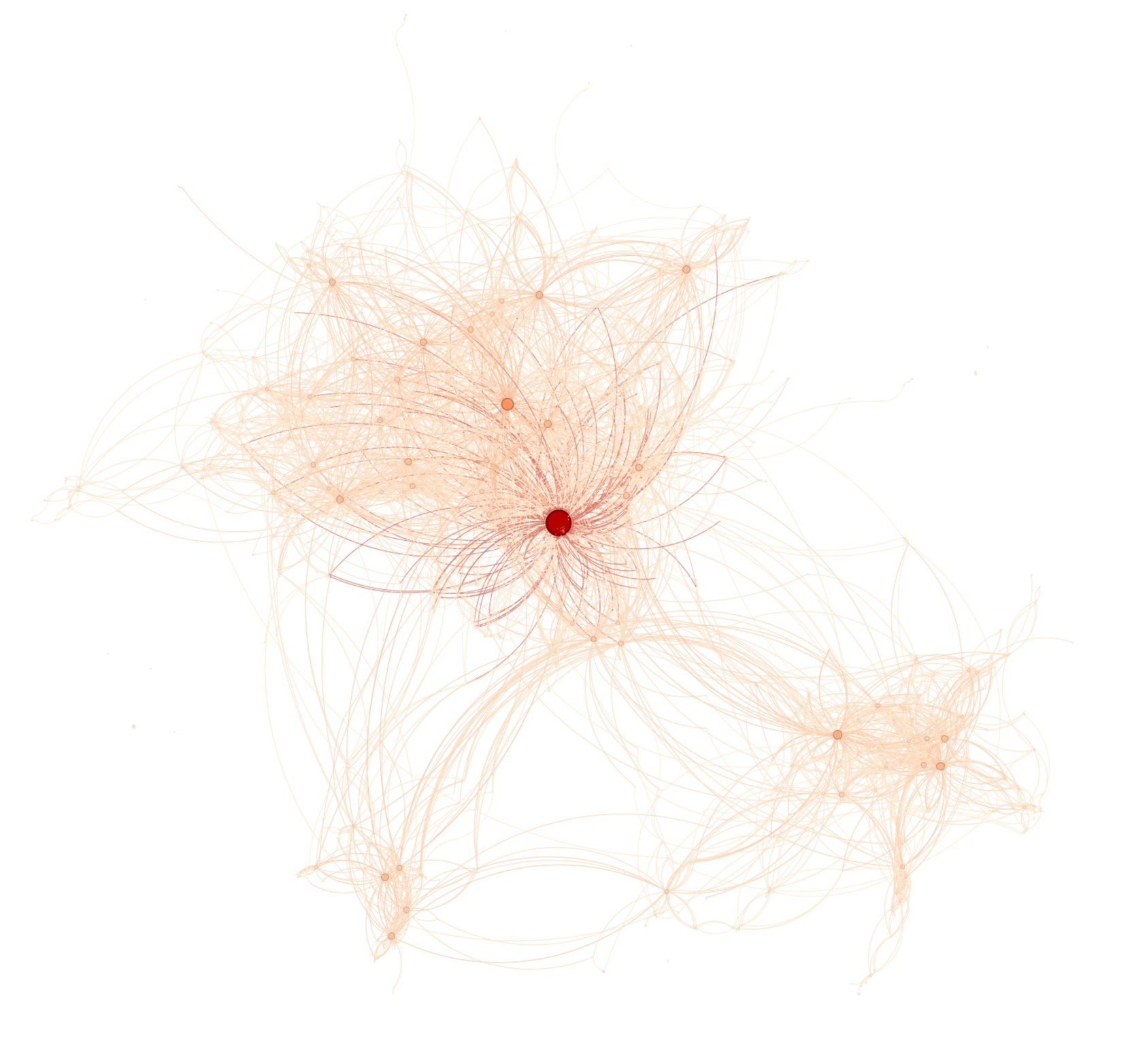
The image is a network diagram depicting connections between various nodes. The nodes are represented by circles, and the connections between them are represented by lines. The color intensity of both the nodes and the lines varies, suggesting a weighting or intensity of connection. The diagram appears to show three main clusters of nodes, with one cluster being significantly more central and densely connected than the other two.
### Components/Axes
* **Nodes:** Represented by circles, varying in size and color intensity (light orange to dark red).
* **Edges:** Represented by lines connecting the nodes, also varying in color intensity (light orange to dark red).
* **Clusters:** Three distinct clusters of interconnected nodes are visible.
### Detailed Analysis
* **Central Cluster:** Located in the center-left of the image. This cluster has the largest and darkest red node, indicating a high degree of connectivity or importance. Many lines converge on this central node, and the lines are generally darker red closer to this node.
* **Upper Cluster:** Located above and slightly to the right of the central cluster. This cluster is less dense than the central cluster, with lighter orange nodes and edges.
* **Lower Cluster:** Located in the bottom-right of the image. This cluster is the least dense, with the faintest orange nodes and edges.
* **Connectivity:** The lines connecting the nodes vary in thickness and color intensity. Thicker, darker lines suggest stronger or more frequent connections. The lines are curved, giving the diagram a more organic feel.
### Key Observations
* The central cluster is the most prominent and highly connected, suggesting it plays a critical role in the network.
* The upper and lower clusters are less densely connected and may represent peripheral or less important components of the network.
* The color gradient from light orange to dark red likely represents the strength or frequency of connections, with darker colors indicating stronger connections.
### Interpretation
The network diagram likely represents a system where different entities (nodes) are interconnected. The central cluster represents a hub or core component of the system, while the other clusters represent peripheral components. The connections between the nodes indicate relationships or interactions between the entities. The color intensity of the nodes and edges likely represents the strength or frequency of these relationships.
The diagram suggests that the central node is a critical point of failure, as its disruption would likely have a significant impact on the entire network. The other clusters may be more resilient to disruption, as they are less densely connected.
The diagram could represent a variety of systems, such as:
* A social network, where nodes represent individuals and edges represent relationships.
* A transportation network, where nodes represent cities and edges represent routes.
* A computer network, where nodes represent devices and edges represent connections.
* A biological network, where nodes represent genes or proteins and edges represent interactions.