\n
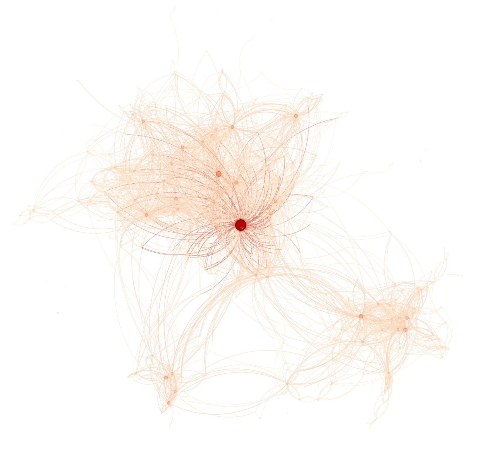
## Network Graph: Connection Visualization
### Overview
The image depicts a network graph, visually representing connections between numerous nodes. The graph is predominantly composed of light orange lines connecting small, pale orange/white nodes. A single, centrally located node is colored red and appears larger than the others. The graph lacks explicit axes, labels, or a legend. The overall impression is one of complex interconnectedness with a central hub.
### Components/Axes
There are no explicit axes, scales, or legends present in the image. The components are:
* **Nodes:** Represented by small circles, varying slightly in opacity.
* **Edges:** Represented by thin lines connecting the nodes.
* **Central Node:** A single, larger, red node positioned near the center of the image.
### Detailed Analysis or Content Details
The graph consists of a dense cluster of nodes and edges in the central and upper-left regions, with sparser connections extending outwards.
* **Central Node:** The red node is highly connected, with numerous lines radiating from it. It appears to be a major hub in the network.
* **Node Density:** The density of nodes and edges decreases as you move away from the central node.
* **Cluster Formation:** There are several smaller clusters of nodes connected by edges, particularly in the bottom-right and upper-right quadrants.
* **Edge Distribution:** The edges are distributed somewhat randomly, but generally follow the overall structure of the node clusters.
* **Node Count (Approximate):** Estimating the number of nodes is difficult due to overlap, but there appear to be approximately 200-300 nodes.
* **Edge Count (Approximate):** Similarly, estimating the number of edges is challenging, but there are likely several hundred edges.
There is no quantitative data associated with the nodes or edges (e.g., weights, values). The visualization is purely topological, showing only the presence or absence of connections.
### Key Observations
* **Centrality:** The red node clearly stands out as the most important node in the network, based on its size and connectivity.
* **Clustering:** The graph exhibits clear clustering behavior, with nodes grouping together into distinct communities.
* **Sparse Connections:** The outer regions of the graph are sparsely connected, suggesting that these nodes are less central to the overall network structure.
* **Lack of Directionality:** The edges appear undirected, meaning the connections are bidirectional.
### Interpretation
The image likely represents a network of relationships, where nodes represent entities (e.g., people, organizations, concepts) and edges represent connections between them. The central red node could represent a key influencer, a central authority, or a critical resource. The clustering suggests that the network is organized into communities with strong internal connections.
The absence of quantitative data limits the depth of analysis. However, the visualization provides a qualitative understanding of the network's structure and key features. The graph could be used to illustrate social networks, communication patterns, information flow, or any other type of relational data.
The image suggests a hierarchical structure, with the central node at the top of the hierarchy and the surrounding clusters representing different sub-groups or communities. The sparse connections in the outer regions could represent peripheral members or weak ties.
Without additional context, it is difficult to determine the specific meaning of the network. However, the visualization provides a valuable starting point for exploring the relationships between the entities represented by the nodes and edges. The image is a visual representation of connectivity, and the red node is a clear focal point.