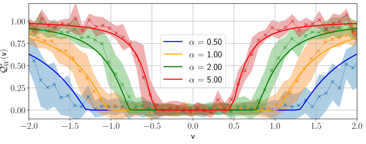
## Line Chart: Q*_W(v) vs. v for different alpha values
### Overview
The image is a line chart displaying the relationship between Q*_W(v) and v for different values of alpha (α). The chart includes four data series, each representing a different alpha value (0.50, 1.00, 2.00, and 5.00). Each data series is plotted with a line and 'x' markers, along with a shaded region indicating uncertainty. The x-axis represents 'v', ranging from -2.0 to 2.0, and the y-axis represents Q*_W(v), ranging from 0.00 to 1.00.
### Components/Axes
* **X-axis:**
* Label: v
* Scale: -2.0 to 2.0, with tick marks at -2.0, -1.5, -1.0, -0.5, 0.0, 0.5, 1.0, 1.5, and 2.0.
* **Y-axis:**
* Label: Q*_W(v)
* Scale: 0.00 to 1.00, with tick marks at 0.00, 0.25, 0.50, 0.75, and 1.00.
* **Legend:** Located in the top-right quadrant of the chart.
* Blue line: α = 0.50
* Orange line: α = 1.00
* Green line: α = 2.00
* Red line: α = 5.00
### Detailed Analysis
* **α = 0.50 (Blue):**
* Trend: Starts at approximately 0.55 at v = -2.0, decreases to approximately 0.0 at v = -0.5, remains near 0.0 until v = 0.5, then increases to approximately 0.55 at v = 2.0.
* Data Points:
* v = -2.0, Q*_W(v) ≈ 0.55
* v = -0.5, Q*_W(v) ≈ 0.0
* v = 0.5, Q*_W(v) ≈ 0.0
* v = 2.0, Q*_W(v) ≈ 0.55
* **α = 1.00 (Orange):**
* Trend: Starts at approximately 0.9 at v = -2.0, decreases to approximately 0.0 at v = -0.5, remains near 0.0 until v = 0.5, then increases to approximately 0.9 at v = 2.0.
* Data Points:
* v = -2.0, Q*_W(v) ≈ 0.9
* v = -0.5, Q*_W(v) ≈ 0.0
* v = 0.5, Q*_W(v) ≈ 0.0
* v = 2.0, Q*_W(v) ≈ 0.9
* **α = 2.00 (Green):**
* Trend: Starts at approximately 0.95 at v = -2.0, decreases to approximately 0.0 at v = -0.5, remains near 0.0 until v = 0.5, then increases to approximately 0.95 at v = 2.0.
* Data Points:
* v = -2.0, Q*_W(v) ≈ 0.95
* v = -0.5, Q*_W(v) ≈ 0.0
* v = 0.5, Q*_W(v) ≈ 0.0
* v = 2.0, Q*_W(v) ≈ 0.95
* **α = 5.00 (Red):**
* Trend: Starts at approximately 1.0 at v = -2.0, decreases to approximately 0.0 at v = -0.5, remains near 0.0 until v = 0.5, then increases to approximately 1.0 at v = 2.0.
* Data Points:
* v = -2.0, Q*_W(v) ≈ 1.0
* v = -0.5, Q*_W(v) ≈ 0.0
* v = 0.5, Q*_W(v) ≈ 0.0
* v = 2.0, Q*_W(v) ≈ 1.0
### Key Observations
* All data series exhibit a similar U-shaped trend, with Q*_W(v) decreasing from a high value at v = -2.0 to approximately 0.0 at v = -0.5, remaining low until v = 0.5, and then increasing back to a high value at v = 2.0.
* As alpha increases, the value of Q*_W(v) at v = -2.0 and v = 2.0 increases, approaching 1.0.
* The shaded regions around each line indicate the uncertainty in the data, which appears to be larger in the regions where Q*_W(v) is changing rapidly.
### Interpretation
The chart illustrates how the function Q*_W(v) changes with respect to 'v' for different values of the parameter alpha. The U-shaped trend suggests that Q*_W(v) is minimized around v = 0 and maximized at the extreme values of v (i.e., -2.0 and 2.0). The parameter alpha appears to control the magnitude of Q*_W(v) at these extreme values, with larger alpha values resulting in Q*_W(v) approaching 1.0. This could represent a system where 'v' is an input, Q*_W(v) is an output, and alpha is a control parameter that influences the system's response to 'v'. The uncertainty regions suggest that the relationship between Q*_W(v) and 'v' is less well-defined in the regions where Q*_W(v) is changing rapidly, possibly due to noise or other factors.