## Chart: Q*Mv(v) vs. v for varying α
### Overview
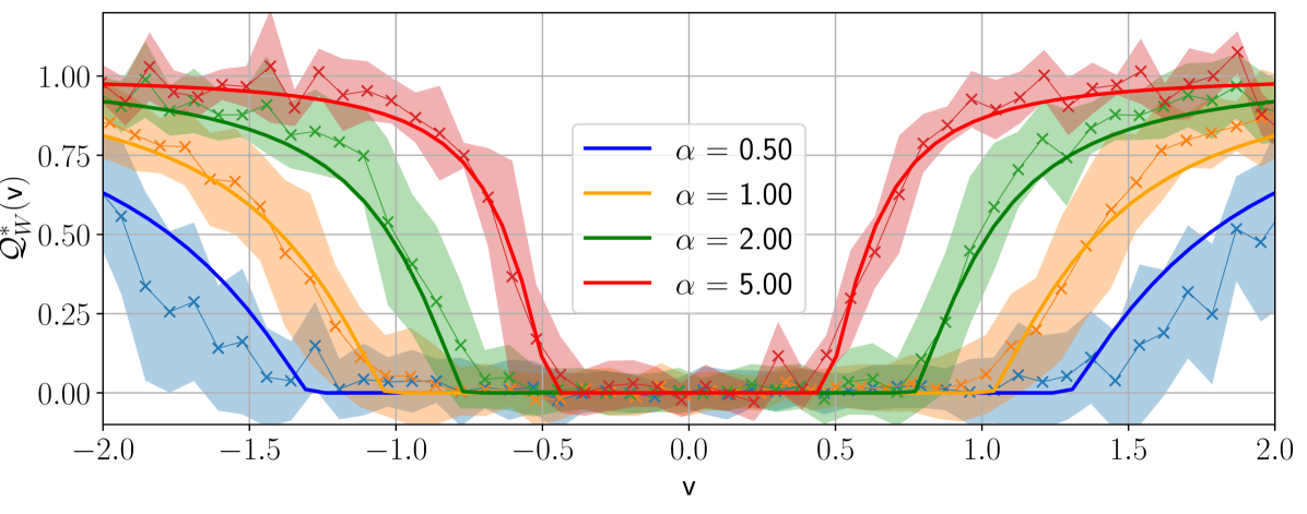
The image presents a line chart illustrating the relationship between Q*Mv(v) and v for different values of α (alpha). The chart displays multiple lines, each representing a specific α value, along with shaded regions indicating the uncertainty or standard deviation around each line.
### Components/Axes
* **X-axis:** Labeled "v", ranging from approximately -2.0 to 2.0 with increments of 0.5.
* **Y-axis:** Labeled "Q*Mv(v)", ranging from approximately 0.0 to 1.0 with increments of 0.25.
* **Legend:** Located in the top-right corner, listing the following lines and their corresponding α values:
* α = 0.50 (Blue)
* α = 1.00 (Orange)
* α = 2.00 (Green)
* α = 5.00 (Red)
* **Data Series:** Four lines, each representing a different α value, with shaded areas around them. The lines are marked with 'x' symbols.
### Detailed Analysis
Let's analyze each line individually, noting the trends and approximate data points.
* **α = 0.50 (Blue):** This line exhibits a sinusoidal pattern. It starts at approximately Q*Mv(v) = 0.3 at v = -2.0, reaches a maximum of approximately Q*Mv(v) = 0.6 at v = -0.5, dips to a minimum of approximately Q*Mv(v) = 0.05 at v = 0.5, and returns to approximately Q*Mv(v) = 0.3 at v = 2.0. The shaded region around this line indicates significant variability.
* **α = 1.00 (Orange):** This line also shows a sinusoidal pattern, but with a different amplitude and phase. It starts at approximately Q*Mv(v) = 0.2 at v = -2.0, reaches a maximum of approximately Q*Mv(v) = 0.8 at v = 0.0, and returns to approximately Q*Mv(v) = 0.2 at v = 2.0. The shaded region is smaller than that of α = 0.50, suggesting less variability.
* **α = 2.00 (Green):** This line displays a more pronounced sinusoidal pattern. It starts at approximately Q*Mv(v) = 0.1 at v = -2.0, reaches a maximum of approximately Q*Mv(v) = 0.95 at v = 0.0, and returns to approximately Q*Mv(v) = 0.1 at v = 2.0. The shaded region is relatively small.
* **α = 5.00 (Red):** This line exhibits a very different behavior. It starts at approximately Q*Mv(v) = 0.95 at v = -2.0, decreases to approximately Q*Mv(v) = 0.2 at v = 0.0, and increases to approximately Q*Mv(v) = 0.95 at v = 2.0. The shaded region is moderate in size.
### Key Observations
* The lines for α = 0.50, 1.00, and 2.00 all exhibit sinusoidal behavior, with varying amplitudes and phases.
* The line for α = 5.00 shows a different trend, decreasing and then increasing, rather than oscillating.
* The variability (as indicated by the shaded regions) is highest for α = 0.50 and relatively lower for α = 1.00 and 2.00.
* All lines converge towards Q*Mv(v) = 1.0 at the extreme left and right ends of the chart.
### Interpretation
The chart demonstrates how the relationship between Q*Mv(v) and v changes as the parameter α varies. For lower values of α (0.50, 1.00, 2.00), the relationship appears to be oscillatory, suggesting a periodic behavior. As α increases to 5.00, the relationship becomes non-oscillatory, indicating a shift in the underlying dynamics. The shaded regions represent the uncertainty in the data, which is most significant for α = 0.50, suggesting that the relationship is less predictable for this value of α.
The convergence of all lines towards Q*Mv(v) = 1.0 at the extremes of the v-axis suggests a common behavior under certain conditions, regardless of the α value. The chart could be representing a model or simulation where α controls a specific parameter influencing the system's behavior. The differences in the lines suggest that the system's response is sensitive to changes in α. The data suggests that the system's behavior transitions from oscillatory to non-oscillatory as α increases.