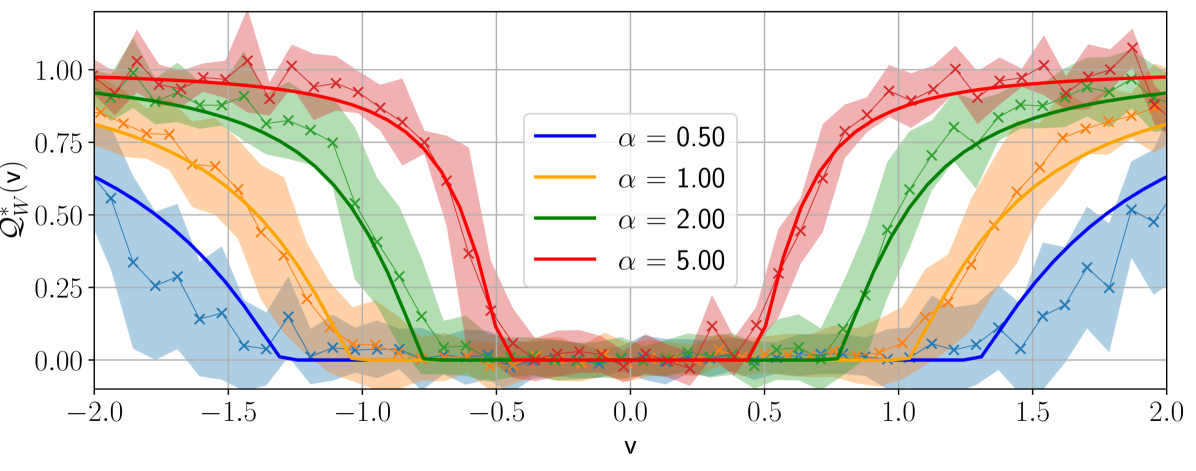
## Line Chart: Q*_M(v) vs. v for Different α Values
### Overview
The image is a line graph with four data series (blue, orange, green, red) and corresponding error bands (shaded regions). It plots \( Q^*_M(v) \) (y-axis) against \( v \) (x-axis) for four values of the parameter \( \alpha \) (alpha). The graph is symmetric around \( v = 0 \), with error bands indicating variability in \( Q^*_M(v) \).
### Components/Axes
- **X-axis**: Labeled \( \boldsymbol{v} \), with ticks at \( -2.0, -1.5, -1.0, -0.5, 0.0, 0.5, 1.0, 1.5, 2.0 \).
- **Y-axis**: Labeled \( \boldsymbol{Q^*_M(v)} \), with ticks at \( 0.00, 0.25, 0.50, 0.75, 1.00 \).
- **Legend**: Positioned in the center (middle of the graph), with four entries:
- Blue line: \( \alpha = 0.50 \)
- Orange line: \( \alpha = 1.00 \)
- Green line: \( \alpha = 2.00 \)
- Red line: \( \alpha = 5.00 \)
- **Data Series**: Each series has a solid line (trend) and a shaded error band (same color as the line) with cross markers (\( \boldsymbol{\times} \)) for data points.
### Detailed Analysis
We analyze each series by color and \( \alpha \):
#### 1. Blue (\( \alpha = 0.50 \))
- **Trend**: At \( v = -2.0 \), \( Q^*_M(v) \approx 0.6 \). It drops to near \( 0 \) by \( v = -1.0 \), stays near \( 0 \) until \( v = 0.0 \), then increases to \( \approx 0.6 \) at \( v = 2.0 \).
- **Error Band**: Shaded blue, wider at \( v = \pm 2.0 \) (extremes) and narrower in the middle (\( v = -1.0 \) to \( 0.0 \)).
- **Data Points**: Cross markers follow the line, with spread matching the error band.
#### 2. Orange (\( \alpha = 1.00 \))
- **Trend**: At \( v = -2.0 \), \( Q^*_M(v) \approx 0.8 \). Drops to near \( 0 \) by \( v = -1.0 \), stays near \( 0 \) until \( v = 0.0 \), then increases to \( \approx 0.8 \) at \( v = 2.0 \).
- **Error Band**: Shaded orange, wider at \( v = \pm 2.0 \), narrower in the middle.
- **Data Points**: Cross markers follow the line, with error band showing variability.
#### 3. Green (\( \alpha = 2.00 \))
- **Trend**: At \( v = -2.0 \), \( Q^*_M(v) \approx 0.9 \). Drops to near \( 0 \) by \( v = -1.0 \), stays near \( 0 \) until \( v = 0.0 \), then increases to \( \approx 0.9 \) at \( v = 2.0 \).
- **Error Band**: Shaded green, wider at \( v = \pm 2.0 \), narrower in the middle.
- **Data Points**: Cross markers follow the line, with error band.
#### 4. Red (\( \alpha = 5.00 \))
- **Trend**: At \( v = -2.0 \), \( Q^*_M(v) \approx 1.0 \). Drops to near \( 0 \) by \( v = -0.5 \), stays near \( 0 \) until \( v = 0.5 \), then increases to \( \approx 1.0 \) at \( v = 2.0 \).
- **Error Band**: Shaded red, wider at \( v = \pm 2.0 \), narrower in the middle.
- **Data Points**: Cross markers follow the line, with error band.
### Key Observations
- **Symmetry**: All series are symmetric around \( v = 0 \) (even function).
- **\( \alpha \) Effect**: As \( \alpha \) increases (0.50 → 5.00):
- Initial \( Q^*_M(v) \) at \( v = \pm 2.0 \) increases (blue ≈ 0.6, orange ≈ 0.8, green ≈ 0.9, red ≈ 1.0).
- The transition from high to low \( Q^*_M(v) \) occurs closer to \( v = 0 \) (red drops at \( v \approx -0.5 \), others at \( v \approx -1.0 \)).
- **Error Bands**: Wider at \( v = \pm 2.0 \) (extremes), narrower in the middle (\( v = -1.0 \) to \( 0.0 \)), indicating more variability at the ends of the \( v \)-range.
### Interpretation
The graph likely models a symmetric function \( Q^*_M(v) \) (e.g., a physical or mathematical response) dependent on \( \alpha \).
- **\( \alpha \) as a Control Parameter**: Higher \( \alpha \) amplifies \( Q^*_M(v) \) at the extremes (\( v = \pm 2.0 \)) and sharpens the transition near \( v = 0 \). This suggests \( \alpha \) scales the function’s “strength” or “peak.”
- **Error Bands**: Wider bands at \( v = \pm 2.0 \) imply greater uncertainty in \( Q^*_M(v) \) when \( v \) is far from 0 (e.g., fewer data points or higher variability).
- **Practical Context**: If \( v \) is a physical quantity (e.g., velocity, voltage) and \( \alpha \) a model parameter, the graph shows how \( \alpha \) tunes the response \( Q^*_M(v) \). Higher \( \alpha \) produces a more pronounced response at the extremes and a sharper transition near \( v = 0 \).
This description captures all visible elements, trends, and interpretive insights, enabling reconstruction of the graph’s information without the image.