## Line Chart: Relationship Between v and Q*_W(v) for Different α Values
### Overview
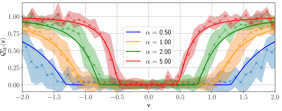
The chart illustrates the relationship between the variable **v** (horizontal axis) and the optimal value **Q*_W(v)** (vertical axis) across four distinct α (alpha) values: 0.50, 1.00, 2.00, and 5.00. Each α value is represented by a colored line with a shaded confidence interval. The graph exhibits symmetry around **v = 0**, with all lines forming U-shaped curves.
---
### Components/Axes
- **X-axis (v)**: Ranges from **-2.0** to **2.0** in increments of **0.5**.
- **Y-axis (Q*_W(v))**: Ranges from **0.00** to **1.00** in increments of **0.25**.
- **Legend**: Positioned on the **right side**, with colors mapped to α values:
- **Blue**: α = 0.50
- **Orange**: α = 1.00
- **Green**: α = 2.00
- **Red**: α = 5.00
- **Shaded Regions**: Surround each line, likely representing confidence intervals or uncertainty bounds.
---
### Detailed Analysis
1. **α = 0.50 (Blue Line)**:
- Starts at **Q*_W(v) ≈ 0.5** when **v = -2.0**.
- Decreases to **Q*_W(v) ≈ 0.0** at **v = 0**.
- Increases back to **Q*_W(v) ≈ 0.5** at **v = 2.0**.
- Shaded region is narrowest, indicating low uncertainty.
2. **α = 1.00 (Orange Line)**:
- Starts at **Q*_W(v) ≈ 0.25** when **v = -2.0**.
- Peaks at **Q*_W(v) ≈ 0.75** near **v = 0**.
- Drops back to **Q*_W(v) ≈ 0.25** at **v = 2.0**.
- Shaded region is wider than α = 0.50.
3. **α = 2.00 (Green Line)**:
- Starts at **Q*_W(v) ≈ 0.75** when **v = -2.0**.
- Peaks at **Q*_W(v) ≈ 0.95** near **v = 0**.
- Decreases to **Q*_W(v) ≈ 0.75** at **v = 2.0**.
- Shaded region is wider than α = 1.00.
4. **α = 5.00 (Red Line)**:
- Starts at **Q*_W(v) ≈ 0.9** when **v = -2.0**.
- Peaks at **Q*_W(v) ≈ 1.0** near **v = 0**.
- Drops back to **Q*_W(v) ≈ 0.9** at **v = 2.0**.
- Shaded region is widest, indicating high uncertainty.
---
### Key Observations
- **Symmetry**: All lines are symmetric around **v = 0**, suggesting a mirrored relationship between **v** and **Q*_W(v)**.
- **Peak at v = 0**: Higher α values correlate with higher peaks at **v = 0** (e.g., α = 5.00 reaches **Q*_W(v) = 1.0**).
- **Uncertainty**: Shaded regions widen as α increases, implying greater variability or confidence intervals for larger α.
- **Crossing Lines**: Lines for α = 1.00 and α = 2.00 intersect near **v = 0**, indicating overlapping optimal values.
---
### Interpretation
The chart demonstrates that **Q*_W(v)** is highly sensitive to **v** and **α**:
- **α** acts as a scaling factor: Larger α values amplify the peak at **v = 0** but reduce the curve’s sensitivity to deviations from **v = 0**.
- The **U-shaped curves** suggest a trade-off between **v** and **Q*_W(v)**, where extreme values of **v** diminish the optimal outcome.
- The widening shaded regions for higher α values may reflect increased uncertainty in estimating **Q*_W(v)** under extreme α conditions.
This relationship could model phenomena such as risk-return trade-offs, optimization under uncertainty, or parameter sensitivity in dynamic systems. The symmetry implies that the system’s behavior is invariant to the direction of **v** (e.g., positive/negative deviations from zero).