\n
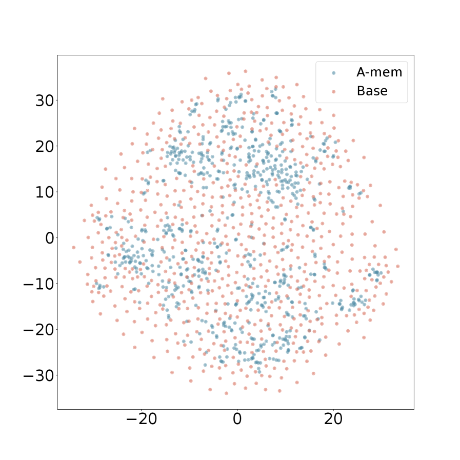
## Scatter Plot: A-mem vs. Base
### Overview
The image presents a scatter plot comparing two datasets, labeled "A-mem" and "Base". The plot displays the distribution of data points across a two-dimensional space, with values ranging approximately from -30 to 30 on both the x and y axes. The data appears to be somewhat clustered, but with significant overlap between the two datasets.
### Components/Axes
* **X-axis:** Ranges from approximately -25 to 25. No explicit label is provided.
* **Y-axis:** Ranges from approximately -35 to 35. No explicit label is provided.
* **Legend:** Located in the top-right corner.
* "A-mem" - Represented by blue dots.
* "Base" - Represented by orange/red dots.
### Detailed Analysis
The plot shows a distribution of points for both "A-mem" and "Base". Due to the density of points, precise numerical values are difficult to extract without the underlying data. However, we can describe the general distribution and approximate values.
**A-mem (Blue Dots):**
The A-mem data appears to be concentrated in a band roughly centered around the y-axis, with a higher density of points between y = 5 and y = 25. There's a noticeable concentration of points around x = 0. The distribution is roughly elliptical, elongated vertically.
* Approximate range of x-values: -20 to 20.
* Approximate range of y-values: -10 to 30.
**Base (Orange/Red Dots):**
The Base data is more evenly distributed across the entire plot area, with a slight tendency towards lower y-values. There is a concentration of points around x = 0.
* Approximate range of x-values: -25 to 25.
* Approximate range of y-values: -30 to 20.
There is significant overlap between the two datasets, particularly in the region where x is close to 0. The Base data appears to have a wider spread in both the x and y directions compared to the A-mem data.
### Key Observations
* The A-mem data is more concentrated and less dispersed than the Base data.
* Both datasets exhibit a roughly symmetrical distribution around the y-axis.
* There is substantial overlap between the two datasets, making it difficult to visually separate them.
* The Base data has a greater presence in the negative y-value region.
### Interpretation
The scatter plot suggests that while there is some difference between the "A-mem" and "Base" datasets, there is also considerable similarity. The concentration of A-mem data in the positive y-value region could indicate a tendency for higher values in that dataset. The wider spread of the Base data suggests greater variability. The overlap implies that the two datasets are not entirely independent and share some common characteristics. Without knowing what the x and y axes represent, it's difficult to draw more specific conclusions. The plot could be visualizing the relationship between two variables for two different conditions or groups ("A-mem" and "Base"). Further analysis, including statistical tests, would be needed to determine if the observed differences are statistically significant.