## Scatter Plot: Comparison of "A-mem" and "Base" Distributions
### Overview
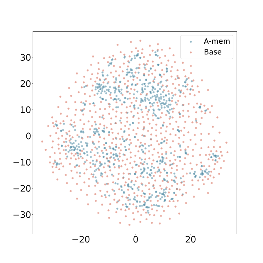
The image is a 2D scatter plot displaying two distinct data series, labeled "A-mem" and "Base," plotted on a Cartesian coordinate system. The data points form a dense, roughly circular cloud centered at the origin (0,0). The plot lacks a main title and axis labels, which limits the contextual interpretation of the data.
### Components/Axes
* **Legend:** Located in the top-right corner of the plot area. It contains two entries:
* A light blue dot labeled **"A-mem"**.
* A light pink dot labeled **"Base"**.
* **X-Axis:** Horizontal axis with numerical markers. The visible major tick marks are at **-20, 0, and 20**. The axis extends approximately from -30 to +30. **No axis title or label is present.**
* **Y-Axis:** Vertical axis with numerical markers. The visible major tick marks are at **-30, -20, -10, 0, 10, 20, and 30**. The axis extends approximately from -35 to +35. **No axis title or label is present.**
* **Data Points:** Hundreds of individual points for each series, plotted as small, solid circles.
### Detailed Analysis
* **Spatial Distribution & Trend:** Both data series ("A-mem" and "Base") are distributed in a broad, roughly circular cluster centered around the coordinate (0,0). There is no clear linear or directional trend; the overall pattern is a diffuse cloud.
* **Series Comparison:**
* **"A-mem" (Light Blue):** These points are densely concentrated in the central region of the plot, particularly within the approximate range of -15 to +15 on both axes. The density appears highest near the origin.
* **"Base" (Light Pink):** These points are more widely dispersed. While they also populate the central region, they extend further towards the periphery of the circular cluster, especially noticeable in the outer regions beyond ±20 on the axes.
* **Overlap:** There is significant spatial overlap between the two series throughout the central area of the plot. No distinct, separate clusters for each series are visible.
### Key Observations
1. **Missing Critical Metadata:** The complete absence of axis titles and a chart title is a major omission for a technical document, rendering the quantitative meaning of the coordinates unknown.
2. **Central vs. Peripheral Spread:** The most notable visual pattern is the difference in dispersion. The "A-mem" series exhibits a tighter, more centrally concentrated distribution, while the "Base" series shows a broader, more scattered distribution.
3. **Circular Symmetry:** The overall shape of the combined data cloud is approximately circular and symmetric about the origin, suggesting the underlying data may be normalized or centered.
4. **High Density:** The plot contains a large number of data points for both series, indicating a substantial dataset.
### Interpretation
This scatter plot visually compares the distribution of two datasets or model outputs ("A-mem" and "Base") in a two-dimensional space. The key insight is the difference in variance or spread between the two.
* **What the data suggests:** The "A-mem" data points are more tightly clustered around the central mean (0,0), indicating lower variance or a more focused representation. The "Base" data points have higher variance, spreading out more widely from the center. This could imply that the "A-mem" method or model produces more consistent, less dispersed results compared to the "Base" method.
* **Relationship between elements:** The significant overlap in the central region suggests that for a large portion of the data, the two series produce similar or indistinguishable values in this 2D projection. The differentiation occurs primarily at the tails of the distribution.
* **Notable Anomalies:** The primary anomaly is the lack of axis labels, which is a critical flaw for data communication. Without knowing what the X and Y axes represent (e.g., principal components, latent dimensions, error metrics), the practical significance of the spread and clustering cannot be determined. The plot effectively shows *that* there is a difference in distribution shape but not *what* that difference means in a real-world context.
* **Peircean Investigative Reading:** The sign (the plot) indicates a comparison. The icon (the visual spread) resembles a difference in consistency. The interpretant (the likely conclusion for a viewer) is that "A-mem" is more precise or stable than "Base," but this conclusion is tentative due to the missing symbolic information (axis labels). The plot successfully communicates a relative difference but fails to communicate absolute meaning.