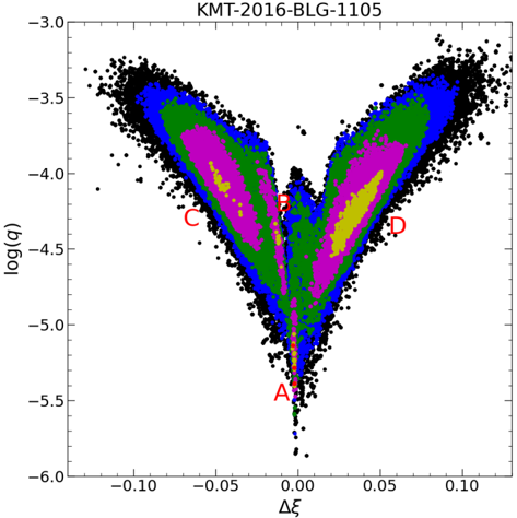
## Scatter Plot: KMT-2016-BLG-1105
### Overview
The image is a scatter plot displaying data points in a distribution resembling a butterfly or an hourglass shape. The plot visualizes the relationship between two variables: log(q) on the y-axis and Δξ on the x-axis. The data points are clustered and colored in distinct regions, with black points forming the outer boundary and inner regions colored in blue, green, magenta, and gold. The plot also contains four red labels: A, B, C, and D.
### Components/Axes
* **Title:** KMT-2016-BLG-1105
* **X-axis:** Δξ (Delta xi)
* Scale ranges from -0.10 to 0.10, with tick marks at -0.10, -0.05, 0.00, 0.05, and 0.10.
* **Y-axis:** log(q)
* Scale ranges from -6.0 to -3.0, with tick marks at -6.0, -5.5, -5.0, -4.5, -4.0, -3.5, and -3.0.
* **Data Points:** The data points are colored in black, blue, green, magenta, and gold, forming distinct regions.
* **Labels:** Red labels A, B, C, and D are placed at specific locations on the plot.
* A is located near (0.00, -5.6).
* B is located near (0.00, -4.1).
* C is located near (-0.07, -4.3).
* D is located near (0.07, -4.3).
### Detailed Analysis or Content Details
* **Black Data Points:** These points form the outermost layer of the distribution, creating the overall butterfly/hourglass shape. They are most dense at the top (around log(q) = -3.2) and taper towards the bottom (around log(q) = -5.5).
* **Blue Data Points:** These points are clustered inside the black points, forming a similar but smaller butterfly/hourglass shape.
* **Green Data Points:** These points are clustered inside the blue points, forming a similar but smaller butterfly/hourglass shape.
* **Magenta Data Points:** These points are clustered inside the green points, forming a similar but smaller butterfly/hourglass shape.
* **Gold Data Points:** These points are clustered inside the magenta points, forming a similar but smaller butterfly/hourglass shape.
* **Point A:** Located at approximately (0.00, -5.6). This point is at the bottom of the distribution, where the butterfly/hourglass shape narrows.
* **Point B:** Located at approximately (0.00, -4.1). This point is at the "neck" of the butterfly/hourglass shape, where the distribution narrows again.
* **Point C:** Located at approximately (-0.07, -4.3). This point is on the left side of the distribution, within the magenta region.
* **Point D:** Located at approximately (0.07, -4.3). This point is on the right side of the distribution, within the magenta region.
### Key Observations
* The data points are highly concentrated in the central region of the plot.
* The distribution is roughly symmetrical about the y-axis (Δξ = 0).
* The different colored regions (black, blue, green, magenta, gold) suggest different levels or categories within the data.
* The labels A, B, C, and D mark specific locations of interest within the distribution.
### Interpretation
The scatter plot likely represents the results of a scientific experiment or simulation. The x and y axes represent two different parameters, and the clustering of data points suggests correlations between these parameters. The different colored regions could represent different experimental conditions, simulation parameters, or data categories. The labels A, B, C, and D likely highlight specific data points or regions of interest that warrant further investigation. The butterfly/hourglass shape suggests a complex relationship between the two variables, possibly involving a threshold effect or a non-linear interaction. The symmetry of the plot suggests that the underlying process is also symmetrical.