## Line Chart: Model Score vs. Model Number
### Overview
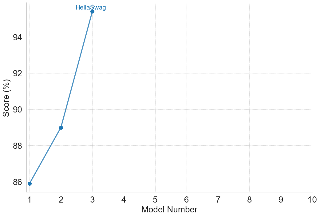
The image is a line chart showing the relationship between "Model Number" on the x-axis and "Score (%)" on the y-axis. The chart displays the performance of different models, with a single data series labeled "HellaSwag". The score increases as the model number increases from 1 to 3.
### Components/Axes
* **X-axis:** "Model Number", with tick marks at integers from 1 to 10.
* **Y-axis:** "Score (%)", with tick marks at 86, 88, 90, 92, and 94.
* **Data Series:** "HellaSwag" (blue line with circular markers).
### Detailed Analysis
The "HellaSwag" data series consists of three data points:
* Model Number 1: Score is approximately 86%.
* Model Number 2: Score is approximately 89%.
* Model Number 3: Score is approximately 95%.
The line slopes sharply upward from Model Number 1 to Model Number 3.
### Key Observations
* The "HellaSwag" model shows a significant increase in score from Model Number 1 to Model Number 3.
* There is no data available for Model Numbers 4 through 10.
### Interpretation
The chart suggests that the "HellaSwag" model's performance improves as the model number increases, at least up to Model Number 3. The absence of data for higher model numbers prevents a complete assessment of the model's performance trend. The rapid increase in score between Model Numbers 1 and 3 indicates a potentially significant improvement in the model's capabilities with each iteration. It is important to note that the data is limited to only three model numbers, so any conclusions about the overall trend should be made with caution.