\n
## Line Chart: Model Score vs. Model Number
### Overview
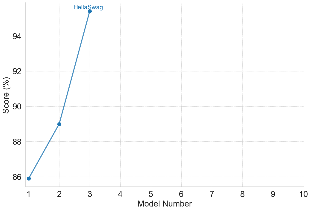
The image presents a line chart illustrating the relationship between Model Number and Score (expressed as a percentage). The chart displays a clear upward trend, with a significant jump in score between Model 2 and Model 3. A single data point is labeled "HellaSwag".
### Components/Axes
* **X-axis:** Labeled "Model Number", ranging from 1 to 10 with integer increments.
* **Y-axis:** Labeled "Score (%)", ranging from 86 to 95 with increments of 2.
* **Data Series:** A single blue line representing the score for each model number.
* **Annotation:** A text label "HellaSwag" positioned near the data point for Model 3.
### Detailed Analysis
The line begins at approximately 86% for Model 1. It rises steadily to approximately 89% for Model 2. There is a substantial increase in score between Model 2 and Model 3, reaching approximately 95% for Model 3, which is labeled "HellaSwag". The line remains flat at approximately 95% from Model 3 to Model 10.
Here's a breakdown of the approximate data points:
* Model 1: 86%
* Model 2: 89%
* Model 3: 95% (labeled "HellaSwag")
* Model 4-10: 95%
The line slopes upward from Model 1 to Model 3, then becomes horizontal from Model 3 to Model 10.
### Key Observations
* The most significant improvement in score occurs between Model 2 and Model 3.
* The score plateaus at 95% starting from Model 3.
* The "HellaSwag" label is associated with the highest score achieved.
### Interpretation
The chart suggests that the model's performance improves rapidly up to Model 3, after which further model iterations do not yield any additional score improvement. The "HellaSwag" label likely indicates a specific model version or configuration that achieves peak performance. The plateauing of the score after Model 3 could indicate that the model has reached its maximum potential with the current architecture or training data, or that the metric used to measure performance is no longer sensitive to further improvements. The rapid increase between Model 2 and 3 suggests a critical change or optimization was implemented at that stage. It is important to note that the chart only shows the score and does not provide information about the resources or complexity of each model.