TECHNICAL ASSET FINGERPRINT
47d37dba4e938e81e3a8268f
Click to view fullscreen
Press ESC or click to close
FOUND IN PAPERS
EXPERT: gemini-2.0-flash VERSION 1
RUNTIME: nugit/gemini/gemini-2.0-flash
INTEL_VERIFIED
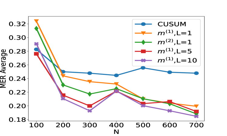
## Line Chart: MER Average vs N
### Overview
The image is a line chart comparing the MER (Match Error Rate) Average for different methods (CUSUM and m) with varying parameters (L) as a function of N. The chart displays five different data series, each represented by a distinct color and marker. The x-axis represents N, and the y-axis represents the MER Average.
### Components/Axes
* **Title:** There is no explicit title on the chart.
* **X-axis:**
* Label: "N"
* Scale: 100 to 700, with markers at 100, 200, 300, 400, 500, 600, and 700.
* **Y-axis:**
* Label: "MER Average"
* Scale: 0.18 to 0.32, with markers at 0.18, 0.20, 0.22, 0.24, 0.26, 0.28, 0.30, and 0.32.
* **Legend:** Located in the top-right corner of the chart.
* Blue: CUSUM
* Orange: m^(1), L=1
* Green: m^(2), L=1
* Red: m^(1), L=5
* Purple: m^(1), L=10
### Detailed Analysis
* **CUSUM (Blue, circle marker):** The line starts at approximately 0.29 at N=100, decreases to around 0.25 at N=200, remains relatively stable around 0.25 until N=500, then slightly increases to approximately 0.26 at N=500, and finally decreases to around 0.25 at N=700.
* **m^(1), L=1 (Orange, triangle marker):** The line starts at approximately 0.32 at N=100, decreases to around 0.25 at N=200, then decreases further to approximately 0.24 at N=300, remains relatively stable around 0.23 until N=500, and finally decreases to around 0.20 at N=700.
* **m^(2), L=1 (Green, diamond marker):** The line starts at approximately 0.31 at N=100, decreases to around 0.24 at N=200, then decreases further to approximately 0.22 at N=300, increases to approximately 0.23 at N=400, and finally decreases to around 0.19 at N=700.
* **m^(1), L=5 (Red, square marker):** The line starts at approximately 0.28 at N=100, decreases to around 0.21 at N=200, then decreases further to approximately 0.20 at N=300, increases to approximately 0.23 at N=400, and finally decreases to around 0.19 at N=700.
* **m^(1), L=10 (Purple, x marker):** The line starts at approximately 0.29 at N=100, decreases to around 0.21 at N=200, then decreases further to approximately 0.19 at N=300, increases to approximately 0.23 at N=400, and finally decreases to around 0.18 at N=700.
### Key Observations
* All methods show a decrease in MER Average as N increases from 100 to 200.
* The CUSUM method has the most stable MER Average across the range of N values.
* The m^(1), L=10 method generally has the lowest MER Average for N greater than 300.
* The m^(1), L=5 and m^(1), L=10 methods exhibit a similar trend, with a slight increase in MER Average around N=400.
### Interpretation
The chart compares the performance of different methods for reducing the Match Error Rate (MER) as the parameter N changes. The CUSUM method appears to be more stable, while the m methods, particularly m^(1) with L=10, tend to achieve lower MER averages at higher N values. The slight increase in MER Average for m^(1) methods around N=400 might indicate a specific characteristic or limitation of these methods in that range. Overall, the data suggests that the choice of method and parameters (L) can significantly impact the MER Average, and the optimal choice may depend on the specific value of N.
DECODING INTELLIGENCE...
EXPERT: gemini-2.5-flash-lite-free VERSION 1
RUNTIME: google-free/gemini-2.5-flash-lite
INTEL_VERIFIED
## Line Chart: MER Average vs. N for Different Methods
### Overview
This image displays a line chart that plots the "MER Average" on the y-axis against "N" on the x-axis. Five different data series, representing various methods, are shown, each with a distinct color and marker. The chart illustrates how the MER Average changes with increasing values of N for each method.
### Components/Axes
* **Y-axis Label**: MER Average
* **Scale**: Ranges from 0.18 to 0.32, with major ticks at 0.18, 0.20, 0.22, 0.24, 0.26, 0.28, 0.30, and 0.32.
* **X-axis Label**: N
* **Scale**: Ranges from 100 to 700, with major ticks at 100, 200, 300, 400, 500, 600, and 700.
* **Legend**: Located in the top-right quadrant of the chart. It associates colors and markers with specific data series:
* **Blue line with circles**: CUSUM
* **Orange line with triangles**: $m^{(1)}, L=1$
* **Green line with diamonds**: $m^{(2)}, L=1$
* **Red line with squares**: $m^{(1)}, L=5$
* **Purple line with crosses**: $m^{(1)}, L=10$
### Detailed Analysis
**Data Series Trends and Points:**
1. **CUSUM (Blue line with circles)**:
* **Trend**: The CUSUM line generally shows a slight decrease from N=100 to N=400, then a slight increase from N=400 to N=500, followed by a slight decrease from N=500 to N=700.
* **Approximate Data Points**:
* N=100: 0.285
* N=200: 0.250
* N=300: 0.245
* N=400: 0.248
* N=500: 0.255
* N=600: 0.250
* N=700: 0.248
2. **$m^{(1)}, L=1$ (Orange line with triangles)**:
* **Trend**: This series starts at its highest point at N=100 and shows a consistent downward trend as N increases, with a slight upward fluctuation around N=400.
* **Approximate Data Points**:
* N=100: 0.322
* N=200: 0.250
* N=300: 0.235
* N=400: 0.230
* N=500: 0.215
* N=600: 0.205
* N=700: 0.198
3. **$m^{(2)}, L=1$ (Green line with diamonds)**:
* **Trend**: This series shows a sharp decrease from N=100 to N=200, then a gradual decrease until N=300, followed by an increase at N=400, and then a consistent decrease from N=400 to N=700.
* **Approximate Data Points**:
* N=100: 0.315
* N=200: 0.230
* N=300: 0.218
* N=400: 0.225
* N=500: 0.208
* N=600: 0.200
* N=700: 0.190
4. **$m^{(1)}, L=5$ (Red line with squares)**:
* **Trend**: This series exhibits a downward trend from N=100 to N=300, a sharp increase at N=400, and then a general downward trend from N=400 to N=700.
* **Approximate Data Points**:
* N=100: 0.278
* N=200: 0.215
* N=300: 0.198
* N=400: 0.225
* N=500: 0.205
* N=600: 0.200
* N=700: 0.195
5. **$m^{(1)}, L=10$ (Purple line with crosses)**:
* **Trend**: This series shows a steep decline from N=100 to N=300, followed by an increase at N=400, and then a consistent downward trend from N=400 to N=700.
* **Approximate Data Points**:
* N=100: 0.285
* N=200: 0.215
* N=300: 0.195
* N=400: 0.228
* N=500: 0.202
* N=600: 0.195
* N=700: 0.188
### Key Observations
* **General Trend**: Most of the methods show a general decrease in MER Average as N increases, particularly from N=100 to N=300.
* **Peak at N=100**: The highest MER Average values are observed at N=100 for all methods, with $m^{(1)}, L=1$ having the highest value (approx. 0.322).
* **N=400 Anomaly**: There is a noticeable upward spike in MER Average for $m^{(2)}, L=1$, $m^{(1)}, L=5$, and $m^{(1)}, L=10$ at N=400. The CUSUM method shows a slight increase at this point as well.
* **Lowest MER Average**: The lowest MER Average values are generally observed at N=700, with $m^{(2)}, L=1$ reaching approximately 0.190 and $m^{(1)}, L=10$ reaching approximately 0.188.
* **Comparison of Methods**:
* The $m^{(1)}, L=1$ method generally exhibits higher MER Averages compared to other methods for larger values of N, although it starts with the highest value at N=100.
* The CUSUM method shows a more stable, albeit slightly fluctuating, MER Average across the range of N compared to the other methods, which exhibit more pronounced decreases and increases.
* The methods with $L=5$ and $L=10$ ($m^{(1)}, L=5$ and $m^{(1)}, L=10$) show similar trends, with $m^{(1)}, L=10$ generally having slightly lower MER Averages than $m^{(1)}, L=5$ for N > 300.
### Interpretation
The chart suggests that the "MER Average" is sensitive to the parameter "N" across all tested methods. The initial high MER Average at N=100 for all methods might indicate a period of higher uncertainty or variability when the sample size (N) is small. As N increases, most methods tend to stabilize or decrease their MER Average, implying improved performance or reduced error in estimating the MER.
The upward spike at N=400 for several methods is a significant observation. This could indicate a specific point where the underlying data distribution or the method's assumptions are challenged, leading to a temporary increase in error before it potentially stabilizes again at larger N. This anomaly warrants further investigation into the nature of the data or the method's behavior at this particular N value.
The CUSUM method appears to be the most robust or stable across the range of N, showing less dramatic fluctuations compared to the other methods. This could imply that CUSUM is less sensitive to changes in N or exhibits a more consistent performance.
The comparison between $m^{(1)}, L=5$ and $m^{(1)}, L=10$ suggests that increasing the parameter L (from 5 to 10) for the $m^{(1)}$ method generally leads to a lower MER Average for larger N, indicating potentially better performance or accuracy with a larger L value in this range. However, the initial values at N=100 are similar.
Overall, the data demonstrates a trade-off or relationship between the sample size (N) and the MER Average for different detection or estimation methods. The choice of method and its parameters (like L) can significantly influence the MER Average, and understanding these trends is crucial for selecting the most appropriate method for a given application and data size. The anomaly at N=400 is a key point of interest for deeper analysis.
DECODING INTELLIGENCE...
EXPERT: gemma-3-27b-it-free VERSION 1
RUNTIME: google-free/gemma-3-27b-it
INTEL_VERIFIED
## Line Chart: MER Average vs. N for Different Methods
### Overview
This image presents a line chart comparing the Mean Error Rate (MER) Average for several methods as a function of 'N'. The methods include CUSUM, and variations of m^(1) and m^(2) with different values of L (1, 5, and 10). The chart aims to demonstrate how the performance of each method changes with increasing 'N'.
### Components/Axes
* **X-axis:** Labeled "N", ranging from approximately 100 to 700, with tick marks at 100, 200, 300, 400, 500, 600, and 700.
* **Y-axis:** Labeled "MER Average", ranging from approximately 0.18 to 0.32, with tick marks at 0.18, 0.20, 0.22, 0.24, 0.26, 0.28, 0.30, and 0.32.
* **Legend:** Located in the top-right corner of the chart. It identifies the following data series:
* CUSUM (Blue)
* m^(1), L=1 (Orange)
* m^(2), L=1 (Green)
* m^(1), L=5 (Red)
* m^(1), L=10 (Purple)
### Detailed Analysis
Here's a breakdown of each line's trend and approximate data points:
* **CUSUM (Blue):** The line starts at approximately (100, 0.26), decreases slightly to around (200, 0.25), remains relatively stable between (200, 0.25) and (600, 0.25), and then increases slightly to approximately (700, 0.26).
* **m^(1), L=1 (Orange):** This line exhibits a strong downward trend from approximately (100, 0.32) to (200, 0.22). It then plateaus around (300, 0.23) and gradually decreases to approximately (700, 0.20).
* **m^(2), L=1 (Green):** This line also shows a significant decrease from approximately (100, 0.31) to (200, 0.22). It then fluctuates between approximately (200, 0.22) and (600, 0.22), and decreases slightly to approximately (700, 0.21).
* **m^(1), L=5 (Red):** This line starts at approximately (100, 0.28), decreases to around (200, 0.21), then increases to approximately (300, 0.23), and decreases again to approximately (700, 0.19).
* **m^(1), L=10 (Purple):** This line begins at approximately (100, 0.29), decreases steadily to approximately (700, 0.18). It shows the most consistent downward trend among all the methods.
### Key Observations
* The methods m^(1), L=1 and m^(2), L=1 start with the highest MER averages and show significant improvement as N increases.
* The CUSUM method maintains a relatively stable MER average across the range of N values.
* m^(1), L=10 consistently exhibits the lowest MER average, indicating the best performance across all N values.
* m^(1), L=5 shows some fluctuation in MER average, with a slight increase around N=300.
### Interpretation
The chart demonstrates the impact of different methods and parameter settings (L) on the Mean Error Rate (MER) as the sample size (N) increases. The consistent decrease in MER for m^(1), L=10 suggests that increasing the value of L improves the method's performance, likely by reducing sensitivity to noise or outliers. The stability of the CUSUM method indicates its robustness to changes in N. The initial high MER averages for m^(1), L=1 and m^(2), L=1 suggest that these methods may require larger sample sizes to achieve comparable performance to CUSUM or m^(1), L=10. The fluctuations observed in m^(1), L=5 could indicate a sensitivity to specific data patterns or a suboptimal parameter setting for certain N values. Overall, the data suggests that the choice of method and parameter tuning are crucial for achieving accurate results, and that increasing the value of L generally leads to improved performance.
DECODING INTELLIGENCE...
EXPERT: healer-alpha-free VERSION 1
RUNTIME: free/openrouter/healer-alpha
INTEL_VERIFIED
## Line Chart: Performance Comparison of Statistical Methods vs. Sample Size (N)
### Overview
The image displays a line chart comparing the performance of five different statistical methods or algorithms as a function of sample size (N). The performance metric is "MER Average," where lower values appear to indicate better performance. All methods show a general trend of decreasing MER Average as N increases, with the most significant improvement occurring between N=100 and N=200.
### Components/Axes
* **Chart Type:** Multi-series line chart with markers.
* **X-Axis:**
* **Label:** `N` (likely representing sample size or number of observations).
* **Scale:** Linear, with major tick marks at 100, 200, 300, 400, 500, 600, and 700.
* **Y-Axis:**
* **Label:** `MER Average` (likely an error or performance metric, e.g., Mean Error Rate).
* **Scale:** Linear, ranging from approximately 0.18 to 0.32, with major tick marks at intervals of 0.02.
* **Legend:** Positioned in the **top-right corner** of the plot area. It contains five entries, each associating a color, line style, and marker with a method name.
1. **Blue line with circle markers:** `CUSUM`
2. **Orange line with downward-pointing triangle markers:** `m^(1),L=1`
3. **Green line with diamond markers:** `m^(2),L=1`
4. **Red line with square markers:** `m^(1),L=5`
5. **Purple line with 'x' (cross) markers:** `m^(1),L=10`
### Detailed Analysis
The following data points are approximate, read from the chart's visual position.
**Trend Verification:** All five data series exhibit a clear downward trend from left to right, indicating that the MER Average decreases as N increases. The slope is steepest between N=100 and N=200 for all series.
**Data Series Points (Approximate MER Average vs. N):**
| N | CUSUM (Blue, ○) | m^(1),L=1 (Orange, ▽) | m^(2),L=1 (Green, ◇) | m^(1),L=5 (Red, □) | m^(1),L=10 (Purple, ×) |
| :-- | :-------------- | :-------------------- | :------------------- | :----------------- | :--------------------- |
| 100 | 0.280 | 0.325 | 0.315 | 0.275 | 0.290 |
| 200 | 0.250 | 0.245 | 0.230 | 0.215 | 0.210 |
| 300 | 0.248 | 0.235 | 0.218 | 0.200 | 0.192 |
| 400 | 0.245 | 0.232 | 0.225 | 0.220 | 0.220 |
| 500 | 0.255 | 0.210 | 0.210 | 0.202 | 0.200 |
| 600 | 0.250 | 0.205 | 0.202 | 0.205 | 0.192 |
| 700 | 0.248 | 0.200 | 0.188 | 0.190 | 0.185 |
**Component Isolation & Spatial Grounding:**
* **Header Region (Top):** Contains the legend in the top-right. The highest initial data point (N=100) belongs to the orange line (`m^(1),L=1`), positioned at the very top of the y-axis range.
* **Main Chart Region:** The five lines are densely clustered between N=200 and N=700. The blue line (`CUSUM`) remains the highest (worst performing) from N=300 onward, forming a relatively flat plateau. The purple (`m^(1),L=10`) and green (`m^(2),L=1`) lines compete for the lowest (best) position at N=700, with purple appearing marginally lower.
* **Footer Region (Bottom):** The x-axis labels are clearly positioned below their corresponding tick marks.
### Key Observations
1. **Universal Improvement with N:** All methods benefit from increased sample size, with the most dramatic gains occurring early (N=100 to 200).
2. **CUSUM Plateau:** The `CUSUM` method shows the least continued improvement after N=200, maintaining a nearly constant MER Average around 0.25.
3. **Impact of Parameter L:** For the `m^(1)` family of methods, increasing the parameter `L` from 1 to 5 to 10 generally leads to better (lower) MER Average at larger N (N≥500). The `m^(1),L=10` series achieves the lowest overall value at N=700.
4. **Performance Crossover:** At N=100, `m^(1),L=1` (orange) performs worst. By N=700, it is outperformed by all methods except `CUSUM`. The ranking of methods changes significantly across the x-axis.
5. **Anomaly at N=400:** Several series (`m^(2),L=1`, `m^(1),L=5`, `m^(1),L=10`) show a slight increase or plateau in MER Average at N=400 before resuming their downward trend. This could indicate a specific characteristic of the data or algorithm at that sample size.
### Interpretation
This chart likely evaluates change-point detection algorithms or sequential analysis methods, where `CUSUM` (Cumulative Sum) is a classic benchmark. The `m^(k),L` notation suggests variants of a proposed method with different model orders (`k=1,2`) and a lookback or window parameter (`L`).
The data suggests that the proposed methods (`m^(k),L`) generally outperform the standard `CUSUM` as the sample size grows, especially when configured with a larger `L` parameter. The `m^(1),L=10` configuration appears most effective for large N. The initial steep drop indicates that all methods require a minimum amount of data (around N=200) to stabilize their performance. The plateau of `CUSUM` implies it may have a fundamental performance limit that the other methods overcome with more data. The anomaly at N=400 warrants investigation—it could be a chart artifact, or it might reveal a point where the methods' assumptions are temporarily less valid for the underlying data generating process. Overall, the chart makes a case for the superiority of the `m^(k),L` methods in scenarios where large sample sizes are available.
DECODING INTELLIGENCE...
EXPERT: nemotron-free VERSION 1
RUNTIME: free/nvidia/nemotron-nano-12b-v2-vl:free
INTEL_VERIFIED
# Technical Document Analysis of Chart
## 1. Labels, Axis Titles, Legends, and Axis Markers
- **X-Axis Label**: `N` (ranging from 100 to 700 in increments of 100).
- **Y-Axis Label**: `MER Average` (ranging from 0.18 to 0.32 in increments of 0.02).
- **Legend Entries**:
- `CUSUM` (blue circles).
- `m^(1),L=1` (orange triangles).
- `m^(2),L=1` (green diamonds).
- `m^(1),L=5` (red squares).
- `m^(1),L=10` (purple crosses).
## 2. Categories and Sub-Categories
- **Categories**:
- `CUSUM`
- `m^(1),L=1`
- `m^(2),L=1`
- `m^(1),L=5`
- `m^(1),L=10`
- **Sub-Categories**:
- For `m^(1)` and `m^(2)` methods, `L` values (1, 5, 10) represent different model configurations.
## 3. Text Embedded in Diagram
- **Legend Text**:
- `CUSUM` (blue circle).
- `m^(1),L=1` (orange triangle).
- `m^(2),L=1` (green diamond).
- `m^(1),L=5` (red square).
- `m^(1),L=10` (purple cross).
## 4. Data Table (Not Applicable)
- No data table is present in the image.
## 5. Legend Color/Label Cross-Reference
- **Blue Circles**: Confirmed as `CUSUM`.
- **Orange Triangles**: Confirmed as `m^(1),L=1`.
- **Green Diamonds**: Confirmed as `m^(2),L=1`.
- **Red Squares**: Confirmed as `m^(1),L=5`.
- **Purple Crosses**: Confirmed as `m^(1),L=10`.
## 6. Spatial Grounding of Legend
- **Legend Placement**: Top-right corner of the chart.
## 7. Trend Verification and Data Points
### CUSUM (Blue Circles)
- **Trend**: Starts at ~0.28 (N=100), dips slightly, then remains relatively flat with minor fluctuations. Ends at ~0.245 (N=700).
- **Data Points**:
- N=100: 0.28
- N=200: 0.25
- N=300: 0.248
- N=400: 0.245
- N=500: 0.255
- N=600: 0.248
- N=700: 0.245
### m^(1),L=1 (Orange Triangles)
- **Trend**: Starts at ~0.325 (N=100), drops sharply to ~0.24 (N=200), then gradually decreases to ~0.20 (N=700).
- **Data Points**:
- N=100: 0.325
- N=200: 0.24
- N=300: 0.235
- N=400: 0.23
- N=500: 0.215
- N=600: 0.205
- N=700: 0.20
### m^(2),L=1 (Green Diamonds)
- **Trend**: Starts at ~0.315 (N=100), drops to ~0.23 (N=200), fluctuates slightly, then trends downward to ~0.19 (N=700).
- **Data Points**:
- N=100: 0.315
- N=200: 0.23
- N=300: 0.22
- N=400: 0.225
- N=500: 0.21
- N=600: 0.205
- N=700: 0.19
### m^(1),L=5 (Red Squares)
- **Trend**: Starts at ~0.275 (N=100), drops to ~0.21 (N=200), fluctuates, then trends downward to ~0.195 (N=700).
- **Data Points**:
- N=100: 0.275
- N=200: 0.21
- N=300: 0.205
- N=400: 0.215
- N=500: 0.205
- N=600: 0.205
- N=700: 0.195
### m^(1),L=10 (Purple Crosses)
- **Trend**: Starts at ~0.29 (N=100), drops to ~0.21 (N=200), fluctuates, then trends downward to ~0.185 (N=700).
- **Data Points**:
- N=100: 0.29
- N=200: 0.21
- N=300: 0.195
- N=400: 0.215
- N=500: 0.205
- N=600: 0.195
- N=700: 0.185
## 8. Component Isolation
- **Header**: Chart title (not explicitly labeled but implied by context).
- **Main Chart**: Plot area with axes, data lines, and markers.
- **Footer**: Legend box in the top-right corner.
## 9. Key Observations
- **CUSUM** maintains the most stable MER Average across all N values.
- **m^(1),L=1** and **m^(2),L=1** show significant declines as N increases, with `m^(1),L=1` starting higher but declining more sharply.
- **m^(1),L=5** and **m^(1),L=10** exhibit similar trends but with less pronounced declines compared to `m^(1),L=1`.
## 10. Conclusion
The chart illustrates the performance of different statistical methods (CUSUM, m^(1),L=1, m^(2),L=1, m^(1),L=5, m^(1),L=10) in terms of MER Average as a function of sample size (N). CUSUM demonstrates the most consistent performance, while methods with higher `L` values (e.g., L=5, L=10) show improved stability at larger N.
DECODING INTELLIGENCE...