## Line Chart: MER Average vs. N for Different Methods
### Overview
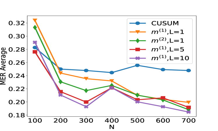
This image displays a line chart that plots the "MER Average" on the y-axis against "N" on the x-axis. Five different data series, representing various methods, are shown, each with a distinct color and marker. The chart illustrates how the MER Average changes with increasing values of N for each method.
### Components/Axes
* **Y-axis Label**: MER Average
* **Scale**: Ranges from 0.18 to 0.32, with major ticks at 0.18, 0.20, 0.22, 0.24, 0.26, 0.28, 0.30, and 0.32.
* **X-axis Label**: N
* **Scale**: Ranges from 100 to 700, with major ticks at 100, 200, 300, 400, 500, 600, and 700.
* **Legend**: Located in the top-right quadrant of the chart. It associates colors and markers with specific data series:
* **Blue line with circles**: CUSUM
* **Orange line with triangles**: $m^{(1)}, L=1$
* **Green line with diamonds**: $m^{(2)}, L=1$
* **Red line with squares**: $m^{(1)}, L=5$
* **Purple line with crosses**: $m^{(1)}, L=10$
### Detailed Analysis
**Data Series Trends and Points:**
1. **CUSUM (Blue line with circles)**:
* **Trend**: The CUSUM line generally shows a slight decrease from N=100 to N=400, then a slight increase from N=400 to N=500, followed by a slight decrease from N=500 to N=700.
* **Approximate Data Points**:
* N=100: 0.285
* N=200: 0.250
* N=300: 0.245
* N=400: 0.248
* N=500: 0.255
* N=600: 0.250
* N=700: 0.248
2. **$m^{(1)}, L=1$ (Orange line with triangles)**:
* **Trend**: This series starts at its highest point at N=100 and shows a consistent downward trend as N increases, with a slight upward fluctuation around N=400.
* **Approximate Data Points**:
* N=100: 0.322
* N=200: 0.250
* N=300: 0.235
* N=400: 0.230
* N=500: 0.215
* N=600: 0.205
* N=700: 0.198
3. **$m^{(2)}, L=1$ (Green line with diamonds)**:
* **Trend**: This series shows a sharp decrease from N=100 to N=200, then a gradual decrease until N=300, followed by an increase at N=400, and then a consistent decrease from N=400 to N=700.
* **Approximate Data Points**:
* N=100: 0.315
* N=200: 0.230
* N=300: 0.218
* N=400: 0.225
* N=500: 0.208
* N=600: 0.200
* N=700: 0.190
4. **$m^{(1)}, L=5$ (Red line with squares)**:
* **Trend**: This series exhibits a downward trend from N=100 to N=300, a sharp increase at N=400, and then a general downward trend from N=400 to N=700.
* **Approximate Data Points**:
* N=100: 0.278
* N=200: 0.215
* N=300: 0.198
* N=400: 0.225
* N=500: 0.205
* N=600: 0.200
* N=700: 0.195
5. **$m^{(1)}, L=10$ (Purple line with crosses)**:
* **Trend**: This series shows a steep decline from N=100 to N=300, followed by an increase at N=400, and then a consistent downward trend from N=400 to N=700.
* **Approximate Data Points**:
* N=100: 0.285
* N=200: 0.215
* N=300: 0.195
* N=400: 0.228
* N=500: 0.202
* N=600: 0.195
* N=700: 0.188
### Key Observations
* **General Trend**: Most of the methods show a general decrease in MER Average as N increases, particularly from N=100 to N=300.
* **Peak at N=100**: The highest MER Average values are observed at N=100 for all methods, with $m^{(1)}, L=1$ having the highest value (approx. 0.322).
* **N=400 Anomaly**: There is a noticeable upward spike in MER Average for $m^{(2)}, L=1$, $m^{(1)}, L=5$, and $m^{(1)}, L=10$ at N=400. The CUSUM method shows a slight increase at this point as well.
* **Lowest MER Average**: The lowest MER Average values are generally observed at N=700, with $m^{(2)}, L=1$ reaching approximately 0.190 and $m^{(1)}, L=10$ reaching approximately 0.188.
* **Comparison of Methods**:
* The $m^{(1)}, L=1$ method generally exhibits higher MER Averages compared to other methods for larger values of N, although it starts with the highest value at N=100.
* The CUSUM method shows a more stable, albeit slightly fluctuating, MER Average across the range of N compared to the other methods, which exhibit more pronounced decreases and increases.
* The methods with $L=5$ and $L=10$ ($m^{(1)}, L=5$ and $m^{(1)}, L=10$) show similar trends, with $m^{(1)}, L=10$ generally having slightly lower MER Averages than $m^{(1)}, L=5$ for N > 300.
### Interpretation
The chart suggests that the "MER Average" is sensitive to the parameter "N" across all tested methods. The initial high MER Average at N=100 for all methods might indicate a period of higher uncertainty or variability when the sample size (N) is small. As N increases, most methods tend to stabilize or decrease their MER Average, implying improved performance or reduced error in estimating the MER.
The upward spike at N=400 for several methods is a significant observation. This could indicate a specific point where the underlying data distribution or the method's assumptions are challenged, leading to a temporary increase in error before it potentially stabilizes again at larger N. This anomaly warrants further investigation into the nature of the data or the method's behavior at this particular N value.
The CUSUM method appears to be the most robust or stable across the range of N, showing less dramatic fluctuations compared to the other methods. This could imply that CUSUM is less sensitive to changes in N or exhibits a more consistent performance.
The comparison between $m^{(1)}, L=5$ and $m^{(1)}, L=10$ suggests that increasing the parameter L (from 5 to 10) for the $m^{(1)}$ method generally leads to a lower MER Average for larger N, indicating potentially better performance or accuracy with a larger L value in this range. However, the initial values at N=100 are similar.
Overall, the data demonstrates a trade-off or relationship between the sample size (N) and the MER Average for different detection or estimation methods. The choice of method and its parameters (like L) can significantly influence the MER Average, and understanding these trends is crucial for selecting the most appropriate method for a given application and data size. The anomaly at N=400 is a key point of interest for deeper analysis.