## Line Chart: Performance Comparison of Statistical Methods vs. Sample Size (N)
### Overview
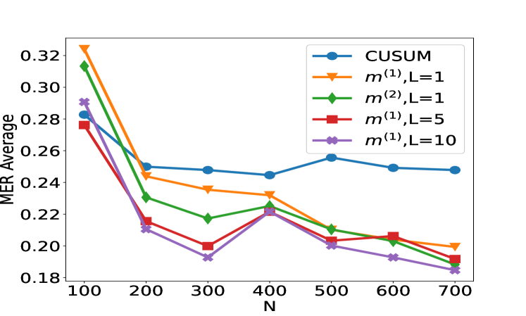
The image displays a line chart comparing the performance of five different statistical methods or algorithms as a function of sample size (N). The performance metric is "MER Average," where lower values appear to indicate better performance. All methods show a general trend of decreasing MER Average as N increases, with the most significant improvement occurring between N=100 and N=200.
### Components/Axes
* **Chart Type:** Multi-series line chart with markers.
* **X-Axis:**
* **Label:** `N` (likely representing sample size or number of observations).
* **Scale:** Linear, with major tick marks at 100, 200, 300, 400, 500, 600, and 700.
* **Y-Axis:**
* **Label:** `MER Average` (likely an error or performance metric, e.g., Mean Error Rate).
* **Scale:** Linear, ranging from approximately 0.18 to 0.32, with major tick marks at intervals of 0.02.
* **Legend:** Positioned in the **top-right corner** of the plot area. It contains five entries, each associating a color, line style, and marker with a method name.
1. **Blue line with circle markers:** `CUSUM`
2. **Orange line with downward-pointing triangle markers:** `m^(1),L=1`
3. **Green line with diamond markers:** `m^(2),L=1`
4. **Red line with square markers:** `m^(1),L=5`
5. **Purple line with 'x' (cross) markers:** `m^(1),L=10`
### Detailed Analysis
The following data points are approximate, read from the chart's visual position.
**Trend Verification:** All five data series exhibit a clear downward trend from left to right, indicating that the MER Average decreases as N increases. The slope is steepest between N=100 and N=200 for all series.
**Data Series Points (Approximate MER Average vs. N):**
| N | CUSUM (Blue, ○) | m^(1),L=1 (Orange, ▽) | m^(2),L=1 (Green, ◇) | m^(1),L=5 (Red, □) | m^(1),L=10 (Purple, ×) |
| :-- | :-------------- | :-------------------- | :------------------- | :----------------- | :--------------------- |
| 100 | 0.280 | 0.325 | 0.315 | 0.275 | 0.290 |
| 200 | 0.250 | 0.245 | 0.230 | 0.215 | 0.210 |
| 300 | 0.248 | 0.235 | 0.218 | 0.200 | 0.192 |
| 400 | 0.245 | 0.232 | 0.225 | 0.220 | 0.220 |
| 500 | 0.255 | 0.210 | 0.210 | 0.202 | 0.200 |
| 600 | 0.250 | 0.205 | 0.202 | 0.205 | 0.192 |
| 700 | 0.248 | 0.200 | 0.188 | 0.190 | 0.185 |
**Component Isolation & Spatial Grounding:**
* **Header Region (Top):** Contains the legend in the top-right. The highest initial data point (N=100) belongs to the orange line (`m^(1),L=1`), positioned at the very top of the y-axis range.
* **Main Chart Region:** The five lines are densely clustered between N=200 and N=700. The blue line (`CUSUM`) remains the highest (worst performing) from N=300 onward, forming a relatively flat plateau. The purple (`m^(1),L=10`) and green (`m^(2),L=1`) lines compete for the lowest (best) position at N=700, with purple appearing marginally lower.
* **Footer Region (Bottom):** The x-axis labels are clearly positioned below their corresponding tick marks.
### Key Observations
1. **Universal Improvement with N:** All methods benefit from increased sample size, with the most dramatic gains occurring early (N=100 to 200).
2. **CUSUM Plateau:** The `CUSUM` method shows the least continued improvement after N=200, maintaining a nearly constant MER Average around 0.25.
3. **Impact of Parameter L:** For the `m^(1)` family of methods, increasing the parameter `L` from 1 to 5 to 10 generally leads to better (lower) MER Average at larger N (N≥500). The `m^(1),L=10` series achieves the lowest overall value at N=700.
4. **Performance Crossover:** At N=100, `m^(1),L=1` (orange) performs worst. By N=700, it is outperformed by all methods except `CUSUM`. The ranking of methods changes significantly across the x-axis.
5. **Anomaly at N=400:** Several series (`m^(2),L=1`, `m^(1),L=5`, `m^(1),L=10`) show a slight increase or plateau in MER Average at N=400 before resuming their downward trend. This could indicate a specific characteristic of the data or algorithm at that sample size.
### Interpretation
This chart likely evaluates change-point detection algorithms or sequential analysis methods, where `CUSUM` (Cumulative Sum) is a classic benchmark. The `m^(k),L` notation suggests variants of a proposed method with different model orders (`k=1,2`) and a lookback or window parameter (`L`).
The data suggests that the proposed methods (`m^(k),L`) generally outperform the standard `CUSUM` as the sample size grows, especially when configured with a larger `L` parameter. The `m^(1),L=10` configuration appears most effective for large N. The initial steep drop indicates that all methods require a minimum amount of data (around N=200) to stabilize their performance. The plateau of `CUSUM` implies it may have a fundamental performance limit that the other methods overcome with more data. The anomaly at N=400 warrants investigation—it could be a chart artifact, or it might reveal a point where the methods' assumptions are temporarily less valid for the underlying data generating process. Overall, the chart makes a case for the superiority of the `m^(k),L` methods in scenarios where large sample sizes are available.