## Chart Type: Density Plot: Salary Density by Gender
### Overview
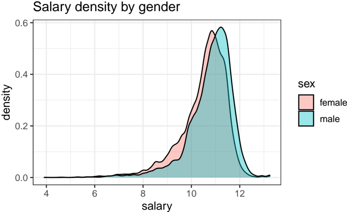
This image displays a density plot illustrating the distribution of salary by gender. Two distinct, overlapping density curves are presented, one for "female" and one for "male," allowing for a visual comparison of their respective salary distributions. The x-axis represents salary, and the y-axis represents density.
### Components/Axes
The chart is structured with a main plotting area, a title at the top, and a legend on the right.
* **Title**: Located at the top-left of the plot, the title is "Salary density by gender".
* **X-axis**:
* **Title**: "salary"
* **Range**: Approximately from 3.5 to 13.
* **Major Tick Markers**: 4, 6, 8, 10, 12.
* **Minor Tick Markers**: Present between major ticks, indicating increments of 1.
* **Y-axis**:
* **Title**: "density"
* **Range**: From 0.0 to 0.6.
* **Major Tick Markers**: 0.0, 0.2, 0.4, 0.6.
* **Minor Tick Markers**: Present between major ticks, indicating increments of 0.1.
* **Grid Lines**: Light gray grid lines are present across the plotting area, aligning with both major and minor tick markers on both axes.
* **Legend**: Located in the top-right quadrant of the plot.
* **Title**: "sex"
* **Entries**:
* A light red filled rectangle with a black outline, labeled "female".
* A light blue (teal) filled rectangle with a black outline, labeled "male".
### Detailed Analysis
Two density curves are plotted, representing the distribution of salary for females and males. Both curves are unimodal and appear to be right-skewed.
1. **Female Salary Density (light red fill, black outline)**:
* **Trend**: The curve starts at a density of approximately 0.0 near a salary value of 4. It gradually increases, showing a slow rise until around a salary of 8, where the increase becomes steeper. The curve reaches its peak density, then decreases sharply.
* **Key Points**:
* Starts at (salary ~4, density ~0.0).
* Density is approximately 0.05 at salary 8.
* The curve rises to a density of approximately 0.25 at salary 10.
* The peak density for females is approximately 0.55, occurring at a salary value of about 10.9.
* After the peak, the density rapidly decreases, reaching approximately 0.1 at salary 12, and returning to near 0.0 by a salary of about 12.5.
2. **Male Salary Density (light blue fill, black outline)**:
* **Trend**: Similar to the female curve, the male curve starts at a density of approximately 0.0 near a salary value of 4. It also shows a gradual increase followed by a steeper rise, reaching a peak, and then a sharp decline.
* **Key Points**:
* Starts at (salary ~4, density ~0.0).
* Density is approximately 0.04 at salary 8 (slightly lower than female at this point).
* The curve rises to a density of approximately 0.2 at salary 10 (lower than female at this point).
* The peak density for males is approximately 0.58, occurring at a salary value of about 11.3.
* After the peak, the density rapidly decreases, reaching approximately 0.15 at salary 12 (higher than female at this point), and returning to near 0.0 by a salary of about 12.8.
3. **Comparison and Overlap**:
* The two curves largely overlap.
* From approximately salary 8 to 10.8, the female density curve is slightly higher than the male density curve, indicating a higher proportion of females in this lower-to-mid salary range.
* The female curve peaks at a slightly lower salary value (approx. 10.9) and with a slightly lower peak density (approx. 0.55) compared to the male curve.
* The male curve peaks at a slightly higher salary value (approx. 11.3) and with a slightly higher peak density (approx. 0.58).
* From approximately salary 10.8 onwards, the male density curve is consistently higher than the female density curve, indicating a higher proportion of males in the higher salary ranges.
* Both distributions exhibit a similar overall shape, characterized by a long tail towards higher salary values (right-skewness).
### Key Observations
* Both male and female salary distributions are unimodal and right-skewed.
* The peak salary density for males is slightly higher and occurs at a higher salary value compared to females.
* Females show a slightly higher density in the lower-to-mid salary range (approximately 8 to 10.8).
* Males show a higher density in the mid-to-higher salary range (approximately 10.8 to 12.8).
* The distributions are very similar in shape and spread, with a noticeable shift in their peaks.
### Interpretation
The density plot suggests a subtle but discernible difference in salary distributions between genders. While there is significant overlap, indicating many individuals of both genders earn similar salaries, the data points to a tendency for males to have slightly higher salaries on average.
The female salary distribution peaks at a slightly lower salary point and with a slightly lower density, implying that a larger proportion of females are concentrated in a salary band that is marginally lower than that of males. Conversely, the male salary distribution peaks at a higher salary point with a slightly greater density, and maintains a higher density in the upper salary ranges, suggesting a greater proportion of males earning higher salaries.
This visual evidence indicates a potential salary gap where, while the overall shape of the distributions is similar, the male distribution is shifted slightly to the right (towards higher salaries) relative to the female distribution. This could be interpreted as a systemic difference in salary outcomes between genders, where males are more likely to occupy the higher end of the salary spectrum within this dataset. Further statistical analysis (e.g., mean, median, standard deviation) would be needed to quantify these differences precisely, but the density plot clearly illustrates the directional trend.