## Density Plot: Salary density by gender
### Overview
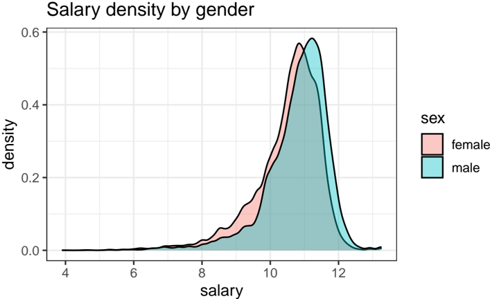
The image is a density plot comparing the distribution of salaries for males and females. The x-axis represents salary, and the y-axis represents density. Two curves, one for each gender, show the distribution of salaries within each group. The legend in the top-right corner identifies the colors associated with each gender: pink for female and blue for male.
### Components/Axes
* **Title:** Salary density by gender
* **X-axis:** salary, ranging from 4 to 12 in increments of 2.
* **Y-axis:** density, ranging from 0.0 to 0.6 in increments of 0.2.
* **Legend:** Located in the top-right corner.
* Pink: female
* Blue: male
### Detailed Analysis
* **Female (Pink):** The pink line represents the salary density for females. The density starts near 0 at a salary of 4, gradually increases, and peaks around a salary of 11, reaching a density of approximately 0.55. After the peak, the density decreases, approaching 0 around a salary of 12.
* **Male (Blue):** The blue line represents the salary density for males. The density starts near 0 at a salary of 4, gradually increases, and peaks around a salary of 11.5, reaching a density of approximately 0.58. After the peak, the density decreases, approaching 0 around a salary of 12.5.
### Key Observations
* Both distributions are unimodal (single peak).
* The male salary distribution is slightly shifted to the right compared to the female distribution, indicating that, on average, males have slightly higher salaries.
* The peak density for males is slightly higher than that for females.
* Both distributions have a similar spread, suggesting similar variability in salaries for both genders.
### Interpretation
The density plot suggests that there is a difference in salary distributions between males and females. While both distributions are centered around similar salary levels, the male distribution is shifted slightly towards higher salaries, and has a slightly higher peak density. This indicates that males, on average, tend to earn slightly more than females in this dataset. The similar spread of the distributions suggests that the variability in salaries is comparable for both genders. The plot visually demonstrates a potential gender pay gap, where males have a tendency to earn more than females.