\n
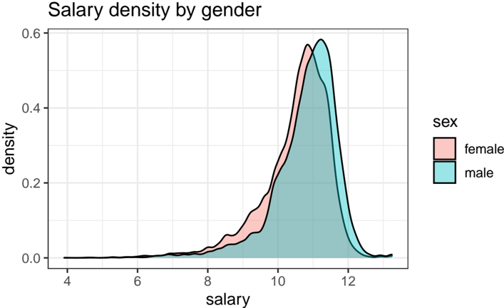
## Density Plot: Salary density by gender
### Overview
The image presents a density plot illustrating the distribution of salaries for two genders: female and male. The plot visualizes the probability density of salaries, allowing for a comparison of salary distributions between the two groups.
### Components/Axes
* **Title:** "Salary density by gender" - positioned at the top-center of the image.
* **X-axis:** "salary" - ranging from approximately 4 to 12 (units not specified, assumed to be thousands of dollars). The axis is labeled at intervals of 2.
* **Y-axis:** "density" - ranging from 0.0 to 0.6. The axis is labeled at intervals of 0.2.
* **Legend:** Located in the top-right corner.
* "sex" - label for the legend.
* "female" - represented by a light red color.
* "male" - represented by a light teal color.
### Detailed Analysis
The plot shows two overlapping density curves.
* **Female (light red):** The density curve for females starts at a salary of approximately 8, rises to a peak density around 10.2, and then declines, approaching zero density around 12.5.
* **Male (light teal):** The density curve for males starts at a salary of approximately 8, rises to a peak density around 10.5, and then declines, approaching zero density around 12.5.
Both curves exhibit a similar shape, with a peak around the 10-11 salary range. The male density curve appears slightly higher than the female density curve around the peak, suggesting a higher concentration of males at that salary level. However, the curves are very close, indicating a relatively similar salary distribution for both genders.
### Key Observations
* The salary distributions for both genders are unimodal, with a single peak.
* The peak salary for both genders is approximately between 10 and 11.
* The male salary distribution appears to be slightly skewed towards higher salaries compared to the female salary distribution, but the difference is subtle.
* There is a noticeable overlap between the two distributions, indicating that there is a significant range of salaries where both genders are represented.
### Interpretation
The data suggests that while there is some difference in the salary distributions between males and females, the distributions are largely similar. The slight difference in peak density suggests that males may be slightly more likely to earn salaries in the 10-11 range, but this difference is not substantial. The overlapping distributions indicate that there is considerable overlap in the salaries earned by both genders.
The plot does not provide information about the *causes* of any observed differences. It is important to note that this plot only shows density, not absolute numbers of individuals at each salary level. Therefore, it is not possible to determine if any observed differences are statistically significant without additional information. The data does not suggest a large disparity in salary between genders, but further investigation may be warranted to explore potential underlying factors contributing to any observed differences.