\n
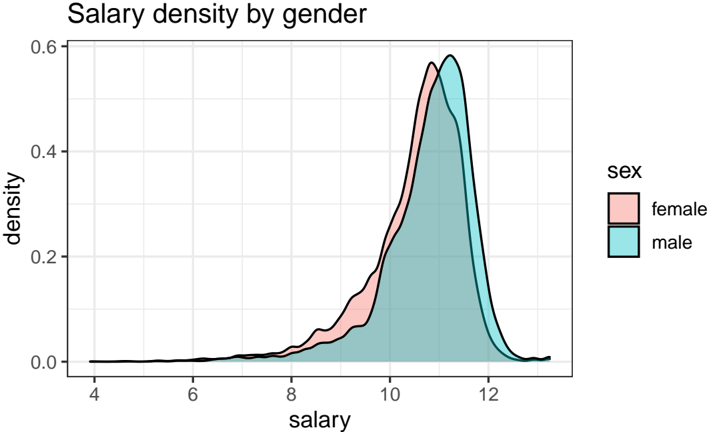
## Density Plot: Salary Density by Gender
### Overview
The image displays a kernel density estimate plot comparing the distribution of salaries between female and male employees. The chart visualizes the probability density of salary values for each gender group, showing where salaries are most concentrated.
### Components/Axes
* **Chart Title:** "Salary density by gender" (top-left corner).
* **X-Axis:** Labeled "salary". The axis has numerical markers at 4, 6, 8, 10, and 12. The scale appears to be linear, representing salary values (units not specified, possibly in thousands or a normalized scale).
* **Y-Axis:** Labeled "density". The axis has numerical markers at 0.0, 0.2, 0.4, and 0.6. This represents the probability density function value.
* **Legend:** Positioned on the right side of the chart, outside the plot area. It is titled "sex" and contains two entries:
* A pink/salmon-colored box labeled "female".
* A teal/cyan-colored box labeled "male".
* **Data Series:** Two filled density curves.
* The **female** distribution is represented by a pink/salmon-filled area under a black outline curve.
* The **male** distribution is represented by a teal/cyan-filled area under a black outline curve.
### Detailed Analysis
* **Female Salary Distribution (Pink):**
* **Trend:** The distribution is unimodal and right-skewed. It starts rising noticeably around a salary value of 7, increases steadily, and reaches its peak density.
* **Peak:** The highest point (mode) of the female density curve occurs at an approximate salary value of **10.5**. The peak density value is approximately **0.57**.
* **Spread:** The bulk of the distribution lies between salary values of approximately 8 and 12. The tail extends leftwards towards lower salaries (down to ~4) and rightwards to about 13.
* **Male Salary Distribution (Teal):**
* **Trend:** Also unimodal and right-skewed. It begins rising at a similar point to the female distribution but shows a steeper ascent.
* **Peak:** The highest point (mode) of the male density curve occurs at a slightly higher salary value than the female peak, at approximately **11.0**. The peak density is higher, at approximately **0.59**.
* **Spread:** The core of the distribution is between salary values of approximately 9 and 12.5. Its left tail is less pronounced than the female distribution's tail.
* **Overlap and Comparison:**
* The two distributions overlap significantly, especially in the salary range of 9 to 11.5.
* The area where the pink (female) curve is visible above the teal (male) curve is most prominent in the lower-to-mid salary range, approximately between 8 and 10. This indicates a higher relative density of females in this salary band.
* The area where the teal (male) curve is visible above the pink (female) curve is most prominent around the peak and in the higher salary range, approximately between 10.5 and 12. This indicates a higher relative density of males at these higher salary levels.
### Key Observations
1. **Peak Disparity:** The modal salary for males (peak at ~11.0) is higher than the modal salary for females (peak at ~10.5).
2. **Density at Peak:** The maximum density for males (~0.59) is slightly higher than for females (~0.57), suggesting male salaries are slightly more concentrated around their mode.
3. **Lower Salary Range:** The female distribution has a heavier left tail, indicating a relatively higher proportion of females in the lower salary range (e.g., 7-9) compared to males.
4. **Higher Salary Range:** The male distribution appears to have a slightly heavier right tail, suggesting a relatively higher proportion of males in the upper salary range (e.g., 11-12).
5. **Overall Shape:** Both distributions are right-skewed, meaning most employees earn salaries on the lower-to-mid end of the scale, with fewer individuals at the very high end.
### Interpretation
This density plot suggests a **gender-based disparity in salary distribution** within the dataset. While there is substantial overlap, indicating many men and women earn similar salaries, the central tendency (mode) for men is shifted to the right (higher salary). The heavier left tail for women points to a greater concentration of women in lower-paying positions or grades. Conversely, the heavier right tail for men suggests a greater concentration in higher-paying roles.
The chart does not show causation but visualizes a correlation between gender and salary distribution. It raises questions about underlying factors such as occupational segregation (different genders clustering in different job types/levels), differences in experience or tenure, or potential bias in compensation. The significant overlap is also crucial, as it demonstrates that salary is not determined by gender alone and that many women earn salaries comparable to or higher than many men. To understand the drivers behind these distributions, one would need to analyze additional variables like job title, department, experience, and education level.