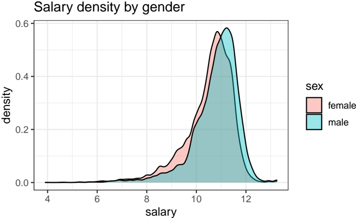
## Line Chart: Salary Density by Gender
### Overview
The chart visualizes the distribution of salaries by gender using density curves. Two overlapping lines represent female (pink) and male (teal) salary distributions across a range of salary values. The y-axis measures density (0–0.6), while the x-axis represents salary (4–12).
### Components/Axes
- **X-axis (salary)**: Labeled "salary," with increments from 4 to 12 in steps of 2.
- **Y-axis (density)**: Labeled "density," ranging from 0 to 0.6 in steps of 0.1.
- **Legend**: Positioned on the right, with "sex" as the category. Female is pink, male is teal.
- **Lines**: Two density curves:
- **Female (pink)**: Peaks at ~11.5 salary with a density of ~0.55.
- **Male (teal)**: Peaks at ~12 salary with a density of ~0.58.
### Detailed Analysis
- **Female (pink)**:
- Starts near 0 at salary 4, rises gradually, and peaks at ~11.5.
- Density declines sharply after 11.5, reaching near 0 by 12.
- **Male (teal)**:
- Starts near 0 at salary 4, rises more steeply than female.
- Peaks at ~12 with a slightly higher density (~0.58) than female.
- Declines more gradually than female after the peak.
### Key Observations
1. Male salaries cluster slightly higher (peak at 12) compared to female (peak at 11.5).
2. Male density is marginally higher at the peak (~0.58 vs. ~0.55).
3. Both distributions overlap significantly between 8–12 salary, indicating similar salary ranges but a slight male advantage at the upper end.
### Interpretation
The data suggests a gender-based disparity in salary distribution, with males earning higher salaries on average. The density curves reveal that while both genders have overlapping salary ranges, males are more concentrated at the higher end of the scale. This aligns with broader socioeconomic trends of gender pay gaps, though the chart does not account for confounding variables like industry, experience, or location. The slight difference in peak densities (~0.03) may reflect systemic biases or occupational segregation.