## Scatter Plots: Load vs. Work Index by Day of Week
### Overview
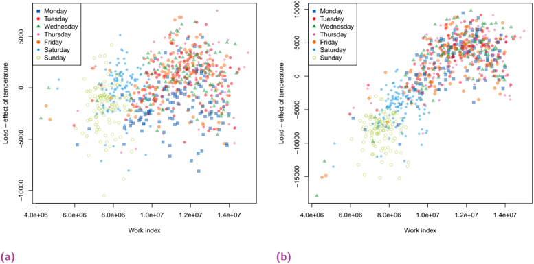
The image contains two scatter plots, labeled (a) and (b), each displaying the relationship between "Load - effect of temperature" (y-axis) and "Work index" (x-axis). Data points are color-coded to represent different days of the week, as indicated by the legend in the top-left corner of each plot. The plots show how the load varies with the work index for each day of the week. Plot (b) has a wider range on the y-axis.
### Components/Axes
**Plot (a) and (b) share the following components:**
* **X-axis:** "Work index" with a scale from approximately 4.0e+06 to 1.4e+07. Axis markers are present at 4.0e+06, 6.0e+06, 8.0e+06, 1.0e+07, 1.2e+07, and 1.4e+07.
* **Y-axis:** "Load - effect of temperature".
* Plot (a) ranges from -10000 to 5000, with axis markers at -10000, -5000, and 5000.
* Plot (b) ranges from -15000 to 10000, with axis markers at -15000, -10000, -5000, 0, 5000, and 10000.
* **Legend (top-left):**
* Monday (blue squares)
* Tuesday (red circles)
* Wednesday (green triangles)
* Thursday (magenta plus signs)
* Friday (orange circles)
* Saturday (cyan asterisks)
* Sunday (yellow circles)
### Detailed Analysis
**Plot (a):**
* **Monday (blue squares):** Data points are scattered, generally increasing in "Load - effect of temperature" as "Work index" increases. The range is approximately from -5000 to 5000.
* **Tuesday (red circles):** Similar to Monday, the data points are scattered and generally increase with "Work index". The range is approximately from -2500 to 5000.
* **Wednesday (green triangles):** Data points are scattered and generally increase with "Work index". The range is approximately from -2500 to 5000.
* **Thursday (magenta plus signs):** Data points are scattered and generally increase with "Work index". The range is approximately from -2500 to 5000.
* **Friday (orange circles):** Data points are scattered and generally increase with "Work index". The range is approximately from -2500 to 5000.
* **Saturday (cyan asterisks):** Data points are scattered, with a slight upward trend. The range is approximately from -5000 to 5000.
* **Sunday (yellow circles):** Data points are concentrated at lower "Work index" values (4.0e+06 to 8.0e+06) and lower "Load - effect of temperature" values (-5000 to 0).
**Plot (b):**
* **Monday (blue squares):** Data points show a clear upward trend, increasing in "Load - effect of temperature" as "Work index" increases. The range is approximately from -5000 to 10000.
* **Tuesday (red circles):** Similar to Monday, the data points show an upward trend. The range is approximately from -2500 to 10000.
* **Wednesday (green triangles):** Data points show an upward trend. The range is approximately from -2500 to 10000.
* **Thursday (magenta plus signs):** Data points show an upward trend. The range is approximately from -2500 to 10000.
* **Friday (orange circles):** Data points show an upward trend. The range is approximately from -2500 to 10000.
* **Saturday (cyan asterisks):** Data points are scattered, with a slight upward trend. The range is approximately from -10000 to 10000.
* **Sunday (yellow circles):** Data points are concentrated at lower "Work index" values (4.0e+06 to 8.0e+06) and lower "Load - effect of temperature" values (-15000 to -2500).
### Key Observations
* In both plots, Sunday consistently shows a lower "Load - effect of temperature" compared to other days, especially at lower "Work index" values.
* The "Load - effect of temperature" generally increases with the "Work index" for all days except Sunday.
* Plot (b) shows a clearer upward trend for most days compared to plot (a).
* Plot (b) has a wider range of "Load - effect of temperature" values, particularly for Sunday.
### Interpretation
The plots suggest that the "Load - effect of temperature" is influenced by both the "Work index" and the day of the week. Sunday exhibits a distinct pattern, indicating a lower load, possibly due to reduced activity on that day. The upward trend observed for other days suggests a positive correlation between "Work index" and "Load - effect of temperature". The difference between plots (a) and (b) might be due to different data sets or different processing methods, with plot (b) potentially capturing a wider range of load variations. The data indicates that the work index is a predictor of load, but the day of the week is also a significant factor, especially for Sundays.