## Scatter Plot Analysis: Work Index vs. Load - Effect of Temperature
### Overview
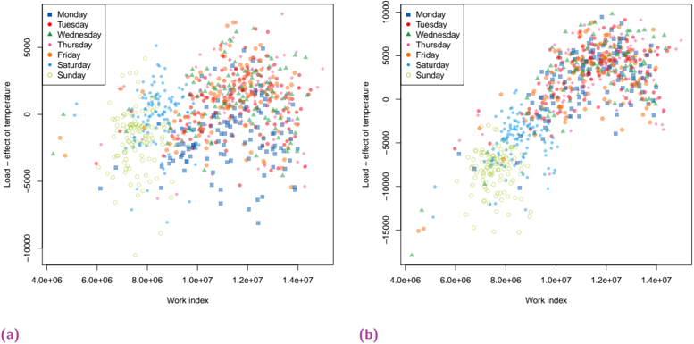
The image contains two side-by-side scatter plots, labeled (a) and (b), comparing "Work index" (x-axis) against "Load - effect of temperature" (y-axis). Each plot visualizes data points for different days of the week, distinguished by color and marker shape. The plots appear to show a relationship between these two variables, with a notable separation between weekday and weekend data clusters.
### Components/Axes
**Common Elements (Both Plots):**
* **X-axis Title:** `Work index`
* **X-axis Scale:** Linear, ranging from approximately `4.0e+06` to `1.4e+07` (4,000,000 to 14,000,000). Major tick marks are at intervals of `2.0e+06`.
* **Y-axis Title:** `Load - effect of temperature`
* **Legend:** Positioned in the top-left corner of each plot. It maps days of the week to specific colors and marker shapes.
* Monday: Blue square (■)
* Tuesday: Red circle (●)
* Wednesday: Green triangle (▲)
* Thursday: Cyan plus sign (+)
* Friday: Orange diamond (◆)
* Saturday: Light blue asterisk (*)
* Sunday: Yellow circle (○)
**Plot (a) Specifics:**
* **Y-axis Scale:** Ranges from `-10000` to `5000`. Major tick marks are at intervals of `5000`.
* **Label:** `(a)` is placed below the plot, centered.
**Plot (b) Specifics:**
* **Y-axis Scale:** Ranges from `-15000` to `10000`. Major tick marks are at intervals of `5000`.
* **Label:** `(b)` is placed below the plot, centered.
### Detailed Analysis
**Plot (a) Analysis:**
* **Data Distribution:** Two primary clusters are visible.
1. **Weekday Cluster (Mon-Fri):** Data points for Monday through Friday are densely clustered in the upper-right quadrant. This cluster spans a Work index range of approximately `8.0e+06` to `1.4e+07` and a Load - effect of temperature range from roughly `-2500` to `5000`. The trend within this cluster appears weakly positive; as the Work index increases, the Load - effect of temperature shows a slight tendency to increase.
2. **Weekend Cluster (Sat-Sun):** Data points for Saturday and Sunday are clustered in the lower-left quadrant. This cluster spans a Work index range of approximately `4.0e+06` to `1.0e+07` and a Load - effect of temperature range from roughly `-10000` to `0`. The trend within this cluster is less clear but appears more scattered with a slight negative correlation.
* **Separation:** There is a clear gap between the two clusters, with minimal overlap. The weekday cluster is centered around a Work index of ~`1.1e+07` and a Load value of ~`2500`. The weekend cluster is centered around a Work index of ~`7.0e+06` and a Load value of ~`-5000`.
**Plot (b) Analysis:**
* **Data Distribution:** The same two-cluster pattern is present but with a more pronounced vertical spread, especially for the weekday data.
1. **Weekday Cluster (Mon-Fri):** This cluster is again in the upper-right but extends higher on the y-axis, reaching up to `10000`. The Work index range is similar (`8.0e+06` to `1.4e+07`). The positive trend is more visually apparent here than in plot (a).
2. **Weekend Cluster (Sat-Sun):** This cluster is in the lower-left and extends lower on the y-axis, down to `-15000`. The Work index range is similar (`4.0e+06` to `1.0e+07`). The negative trend or scatter is also more pronounced.
* **Separation:** The separation between clusters remains distinct. The vertical (y-axis) range of the data is significantly larger in plot (b) compared to plot (a).
### Key Observations
1. **Strong Day-Type Segregation:** The most striking feature is the clear separation between weekday (Mon-Fri) and weekend (Sat-Sun) data points in both plots. They form distinct clouds with little overlap.
2. **Correlation Direction:** Within the weekday cluster, there is a visible positive correlation between Work index and Load - effect of temperature. Within the weekend cluster, the correlation is weaker and appears slightly negative or neutral.
3. **Increased Variance in Plot (b):** Plot (b) shows a much wider range of values on the y-axis ("Load - effect of temperature") for both clusters compared to plot (a), suggesting either a different dataset, a different measurement scale, or a different experimental condition.
4. **Consistent Legend and Axes:** The legends, axis titles, and x-axis scales are identical between the two plots, facilitating direct comparison of the y-axis distributions.
### Interpretation
The data strongly suggests that the "Work index" and the "Load - effect of temperature" are influenced by whether it is a weekday or a weekend. The "Work index" is consistently higher on weekdays, which could correlate with higher industrial activity, energy consumption, or operational load. The "Load - effect of temperature" is also positive and higher on weekdays, implying that temperature has a greater positive impact on the measured load during workdays.
Conversely, on weekends, both the Work index and the temperature effect on load are lower, with the temperature effect often being negative. This could indicate reduced operational activity where temperature variations might lead to a decrease in load (e.g., reduced heating/cooling demand in inactive facilities).
The difference between plots (a) and (b) is critical. Plot (b) shows the same pattern but with amplified effects—the temperature's influence on load is more extreme (both positive and negative) for the same range of Work index. This could represent data from a different season (e.g., summer vs. winter), a different geographic location with more extreme temperatures, or a different system with higher sensitivity. Without additional context, the exact cause for the difference in y-axis scale between (a) and (b) cannot be determined from the image alone.