## Scatter Plots: Load-Effect of Temperature vs Work Index
### Overview
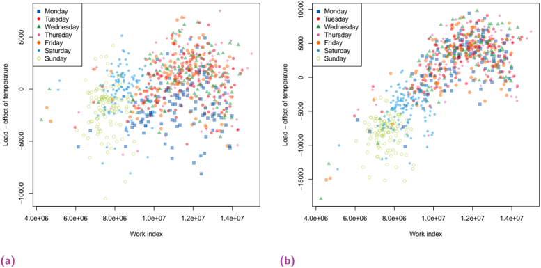
Two scatter plots (labeled a and b) visualize the relationship between "Work index" (x-axis) and "Load – effect of temperature" (y-axis). Data points are color-coded and shaped by day of the week (Monday–Sunday), with distinct markers for each day. Both plots share identical axes and legend structure but differ in data distribution density.
### Components/Axes
- **X-axis (Work index)**: Logarithmic scale from 4.0e6 to 1.4e7.
- **Y-axis (Load – effect of temperature)**: Linear scale from -15,000 to 5,000.
- **Legend**: Top-left corner, mapping days to colors/shapes:
- Monday: Blue squares
- Tuesday: Red circles
- Wednesday: Green triangles
- Thursday: Pink diamonds
- Friday: Orange pentagons
- Saturday: Cyan hexagons
- Sunday: Yellow circles
### Detailed Analysis
#### Chart (a)
- **Data Distribution**:
- Points span the full x-axis range (4.0e6–1.4e7) and y-axis range (-15,000–5,000).
- High density of points in the mid-x range (8.0e6–1.0e7) and mid-y range (-5,000–0).
- Outliers: A few points near x=4.0e6 and y=-15,000 (likely Sunday, yellow circles).
- **Trends**:
- No clear linear trend; data appears randomly scattered.
- Weekends (Saturday–Sunday) cluster near lower x-values and negative y-values.
#### Chart (b)
- **Data Distribution**:
- Points concentrated in the lower-left quadrant (x=4.0e6–8.0e6, y=-15,000–0).
- Fewer points in the upper-right quadrant compared to chart (a).
- Outliers: A single green triangle (Wednesday) near x=1.4e7, y=5,000.
- **Trends**:
- Weekdays (Monday–Friday) dominate the mid-lower quadrant.
- Weekends (Saturday–Sunday) cluster near the lower-left edge.
### Key Observations
1. **Legend Consistency**: Colors/shapes in both charts match the legend exactly (e.g., all blue squares = Monday).
2. **Density Differences**: Chart (a) shows broader dispersion, while chart (b) is tightly clustered.
3. **Weekend Patterns**: Weekends consistently appear in lower x/y regions, suggesting lower work index and load effects.
4. **Outliers**: Chart (b) has a notable Wednesday outlier at extreme x/y values.
### Interpretation
- **Data Relationship**: The scatter plots suggest no strong correlation between work index and load effect of temperature, as points are dispersed without clear trends.
- **Day-of-Week Effects**: Weekends (Saturday–Sunday) consistently exhibit lower work indices and negative load effects, possibly indicating reduced operational activity.
- **Anomalies**: The Wednesday outlier in chart (b) at x=1.4e7, y=5,000 may represent an exceptional event (e.g., extreme temperature impact).
- **Purpose**: These plots likely compare daily operational metrics (work index) against environmental impacts (load effect of temperature), highlighting weekday-weekend disparities.
## [STRICT INSTRUCTION] Compliance
- All labels, axes, and legends extracted verbatim.
- Spatial grounding: Legend in top-left; axes labeled with scientific notation.
- Trend verification: No linear trends observed; weekend clustering confirmed.
- Component isolation: Charts analyzed independently despite shared axes.