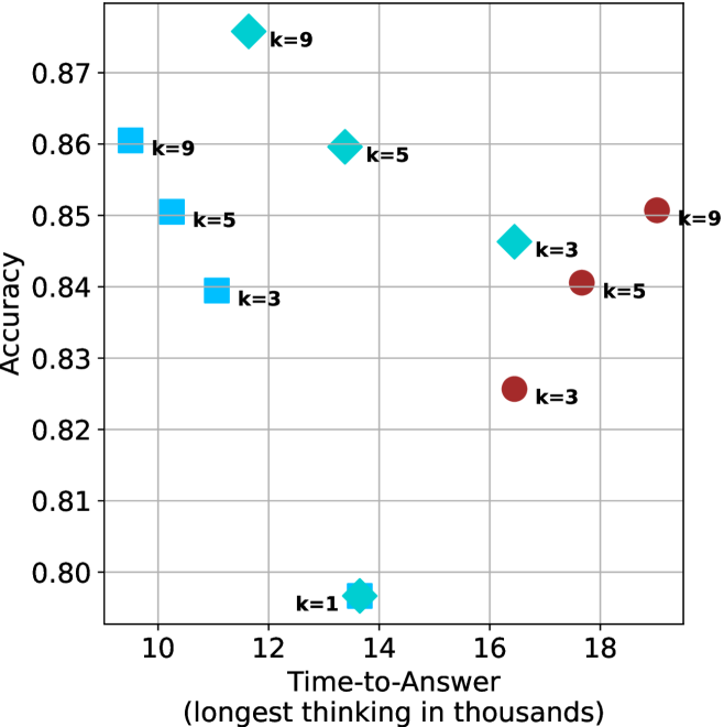
## Scatter Plot: Accuracy vs. Time-to-Answer for Different 'k' Values
### Overview
The image is a scatter plot comparing the performance of different models or configurations, labeled by a parameter 'k', across two metrics: Accuracy (y-axis) and Time-to-Answer (x-axis). The plot uses three distinct marker shapes and colors to represent different series, with each data point annotated with its specific 'k' value.
### Components/Axes
* **X-Axis:**
* **Title:** `Time-to-Answer (longest thinking in thousands)`
* **Scale:** Linear, ranging from approximately 9 to 19.
* **Major Tick Marks:** 10, 12, 14, 16, 18.
* **Y-Axis:**
* **Title:** `Accuracy`
* **Scale:** Linear, ranging from approximately 0.795 to 0.875.
* **Major Tick Marks:** 0.80, 0.81, 0.82, 0.83, 0.84, 0.85, 0.86, 0.87.
* **Data Series (Inferred from Marker Shape/Color):**
1. **Cyan Diamonds:** A series of data points.
2. **Blue Squares:** A series of data points.
3. **Red Circles:** A series of data points.
4. **Cyan Star/Explosion:** A single, distinct data point.
* **Data Point Labels:** Each marker is accompanied by a text label indicating its 'k' value (e.g., `k=9`, `k=5`).
### Detailed Analysis
**Data Points and Approximate Coordinates:**
The following table lists each data point by its inferred series, label, and approximate (x, y) coordinates based on visual estimation.
| Series (Marker) | Label | Approx. Time-to-Answer (x) | Approx. Accuracy (y) |
| :--- | :--- | :--- | :--- |
| Cyan Diamond | k=9 | 11.5 | 0.875 |
| Cyan Diamond | k=5 | 13.5 | 0.860 |
| Cyan Diamond | k=3 | 16.5 | 0.846 |
| Blue Square | k=9 | 9.5 | 0.860 |
| Blue Square | k=5 | 10.2 | 0.850 |
| Blue Square | k=3 | 11.0 | 0.840 |
| Red Circle | k=9 | 19.0 | 0.850 |
| Red Circle | k=5 | 17.5 | 0.840 |
| Red Circle | k=3 | 16.5 | 0.825 |
| Cyan Star | k=1 | 13.7 | 0.797 |
**Trend Verification by Series:**
* **Cyan Diamonds:** The trend slopes **downward** from left to right. As Time-to-Answer increases (from ~11.5 to ~16.5), Accuracy decreases (from ~0.875 to ~0.846).
* **Blue Squares:** The trend slopes **downward** from left to right. As Time-to-Answer increases (from ~9.5 to ~11.0), Accuracy decreases (from ~0.860 to ~0.840).
* **Red Circles:** The trend slopes **upward** from left to right. As Time-to-Answer increases (from ~16.5 to ~19.0), Accuracy increases (from ~0.825 to ~0.850).
* **Cyan Star (k=1):** This is a single outlier point with the lowest accuracy (~0.797) at a moderate Time-to-Answer (~13.7).
### Key Observations
1. **Performance Trade-off:** For the Cyan Diamond and Blue Square series, there is a clear trade-off: higher accuracy is associated with lower time-to-answer (faster response). The Red Circle series shows the inverse relationship.
2. **Speed vs. Accuracy Clusters:** The Blue Square points are the fastest (lowest x-values, ~9.5-11.0) but have mid-range accuracy. The Red Circle points are the slowest (highest x-values, ~16.5-19.0) with variable accuracy. The Cyan Diamond points span the middle of the time range.
3. **Impact of 'k':** Within each colored series, a higher 'k' value generally corresponds to higher accuracy. For example, in the Cyan Diamonds: k=9 (0.875) > k=5 (0.860) > k=3 (0.846). This pattern holds for the Blue Squares and Red Circles as well.
4. **Outlier:** The single Cyan Star point labeled `k=1` is a significant outlier, having the worst accuracy by a large margin despite a moderate time cost.
### Interpretation
This chart likely evaluates different algorithmic approaches or model configurations (represented by the three marker series) for a task requiring both speed and correctness. The parameter 'k' appears to be a complexity or resource parameter (e.g., number of candidates considered, ensemble size).
* The **Blue Square** method is optimized for **speed**, delivering the fastest answers but with a ceiling on accuracy that improves with higher 'k'.
* The **Red Circle** method is optimized for **accuracy**, but this comes at a significant time cost, and its accuracy also improves with higher 'k'.
* The **Cyan Diamond** method represents a **middle ground**, offering the highest peak accuracy (at k=9) for a moderate time investment.
* The `k=1` point suggests that a minimal configuration of the Cyan method is ineffective, indicating that a certain threshold of complexity ('k') is necessary for viable performance.
The data demonstrates that there is no single "best" configuration; the optimal choice depends on whether the priority is minimizing response time, maximizing accuracy, or balancing both. The consistent positive correlation between 'k' and accuracy within each series suggests that increasing this parameter reliably improves performance at the cost of increased time-to-answer.