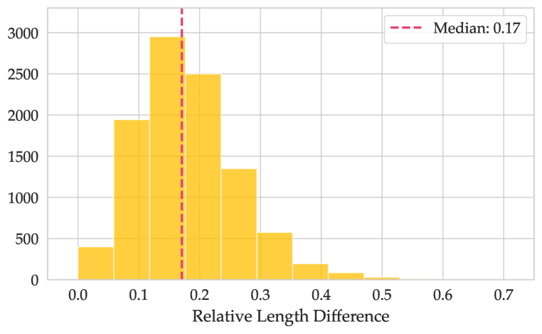
## Histogram: Relative Length Difference Distribution
### Overview
The image displays a histogram visualizing the frequency distribution of a metric called "Relative Length Difference." The chart includes a vertical dashed line indicating the median value of the distribution. The overall shape is right-skewed, with the majority of data points concentrated on the left side of the scale.
### Components/Axes
* **Chart Type:** Histogram.
* **X-Axis:**
* **Label:** "Relative Length Difference"
* **Scale:** Linear scale from 0.0 to 0.7.
* **Major Tick Marks:** 0.0, 0.1, 0.2, 0.3, 0.4, 0.5, 0.6, 0.7.
* **Y-Axis:**
* **Label:** Not explicitly labeled, but represents frequency/count.
* **Scale:** Linear scale from 0 to 3000.
* **Major Tick Marks:** 0, 500, 1000, 1500, 2000, 2500, 3000.
* **Legend:**
* **Position:** Top-right corner of the chart area.
* **Content:** A dashed red line symbol followed by the text "Median: 0.17".
* **Data Series:** A single series represented by yellow bars.
* **Reference Line:** A vertical, dashed red line positioned at x = 0.17, corresponding to the median.
### Detailed Analysis
The histogram bins data into intervals of approximately 0.05 units along the "Relative Length Difference" axis. The approximate frequency (count) for each bin, estimated from the bar heights, is as follows:
* **0.00 - 0.05:** ~400
* **0.05 - 0.10:** ~1950
* **0.10 - 0.15:** ~2950 (This is the modal bin, the highest bar)
* **0.15 - 0.20:** ~2500
* **0.20 - 0.25:** ~1350
* **0.25 - 0.30:** ~550
* **0.30 - 0.35:** ~200
* **0.35 - 0.40:** ~100
* **0.40 - 0.45:** ~50
* **0.45 - 0.50:** ~20
* **0.50 - 0.55:** ~10 (Very small bar, barely visible)
* **0.55 - 0.70:** No visible bars, frequency appears to be 0 or near 0.
**Trend Verification:** The visual trend is a sharp rise to a peak in the 0.10-0.15 bin, followed by a steady, decaying decline as the Relative Length Difference increases. The distribution has a long tail extending to the right.
### Key Observations
1. **Central Tendency:** The median is explicitly stated as 0.17, marked by the red dashed line. This falls within the second-highest bar (0.15-0.20 bin).
2. **Peak Frequency:** The highest concentration of data (mode) occurs in the interval between 0.10 and 0.15.
3. **Skewness:** The distribution is positively skewed (right-skewed). The tail on the right side (higher values) is much longer than the left.
4. **Data Range:** The vast majority of the data lies between 0.05 and 0.30. Values above 0.40 are rare.
5. **Visual Design:** The chart uses a simple, clean design with a white background, light gray grid lines, and a single accent color (yellow) for the data bars. The median line uses a contrasting red color for emphasis.
### Interpretation
This histogram demonstrates that the measured "Relative Length Difference" is not symmetrically distributed. Instead, it shows a strong clustering of values at the lower end of the scale, with a median of 0.17. This suggests that for the population sampled, the relative difference in length is typically small.
The right skew indicates the presence of a subset of cases with substantially larger relative differences, though these are progressively less common. The sharp drop-off after 0.30 implies that extreme differences are outliers in this dataset.
From a technical or investigative perspective, this pattern could indicate:
* A process that is generally well-controlled (keeping differences low) but occasionally experiences larger deviations.
* A natural phenomenon where small differences are the norm, and large differences represent exceptional or edge-case scenarios.
* The need to investigate the causes behind the data points in the long tail (values > 0.3) to understand what drives these larger relative length differences.
The chart effectively communicates that while the typical case involves a ~17% relative length difference, one should be prepared for and investigate instances where the difference is significantly higher.