## Multi-Panel Line Chart: Performance Gap vs. Number of Variables
### Overview
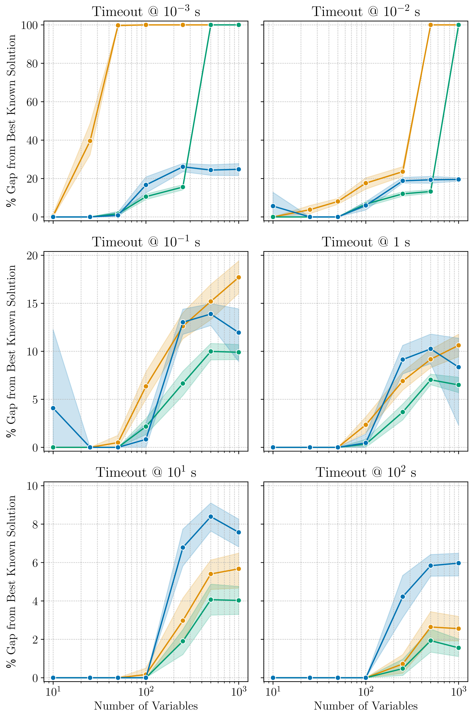
This image displays a grid of six line charts, arranged in a 2x3 layout. Each chart plots the "% Gap from Best Known Solution" (Y-axis) against the "Number of Variables" (X-axis) for a specific "Timeout" duration. There are three distinct data series represented by colored lines (Blue, Orange, and Green), each accompanied by a shaded region representing uncertainty or variance (confidence interval).
There is no explicit legend provided in the image to identify the specific algorithms or methods corresponding to the Blue, Orange, and Green lines.
### Components/Axes
* **Layout:** 6 subplots arranged in 2 columns and 3 rows.
* **X-Axis:** "Number of Variables" (Logarithmic scale). Ticks are present at $10^1$ and $10^3$, with intermediate grid lines representing logarithmic intervals.
* **Y-Axis:** "% Gap from Best Known Solution".
* **Top Row (Timeouts $10^{-3}$ s, $10^{-2}$ s):** Scale ranges from 0 to 100.
* **Middle Row (Timeouts $10^{-1}$ s, $1$ s):** Scale ranges from 0 to 20.
* **Bottom Row (Timeouts $10^1$ s, $10^2$ s):** Scale ranges from 0 to 10.
* **Titles:** Each subplot is titled with its respective timeout duration:
* Top-Left: `Timeout @ 10⁻³ s`
* Top-Right: `Timeout @ 10⁻² s`
* Middle-Left: `Timeout @ 10⁻¹ s`
* Middle-Right: `Timeout @ 1 s`
* Bottom-Left: `Timeout @ 10¹ s`
* Bottom-Right: `Timeout @ 10² s`
---
### Detailed Analysis
#### Row 1: High-Speed Timeouts ($10^{-3}$ s and $10^{-2}$ s)
* **Trend:** All series show a sharp upward trend as the number of variables increases.
* **Top-Left ($10^{-3}$ s):**
* **Orange:** Rises steeply from 0 at $10^1$ to 100 at $10^2$, remaining at 100 thereafter.
* **Green:** Remains at 0 until $10^2$, then rises sharply to 100 at $5 \times 10^2$.
* **Blue:** Remains at 0 until $10^2$, then rises to approximately 25 at $5 \times 10^2$, where it plateaus.
* **Top-Right ($10^{-2}$ s):**
* **Orange:** Rises to ~25 at $5 \times 10^2$, then jumps to 100 at $10^3$.
* **Green:** Rises to ~15 at $5 \times 10^2$, then jumps to 100 at $10^3$.
* **Blue:** Rises to ~20 at $5 \times 10^2$, remaining flat at $10^3$.
#### Row 2: Moderate Timeouts ($10^{-1}$ s and $1$ s)
* **Trend:** The gap is significantly lower than the top row. The curves show a "hump" shape or a plateau after $5 \times 10^2$ variables.
* **Middle-Left ($10^{-1}$ s):**
* **Orange:** Shows the highest gap, reaching ~18 at $10^3$.
* **Blue:** Reaches ~14 at $5 \times 10^2$, then dips slightly to ~12 at $10^3$.
* **Green:** Reaches ~10 at $5 \times 10^2$ and stays flat.
* **Middle-Right ($1$ s):**
* **Blue:** Reaches ~10 at $5 \times 10^2$, then dips to ~8 at $10^3$.
* **Orange:** Reaches ~10 at $10^3$.
* **Green:** Reaches ~7 at $5 \times 10^2$, then dips slightly.
#### Row 3: Long Timeouts ($10^1$ s and $10^2$ s)
* **Trend:** The gap is minimized. The curves show a clear separation between the three series.
* **Bottom-Left ($10^1$ s):**
* **Blue:** Highest gap, peaking at ~8.5 at $5 \times 10^2$, then dropping to ~7.5 at $10^3$.
* **Orange:** Reaches ~5.5 at $10^3$.
* **Green:** Lowest gap, reaching ~4 at $10^3$.
* **Bottom-Right ($10^2$ s):**
* **Blue:** Highest gap, reaching ~6 at $10^3$.
* **Orange:** Reaches ~2.5 at $10^3$.
* **Green:** Lowest gap, reaching ~2 at $10^3$.
---
### Key Observations
1. **Inverse Relationship:** As the "Timeout" duration increases (moving from top-left to bottom-right), the "% Gap from Best Known Solution" decreases significantly.
2. **Scaling Difficulty:** As the "Number of Variables" increases, the gap generally increases, indicating that the problem becomes harder to solve optimally as complexity grows.
3. **Algorithm Performance:**
* **Green Series:** Generally performs best (lowest gap) in the longer timeout scenarios (bottom row).
* **Blue Series:** Performs best in the shortest timeout scenarios (top row) but performs worst (highest gap) in the longest timeout scenarios (bottom row).
* **Orange Series:** Often occupies the middle ground or performs worst in the shortest timeouts.
### Interpretation
The data demonstrates a classic trade-off in computational optimization algorithms. The three series likely represent different algorithms or heuristics.
* **The "Blue" algorithm** appears to be a "fast-start" or "greedy" approach. It performs well when time is extremely limited ($10^{-3}$ s), likely finding a decent solution quickly. However, it fails to improve significantly with more time, resulting in a higher gap compared to the others when given $10^1$ or $10^2$ seconds.
* **The "Green" algorithm** appears to be a more robust or "thorough" approach. It struggles significantly when time is extremely limited (high gap in top row) but scales much better as time is provided, eventually achieving the lowest gap from the best-known solution in the longest timeout scenarios.
* **The "Orange" algorithm** represents a middle-ground approach, though it is notably outperformed by the Green algorithm in the long-timeout scenarios.
The "hump" or dip observed in the middle and bottom rows (where the gap decreases slightly at $10^3$ variables compared to $5 \times 10^2$) suggests that for certain algorithms, the problem structure at $10^3$ variables might be easier to approximate than at $5 \times 10^2$, or the algorithm's heuristic is better suited to that specific scale.