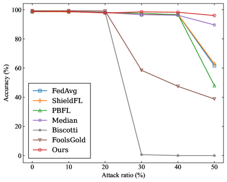
## Line Chart: Accuracy vs. Attack Ratio for Various Federated Learning Methods
### Overview
The image is a line chart comparing the performance (accuracy) of seven different methods in a federated learning context as the percentage of malicious participants (attack ratio) increases. The chart demonstrates how each method's accuracy degrades under increasing adversarial conditions.
### Components/Axes
* **Chart Type:** Multi-line chart with markers.
* **X-Axis:** Labeled **"Attack ratio (%)"**. Major tick marks and labels are present at 0, 10, 20, 30, 40, and 50.
* **Y-Axis:** Labeled **"Accuracy (%)"**. The scale runs from 0 to 100, with major tick marks at intervals of 20 (0, 20, 40, 60, 80, 100).
* **Legend:** Positioned in the **bottom-left corner** of the plot area. It contains seven entries, each with a unique color, marker shape, and label:
1. **FedAvg** - Blue line with square markers (□).
2. **ShieldFL** - Orange line with diamond markers (◇).
3. **PBFL** - Green line with upward-pointing triangle markers (△).
4. **Median** - Purple line with circle markers (○).
5. **Biscotti** - Gray line with star/asterisk markers (☆).
6. **FoolsGold** - Brown line with downward-pointing triangle markers (▽).
7. **Ours** - Red line with circle markers (○).
### Detailed Analysis
The following data points are approximate, extracted by visual inspection of the chart.
**Trend Verification & Data Points:**
1. **Ours (Red, ○):** The line remains nearly flat at the top of the chart, showing high resilience.
* 0% Attack: ~100% Accuracy
* 10% Attack: ~100% Accuracy
* 20% Attack: ~100% Accuracy
* 30% Attack: ~99% Accuracy
* 40% Attack: ~98% Accuracy
* 50% Attack: ~96% Accuracy
2. **Median (Purple, ○):** The line stays high until 40% attack, then shows a moderate decline.
* 0% Attack: ~100% Accuracy
* 10% Attack: ~100% Accuracy
* 20% Attack: ~99% Accuracy
* 30% Attack: ~98% Accuracy
* 40% Attack: ~97% Accuracy
* 50% Attack: ~90% Accuracy
3. **ShieldFL (Orange, ◇):** The line follows a path very close to FedAvg, with a sharp decline after 40%.
* 0% Attack: ~100% Accuracy
* 10% Attack: ~100% Accuracy
* 20% Attack: ~99% Accuracy
* 30% Attack: ~98% Accuracy
* 40% Attack: ~97% Accuracy
* 50% Attack: ~63% Accuracy
4. **FedAvg (Blue, □):** The line shows a similar trend to ShieldFL, dropping sharply after 40%.
* 0% Attack: ~100% Accuracy
* 10% Attack: ~100% Accuracy
* 20% Attack: ~99% Accuracy
* 30% Attack: ~98% Accuracy
* 40% Attack: ~97% Accuracy
* 50% Attack: ~61% Accuracy
5. **PBFL (Green, △):** The line begins its decline earlier than FedAvg/ShieldFL, starting after 20%.
* 0% Attack: ~100% Accuracy
* 10% Attack: ~100% Accuracy
* 20% Attack: ~99% Accuracy
* 30% Attack: ~98% Accuracy
* 40% Attack: ~96% Accuracy
* 50% Attack: ~48% Accuracy
6. **FoolsGold (Brown, ▽):** The line shows a steady, significant decline starting after 20%.
* 0% Attack: ~100% Accuracy
* 10% Attack: ~100% Accuracy
* 20% Attack: ~99% Accuracy
* 30% Attack: ~59% Accuracy
* 40% Attack: ~48% Accuracy
* 50% Attack: ~39% Accuracy
7. **Biscotti (Gray, ☆):** The line exhibits the most catastrophic failure, dropping to near-zero accuracy after 20%.
* 0% Attack: ~100% Accuracy
* 10% Attack: ~100% Accuracy
* 20% Attack: ~99% Accuracy
* 30% Attack: ~1% Accuracy
* 40% Attack: ~0% Accuracy
* 50% Attack: ~0% Accuracy
### Key Observations
* **Performance Clustering:** At low attack ratios (0-20%), all methods perform nearly identically with ~100% accuracy.
* **Divergence Point:** The critical divergence occurs between 20% and 30% attack ratio. Biscotti and FoolsGold begin severe degradation here.
* **Second Drop Point:** A second major divergence occurs between 40% and 50% attack ratio, where FedAvg, ShieldFL, and PBFL experience sharp declines.
* **Robustness Hierarchy:** The chart clearly ranks the methods by robustness to high attack ratios: **Ours** > **Median** > **ShieldFL** ≈ **FedAvg** > **PBFL** > **FoolsGold** > **Biscotti**.
* **Outlier:** The **Biscotti** method is a significant outlier, showing complete failure (accuracy ~0%) once the attack ratio exceeds 20%.
### Interpretation
This chart is a comparative robustness analysis for federated learning aggregation methods under poisoning attacks. The "Attack ratio (%)" represents the proportion of malicious clients in the network.
* **What the data suggests:** The proposed method ("Ours") demonstrates superior resilience, maintaining over 95% accuracy even when half the clients are malicious. This suggests it has a robust mechanism for identifying and mitigating the influence of poisoned model updates.
* **Relationship between elements:** The x-axis (attack strength) is the independent variable testing the systems. The y-axis (accuracy) is the dependent variable measuring system integrity. The diverging lines illustrate the different failure modes and thresholds of each aggregation strategy.
* **Notable trends/anomalies:**
1. The **Median** aggregator, a known robust statistic, performs well but is still outperformed by "Ours" at the highest attack ratio.
2. Standard **FedAvg** is highly vulnerable once a critical mass of attackers (~40%) is reached.
3. The catastrophic failure of **Biscotti** after 20% suggests its security model has a sharp phase transition or a specific assumption that is violated at that threshold.
4. The chart effectively argues that the new method ("Ours") pushes the boundary of reliable operation into much more hostile environments than prior work.