## Line Graph: Cumulative Density Function vs. Relative Absolute Error
### Overview
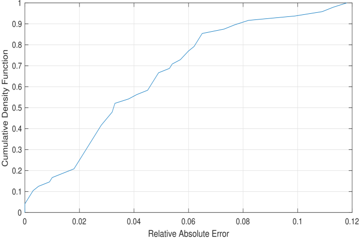
The image depicts a line graph illustrating the relationship between **Relative Absolute Error** (x-axis) and **Cumulative Density Function** (y-axis). The graph shows a monotonically increasing curve starting at (0, 0) and ending at (0.12, 1), with grid lines for reference. No legends, titles, or additional annotations are present.
---
### Components/Axes
- **X-axis (Horizontal)**:
- Label: **Relative Absolute Error**
- Scale: 0.00 to 0.12 in increments of 0.02
- Position: Bottom of the graph
- **Y-axis (Vertical)**:
- Label: **Cumulative Density Function**
- Scale: 0.00 to 1.00 in increments of 0.10
- Position: Left side of the graph
- **Line**:
- Color: Blue
- Path: Starts at (0, 0), ends at (0.12, 1)
- Trend: Gradually steepens in the middle, then flattens near the top
- **Grid**:
- Light gray horizontal and vertical lines for reference
---
### Detailed Analysis
1. **Key Data Points**:
- At **Relative Absolute Error = 0.02**, **Cumulative Density Function ≈ 0.20**
- At **Relative Absolute Error = 0.04**, **Cumulative Density Function ≈ 0.50**
- At **Relative Absolute Error = 0.06**, **Cumulative Density Function ≈ 0.70**
- At **Relative Absolute Error = 0.08**, **Cumulative Density Function ≈ 0.90**
- At **Relative Absolute Error = 0.10**, **Cumulative Density Function ≈ 0.95**
- At **Relative Absolute Error = 0.12**, **Cumulative Density Function = 1.00**
2. **Trend Verification**:
- The line exhibits a **concave upward** shape initially, with a steep slope between 0.02 and 0.06.
- After 0.06, the slope decreases, and the curve flattens as it approaches 1.00.
3. **Spatial Grounding**:
- The line occupies the central region of the graph, anchored at the origin (bottom-left) and terminating at the top-right corner.
- No other elements (e.g., legends, annotations) are present.
---
### Key Observations
- The **Cumulative Density Function** increases monotonically with **Relative Absolute Error**, suggesting a direct relationship.
- The curve’s flattening near the top (after 0.08) indicates diminishing returns or saturation.
- No outliers or anomalies are visible.
---
### Interpretation
The graph likely represents a **probability distribution** or **error threshold analysis**, where:
- **Cumulative Density Function** quantifies the proportion of data points with errors ≤ a given threshold.
- The steep rise between 0.02 and 0.06 suggests a critical range where most errors are concentrated.
- The flattening trend implies that errors beyond 0.08 are rare or negligible in this context.
This could be used to model system performance, risk assessment, or quality control, where understanding error distribution is critical. The absence of a legend or title limits contextual interpretation, but the mathematical relationship is clear.