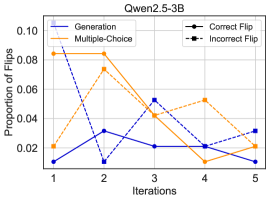
## Line Chart: Proportion of Flips Across Iterations for Qwen2.5-3B
### Overview
The chart illustrates the proportion of "flips" (likely correct or incorrect responses) for two methods—**Generation** and **Multiple-Choice**—across five iterations. The y-axis represents the proportion of flips (0.00 to 0.10), and the x-axis represents iterations (1 to 5). Two data series are plotted: a blue line for **Generation** and an orange line for **Multiple-Choice**. A legend distinguishes **Correct Flip** (solid line) and **Incorrect Flip** (dashed line), though the chart only shows solid lines for both methods.
---
### Components/Axes
- **Title**: "Qwen2.5-3B"
- **Y-Axis**: "Proportion of Flips" (scale: 0.00 to 0.10, increments of 0.02)
- **X-Axis**: "Iterations" (labeled 1 to 5)
- **Legend**:
- **Generation**: Blue solid line
- **Multiple-Choice**: Orange solid line
- **Correct Flip**: Solid line (blue)
- **Incorrect Flip**: Dashed line (orange)
---
### Detailed Analysis
#### Generation (Blue Line)
- **Iteration 1**: ~0.01
- **Iteration 2**: ~0.03
- **Iteration 3**: ~0.02
- **Iteration 4**: ~0.04
- **Iteration 5**: ~0.02
- **Trend**: Starts low, peaks at iteration 2, then fluctuates with a slight increase at iteration 4 before dropping.
#### Multiple-Choice (Orange Line)
- **Iteration 1**: ~0.08
- **Iteration 2**: ~0.06
- **Iteration 3**: ~0.04
- **Iteration 4**: ~0.05
- **Iteration 5**: ~0.02
- **Trend**: Starts high, decreases steadily, with a minor uptick at iteration 4 before a sharp drop.
---
### Key Observations
1. **Initial Disparity**: Multiple-Choice begins with a significantly higher proportion of flips (~0.08) compared to Generation (~0.01) at iteration 1.
2. **Divergent Trends**:
- Generation shows volatility but stabilizes around 0.02–0.04 after iteration 2.
- Multiple-Choice declines consistently, with a brief rise at iteration 4.
3. **Legend Ambiguity**: The legend labels "Correct Flip" (solid) and "Incorrect Flip" (dashed) conflict with the chart’s solid lines for both methods. This suggests a possible mislabeling or misinterpretation of the data.
---
### Interpretation
- **Data Meaning**: The chart likely tracks the proportion of **correct flips** (e.g., model adjustments or corrections) for two methods over iterations. The **Generation** method shows a more variable but stabilizing trend, while **Multiple-Choice** declines sharply, suggesting it may be less effective or less adaptable over time.
- **Legend Confusion**: The legend’s "Correct Flip" and "Incorrect Flip" labels do not align with the solid lines for both methods. This could indicate:
- A mislabeling error in the legend.
- The lines represent **total flips** (correct + incorrect), with the legend incorrectly categorizing them.
- **Implications**: If the lines represent **correct flips**, the data suggests that **Generation** may improve over iterations, while **Multiple-Choice** deteriorates. If they represent **incorrect flips**, the opposite would be true. Further clarification of the legend is critical for accurate interpretation.
---
**Note**: The chart lacks explicit data points for "Incorrect Flip," and the legend’s labels may not correspond to the plotted lines. This ambiguity limits definitive conclusions without additional context.