TECHNICAL ASSET FINGERPRINT
492388fa55ec5dccb3aa6a0f
Click to view fullscreen
Press ESC or click to close
FOUND IN PAPERS
EXPERT: healer-alpha-free VERSION 1
RUNTIME: free/openrouter/healer-alpha
INTEL_VERIFIED
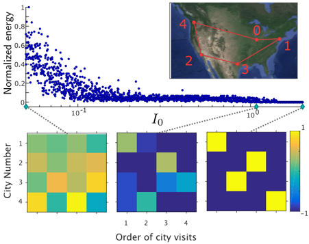
## Scatter Plot with Heatmaps and Network Diagram
### Overview
The image is a composite technical figure containing three interconnected visualizations: a main scatter plot, an inset network map, and three corresponding heatmaps. The figure appears to analyze the relationship between a parameter \(I_0\) and "Normalized energy" for a system involving visits to five cities, likely related to an optimization problem such as the Traveling Salesman Problem (TSP). The heatmaps visualize the "Order of city visits" for specific data points highlighted in the scatter plot.
### Components/Axes
1. **Main Scatter Plot (Top Left):**
* **Y-axis:** Label: "Normalized energy". Scale: Linear, from 0 to 1. Ticks at 0, 0.2, 0.4, 0.6, 0.8, 1.
* **X-axis:** Label: "\(I_0\)". Scale: Logarithmic. Major ticks at \(10^{-1}\) and \(10^{0}\) (i.e., 0.1 and 1). The axis spans approximately from 0.05 to 1.5.
* **Data:** A dense cloud of blue data points. Three specific points are highlighted with cyan circles and connected via dashed lines to the heatmaps below.
* **Legend:** None explicit. The cyan circles serve as markers for specific cases.
2. **Inset Network Map (Top Right):**
* **Content:** A map of North America with five labeled nodes (cities) connected by red lines.
* **Node Labels:** The cities are numbered 0, 1, 2, 3, 4.
* **Spatial Layout (Approximate):**
* City 0: North-central United States (e.g., near Nebraska).
* City 1: East Coast of the United States (e.g., near New York).
* City 2: Southwestern United States (e.g., near Arizona).
* City 3: Southeastern United States (e.g., near Georgia).
* City 4: Northwestern United States (e.g., near Washington state).
* **Connections:** Red lines form a complete graph, connecting every city to every other city.
3. **Heatmaps (Bottom Row):**
* **Common Structure:** Three 4x4 grids.
* **Y-axis (for all):** Label: "City Number". Ticks: 1, 2, 3, 4.
* **X-axis (for all):** Label: "Order of city visits". Ticks: 1, 2, 3, 4.
* **Color Bar (Rightmost):** A vertical bar labeled from -1 (dark blue) to 1 (bright yellow). The gradient passes through teal and green. This scale applies to all three heatmaps.
* **Connection:** Each heatmap is linked by a dashed line to one of the three cyan-circled points on the scatter plot, from left to right corresponding to increasing \(I_0\).
### Detailed Analysis
**1. Scatter Plot Trend:**
* **Visual Trend:** The cloud of blue points shows a clear negative correlation. As \(I_0\) increases (moving right on the log scale), the "Normalized energy" decreases. The relationship is non-linear, with a steep drop at low \(I_0\) values that flattens out as \(I_0\) approaches 1.
* **Highlighted Points:**
* **Point A (Leftmost):** Located at approximately \(I_0 \approx 0.06\), Normalized energy \(\approx 0.05\). Connected to the leftmost heatmap.
* **Point B (Middle):** Located at approximately \(I_0 \approx 0.3\), Normalized energy \(\approx 0.02\). Connected to the middle heatmap.
* **Point C (Rightmost):** Located at approximately \(I_0 \approx 1.0\), Normalized energy \(\approx 0.01\). Connected to the rightmost heatmap.
**2. Heatmap Content (Order of City Visits):**
* **Leftmost Heatmap (Low \(I_0\), Point A):** The pattern is diffuse. High values (yellow/green) are scattered, suggesting a less ordered or more random visitation sequence. No clear diagonal.
* **Middle Heatmap (Medium \(I_0\), Point B):** The pattern becomes more structured. A diagonal trend begins to emerge, with higher values (yellow) appearing near the diagonal (e.g., City 1 at Visit 1, City 2 at Visit 2).
* **Rightmost Heatmap (High \(I_0\), Point C):** Shows a near-perfect diagonal pattern. Bright yellow squares are located precisely at (City 1, Visit 1), (City 2, Visit 2), (City 3, Visit 3), and (City 4, Visit 4). This indicates a highly ordered, sequential visitation plan: City 1 is visited first, City 2 second, and so on.
### Key Observations
1. **Inverse Relationship:** There is a strong inverse relationship between the parameter \(I_0\) and the system's "Normalized energy." Higher \(I_0\) leads to lower energy states.
2. **Order from Disorder:** The progression of the three heatmaps demonstrates a transition from a disordered state (scattered high values) to a highly ordered state (clear diagonal) as \(I_0\) increases and energy decreases.
3. **Network Context:** The inset map defines the problem space—a TSP-like scenario with 5 cities. The heatmaps do not show the *route* (which city connects to which), but rather the *sequence* in which cities are visited.
4. **Color Scale Interpretation:** The color bar from -1 to 1 likely represents a correlation or assignment strength. A value of 1 (yellow) indicates a strong, definitive assignment of a city to a specific visit order. A value of -1 (blue) indicates a strong negative assignment.
### Interpretation
This figure likely illustrates the results of an optimization or annealing process (e.g., simulated annealing, quantum annealing) applied to a combinatorial problem like the Traveling Salesman Problem.
* **\(I_0\) as a Control Parameter:** \(I_0\) appears to be a control parameter that influences the system's ability to find low-energy (optimal or near-optimal) solutions. It could represent temperature, noise level, or a quantum tunneling parameter.
* **Energy as Cost Function:** "Normalized energy" represents the cost function of the problem (e.g., total tour length). Lower energy corresponds to a better solution.
* **The Core Finding:** The data suggests that increasing \(I_0\) drives the system toward lower-energy states. Crucially, these low-energy states correspond to highly ordered, sequential visitation plans (the diagonal heatmap). This implies that the optimal solution for this specific 5-city network is a simple sequential tour (1→2→3→4→...).
* **Underlying Mechanism:** The transition from the diffuse heatmap to the diagonal one visualizes the "freezing out" of disorder. At high energy (low \(I_0\)), many visitation sequences are possible (high entropy). At low energy (high \(I_0\)), the system settles into one specific, ordered sequence (low entropy), which is the optimal solution.
**In summary, the figure demonstrates how tuning a parameter \(I_0\) allows a system to escape high-energy, disordered states and converge onto a low-energy, highly ordered solution to a routing problem.**
DECODING INTELLIGENCE...