\n
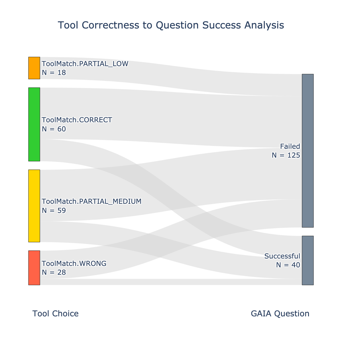
## Alluvial Diagram: Tool Correctness to Question Success Analysis
### Overview
This image presents an alluvial diagram visualizing the relationship between "Tool Choice" and "GAIA Question" outcomes (Successful or Failed). The diagram uses colored bands to represent different levels of tool correctness (ToolMatch.CORRECT, ToolMatch.PARTIAL_LOW, ToolMatch.PARTIAL_MEDIUM, ToolMatch.WRONG) and their corresponding flow to either a successful or failed question outcome. The width of each band represents the number of instances (N).
### Components/Axes
* **X-axis:** Represents the two categories: "Tool Choice" on the left and "GAIA Question" on the right.
* **Y-axis:** Implicitly represents the different levels of tool correctness.
* **Legend:** Located in the top-left corner, it defines the color coding for each tool correctness level:
* Yellow: ToolMatch.PARTIAL_LOW (N = 18)
* Green: ToolMatch.CORRECT (N = 60)
* Orange: ToolMatch.PARTIAL_MEDIUM (N = 59)
* Red: ToolMatch.WRONG (N = 28)
* **GAIA Question Outcomes:**
* Blue: Failed (N = 125)
* Gray: Successful (N = 40)
### Detailed Analysis
The diagram shows the flow from each tool correctness level to either a successful or failed GAIA question.
* **ToolMatch.PARTIAL_LOW (Yellow, N=18):** Approximately 15 instances flow to "Failed" and 3 instances flow to "Successful".
* **ToolMatch.CORRECT (Green, N=60):** The majority (approximately 55 instances) flow to "Successful", while a smaller portion (approximately 5 instances) flow to "Failed".
* **ToolMatch.PARTIAL_MEDIUM (Orange, N=59):** A significant portion (approximately 50 instances) flow to "Failed", and a smaller portion (approximately 9 instances) flow to "Successful".
* **ToolMatch.WRONG (Red, N=28):** Almost all instances (approximately 25 instances) flow to "Failed", with only a very small number (approximately 3 instances) flowing to "Successful".
### Key Observations
* The "Failed" outcome (blue) has a significantly higher total count (N=125) than the "Successful" outcome (N=40).
* "ToolMatch.CORRECT" has the highest number of instances (N=60) and predominantly leads to "Successful" outcomes.
* "ToolMatch.WRONG" almost exclusively leads to "Failed" outcomes.
* "ToolMatch.PARTIAL_LOW" and "ToolMatch.PARTIAL_MEDIUM" have a more balanced flow to both "Successful" and "Failed" outcomes, but with a stronger tendency towards "Failed".
### Interpretation
The data suggests a strong correlation between tool correctness and question success. When the tool choice is correct ("ToolMatch.CORRECT"), the question is much more likely to be answered successfully. Conversely, when the tool choice is wrong ("ToolMatch.WRONG"), the question is almost always answered incorrectly. Partial matches ("ToolMatch.PARTIAL_LOW" and "ToolMatch.PARTIAL_MEDIUM") result in a more mixed outcome, indicating that the level of partial correctness influences the likelihood of success.
The large number of "Failed" outcomes overall suggests that the tool selection process is not consistently accurate, or that even with a correct tool, there are other factors contributing to question failure. The diagram highlights the importance of accurate tool selection for achieving successful question answering. The flow of bands visually demonstrates the probabilistic relationship between tool choice and outcome, with wider bands indicating a higher probability. The diagram is a clear visualization of the impact of tool correctness on the overall success rate of the GAIA question answering system.