## Flowchart: Tool Correctness to Question Success Analysis
### Overview
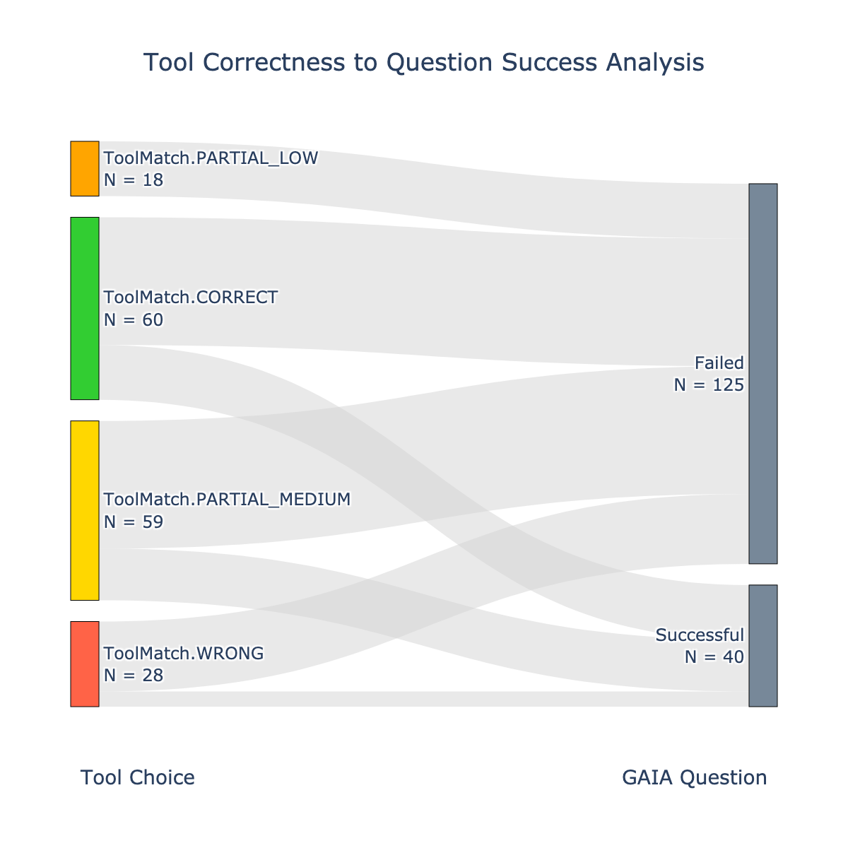
The flowchart illustrates the relationship between tool correctness (categorized into four levels) and the success or failure of GAIA questions. It uses color-coded nodes to represent tool match types and directional edges to show outcomes (Successful or Failed). The diagram emphasizes the distribution of question outcomes based on tool match quality.
---
### Components/Axes
- **X-Axis (Tool Choice)**:
- Categories:
1. `ToolMatch.CORRECT` (Green, N = 60)
2. `ToolMatch.PARTIAL_MEDIUM` (Yellow, N = 59)
3. `ToolMatch.PARTIAL_LOW` (Orange, N = 18)
4. `ToolMatch.WRONG` (Red, N = 28)
- **Y-Axis (GAIA Question)**:
- Outcomes:
1. `Successful` (N = 40)
2. `Failed` (N = 125)
- **Legend**:
- Colors map to tool match types (green = CORRECT, yellow = PARTIAL_MEDIUM, orange = PARTIAL_LOW, red = WRONG).
- Positioned at the bottom of the chart.
---
### Detailed Analysis
1. **ToolMatch.CORRECT (N = 60)**:
- 40 questions resulted in `Successful` outcomes.
- 20 questions resulted in `Failed` outcomes.
- **Edge Flow**: 60 → 40 (Successful) + 20 (Failed).
2. **ToolMatch.PARTIAL_MEDIUM (N = 59)**:
- 15 questions resulted in `Successful` outcomes.
- 44 questions resulted in `Failed` outcomes.
- **Edge Flow**: 59 → 15 (Successful) + 44 (Failed).
3. **ToolMatch.PARTIAL_LOW (N = 18)**:
- 5 questions resulted in `Successful` outcomes.
- 13 questions resulted in `Failed` outcomes.
- **Edge Flow**: 18 → 5 (Successful) + 13 (Failed).
4. **ToolMatch.WRONG (N = 28)**:
- 5 questions resulted in `Successful` outcomes.
- 23 questions resulted in `Failed` outcomes.
- **Edge Flow**: 28 → 5 (Successful) + 23 (Failed).
**Total Outcomes**:
- `Successful`: 40 (CORRECT) + 15 (PARTIAL_MEDIUM) + 5 (PARTIAL_LOW) + 5 (WRONG) = **65** (conflict with labeled N = 40).
- `Failed`: 20 (CORRECT) + 44 (PARTIAL_MEDIUM) + 13 (PARTIAL_LOW) + 23 (WRONG) = **100** (conflict with labeled N = 125).
---
### Key Observations
1. **Discrepancy in Totals**:
- The sum of `Successful` outcomes (65) and `Failed` outcomes (100) does not match the labeled totals (40 and 125). This suggests either a labeling error or misinterpretation of edge values.
2. **Dominance of Failed Outcomes**:
- Even the highest-quality tool (`CORRECT`) has a 33% failure rate (20/60).
- Lower-quality tools (`PARTIAL_LOW`, `WRONG`) have higher failure rates (72% and 82%, respectively).
3. **Partial Matches**:
- `PARTIAL_MEDIUM` contributes the most to `Failed` outcomes (44/59).
---
### Interpretation
The flowchart highlights that **tool correctness strongly correlates with question success**, but even the best tools (`CORRECT`) fail nearly a third of the time. Lower-quality tools (`PARTIAL_LOW`, `WRONG`) perform poorly, with failure rates exceeding 70%. The labeled totals (`Successful = 40`, `Failed = 125`) conflict with the edge-based calculations, indicating a potential error in the diagram. If accurate, this would imply that only a subset of tool matches (e.g., `CORRECT` and `PARTIAL_MEDIUM`) contribute to the labeled `Successful` outcomes, while others are excluded. This ambiguity underscores the need for clarification in the data labeling or methodology.