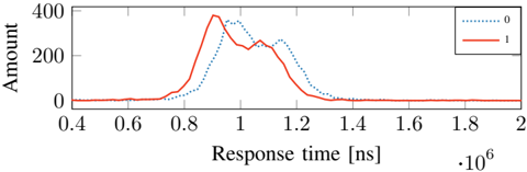
## Line Chart: Response Time Distribution Comparison
### Overview
The image displays a line chart comparing the distribution of "Amount" (likely frequency or count) against "Response time" in nanoseconds (ns) for two distinct categories labeled "0" and "1". The chart shows two overlapping, bell-shaped curves, indicating the response time profiles for each category.
### Components/Axes
* **Chart Type:** Line chart with two data series.
* **X-Axis:**
* **Label:** `Response time [ns]`
* **Scale:** Linear, ranging from 0.4 to 2.0.
* **Multiplier:** A notation at the bottom right indicates `·10^6`, meaning the displayed values are in millions of nanoseconds (i.e., microseconds). The effective range is 400,000 ns to 2,000,000 ns (or 400 µs to 2000 µs).
* **Major Ticks:** 0.4, 0.6, 0.8, 1.0, 1.2, 1.4, 1.6, 1.8, 2.0.
* **Y-Axis:**
* **Label:** `Amount`
* **Scale:** Linear, ranging from 0 to 400.
* **Major Ticks:** 0, 200, 400.
* **Legend:**
* **Position:** Top-right corner of the plot area.
* **Series 0:** Represented by a blue dotted line (`......`).
* **Series 1:** Represented by a red solid line (`——`).
### Detailed Analysis
**Trend Verification & Data Points:**
* **Series 1 (Red Solid Line):**
* **Trend:** The line starts near zero, rises sharply to a primary peak, dips slightly, forms a secondary lower peak, and then declines back to near zero.
* **Key Points (Approximate):**
* Baseline: ~0 from 0.4 to ~0.75 on the x-axis.
* Primary Peak: Occurs at approximately x = 0.95 (950,000 ns), with a y-value of ~380.
* Trough: Between peaks at approximately x = 1.05, y ≈ 250.
* Secondary Peak: At approximately x = 1.1 (1,100,000 ns), y ≈ 280.
* Returns to baseline (~0) by x ≈ 1.35.
* **Series 0 (Blue Dotted Line):**
* **Trend:** The line starts near zero, rises to a single, smoother peak, and then declines back to near zero. Its peak is shifted to the right (higher response time) compared to Series 1's primary peak.
* **Key Points (Approximate):**
* Baseline: ~0 from 0.4 to ~0.8 on the x-axis.
* Peak: Occurs at approximately x = 1.05 (1,050,000 ns), with a y-value of ~350.
* Returns to baseline (~0) by x ≈ 1.4.
**Spatial Grounding & Component Isolation:**
* **Header Region:** Contains the chart title area (empty in this image) and the legend in the top-right.
* **Main Chart Region:** Contains the two plotted lines and the grid/tick marks.
* **Footer Region:** Contains the x-axis label and the `·10^6` multiplier notation in the bottom-right corner.
* The two curves overlap significantly between x ≈ 0.85 and x ≈ 1.25. The red line (1) is generally above the blue line (0) for response times less than ~1.05, and below it for times greater than ~1.05.
### Key Observations
1. **Bimodal vs. Unimodal:** Series 1 (red) exhibits a bimodal distribution (two peaks), while Series 0 (blue) appears unimodal (one peak).
2. **Temporal Shift:** The central tendency (peak) of Series 1 occurs at a lower response time (~950 µs) than that of Series 0 (~1050 µs).
3. **Amplitude Difference:** The maximum "Amount" for Series 1 (~380) is higher than the maximum for Series 0 (~350).
4. **Distribution Width:** Both distributions have a similar overall width, spanning roughly 500,000 ns (0.5 on the x-axis scale) from rise to fall.
### Interpretation
This chart likely compares the performance or behavior of two different systems, conditions, or groups (labeled 0 and 1) in terms of their response time characteristics.
* **What the data suggests:** Category "1" tends to have a **faster initial response** (earlier primary peak) but with more variability or a two-stage process, as indicated by its bimodal shape. Category "0" has a **slower, more consistent** single-stage response profile.
* **Relationship between elements:** The overlap area represents response times common to both categories. The point where the lines cross (~1.05 on the x-axis) is the response time at which the "Amount" for both categories is equal; it also marks the peak of Series 0 and the trough of Series 1.
* **Notable anomalies:** The distinct bimodal shape of Series 1 is the most significant feature. It could indicate two underlying sub-populations or processes within category "1" (e.g., a fast path and a slow path), whereas category "0" represents a more homogeneous process. The higher peak of Series 1 suggests a greater concentration of events around its primary mode.