## Heatmap: Response Time Distribution
### Overview
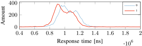
The heatmap illustrates the distribution of response times for two different conditions, labeled as 0 and 1. The x-axis represents the response time in nanoseconds (ns), while the y-axis represents the amount of data processed.
### Components/Axes
- **X-axis**: Response time [ns]
- **Y-axis**: Amount
- **Legend**:
- Red line: Condition 0
- Blue line: Condition 1
### Detailed Analysis or ### Content Details
- **Condition 0**: The response time for Condition 0 is relatively low, with a peak around 0.6 ns and a slight increase to 0.8 ns. The amount of data processed is low, with a peak around 200,000 and a slight decrease to 100,000.
- **Condition 1**: The response time for Condition 1 is higher, with a peak around 1.2 ns and a slight increase to 1.4 ns. The amount of data processed is higher, with a peak around 400,000 and a slight decrease to 300,000.
### Key Observations
- **Condition 1** generally has higher response times compared to Condition 0.
- **Condition 1** also processes more data than Condition 0.
- There is a slight trend of increasing response time with increasing data amount for both conditions.
### Interpretation
The heatmap suggests that Condition 1 has a higher response time and processes more data compared to Condition 0. This could indicate that Condition 1 is more computationally intensive or has a higher latency. The slight increase in response time with increasing data amount for both conditions suggests that the system's performance may be limited by the amount of data being processed.