## Line Chart: Processing Time vs. ID Batch Size
### Overview
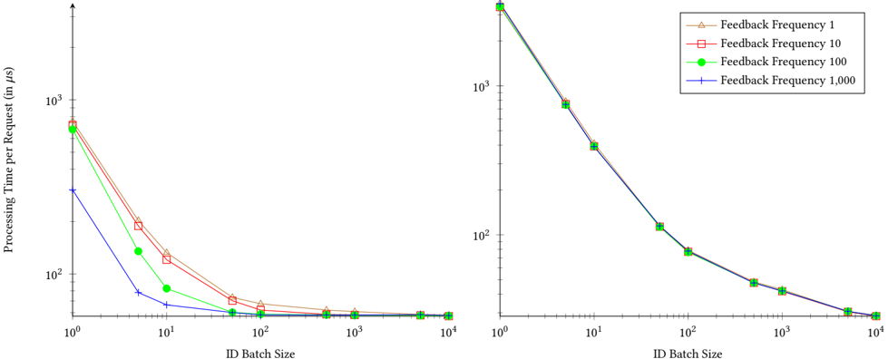
The image displays two side-by-side line charts comparing "Processing Time per Request (in $\mu s$)" against "ID Batch Size." Both charts utilize a logarithmic scale for both the X and Y axes. The charts illustrate how different "Feedback Frequencies" (1, 10, 100, and 1,000) impact processing time as the batch size increases. The left chart shows distinct performance variance based on feedback frequency at lower batch sizes, while the right chart shows all feedback frequencies converging into a single performance profile.
### Components/Axes
* **X-Axis (Both Charts):** "ID Batch Size." Logarithmic scale ranging from $10^0$ (1) to $10^4$ (10,000).
* **Y-Axis (Both Charts):** "Processing Time per Request (in $\mu s$)." Logarithmic scale.
* Left Chart: Range is approximately $60 \mu s$ to $1000 \mu s$.
* Right Chart: Range is approximately $50 \mu s$ to $>1000 \mu s$.
* **Legend (Top-right of the right chart):**
* **Tan Triangle:** Feedback Frequency 1
* **Red Square:** Feedback Frequency 10
* **Green Circle:** Feedback Frequency 100
* **Blue Plus (+):** Feedback Frequency 1,000
### Detailed Analysis
#### Left Chart
* **Trend:** All four data series exhibit a sharp downward slope as the ID Batch Size increases from 1 to 100. Beyond a batch size of 100, the curves flatten significantly, approaching a horizontal asymptote near $60 \mu s$.
* **Data Points (Approximate):**
* **Batch Size 1:** The lines are separated. Feedback Frequency 1,000 (Blue) is the fastest at $\approx 350 \mu s$. Feedback Frequency 100 (Green) is $\approx 600 \mu s$. Feedback Frequency 10 (Red) and 1 (Tan) are the slowest, both clustering around $\approx 750 \mu s$.
* **Batch Size 10:** The lines remain separated but the gap narrows. Feedback Frequency 1,000 (Blue) is $\approx 80 \mu s$. Feedback Frequency 100 (Green) is $\approx 120 \mu s$. Feedback Frequency 10 (Red) is $\approx 180 \mu s$. Feedback Frequency 1 (Tan) is $\approx 200 \mu s$.
* **Batch Size 100+:** All lines converge to approximately $60 \mu s$.
#### Right Chart
* **Trend:** All four data series overlap almost perfectly, creating a single, unified downward curve. The slope is steep from batch size 1 to 100, then flattens.
* **Data Points (Approximate):**
* **Batch Size 1:** All lines start at a high point of $\approx 3,000 \mu s$.
* **Batch Size 10:** All lines drop to $\approx 700 \mu s$.
* **Batch Size 100:** All lines drop to $\approx 120 \mu s$.
* **Batch Size 1,000:** All lines drop to $\approx 60 \mu s$.
* **Batch Size 10,000:** All lines drop to $\approx 50 \mu s$.
### Key Observations
* **Divergence vs. Convergence:** The left chart demonstrates that at low batch sizes, the "Feedback Frequency" is a critical variable for performance. The right chart demonstrates that under different conditions (likely a different workload or system configuration), the "Feedback Frequency" becomes irrelevant to the processing time.
* **Economies of Scale:** In both charts, increasing the ID Batch Size consistently reduces the processing time per request, indicating that the system is significantly more efficient when processing larger batches.
* **Performance Inversion:** In the left chart, higher feedback frequency (1,000) results in *lower* processing time (better performance) at low batch sizes. This is counter-intuitive if one assumes "feedback" is an overhead cost, suggesting that in this specific context, the feedback mechanism might be optimizing the process or reducing contention.
### Interpretation
The data suggests two distinct operational modes or system states.
1. **The Left Chart** represents a scenario where the feedback mechanism provides a tangible performance benefit at low batch sizes. The fact that "Feedback Frequency 1,000" is faster than "Feedback Frequency 1" suggests that the feedback loop might be facilitating better resource utilization, caching, or state management when requests are sparse.
2. **The Right Chart** represents a scenario where the system is likely bottlenecked by something other than the feedback mechanism (e.g., I/O throughput or CPU limits), rendering the feedback frequency irrelevant. The significantly higher starting latency at Batch Size 1 in the right chart ($\approx 3,000 \mu s$ vs $\approx 750 \mu s$ in the left) suggests the right chart represents a more "expensive" or "heavier" operation where the feedback frequency overhead is negligible compared to the base cost of the request.
In summary, the system exhibits high sensitivity to feedback frequency only when the batch size is small and the base processing cost is relatively low. As batch sizes increase, the system reaches a point of diminishing returns where the overhead of the feedback mechanism is amortized or overshadowed by the batch processing efficiency.