## Dual Logarithmic Line Charts: Processing Time vs. ID Batch Size
### Overview
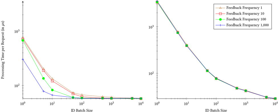
The image displays two side-by-side line charts on a white background. Both charts plot "Processing Time per Request (in μs)" against "ID Batch Size" on logarithmic scales. The charts compare the performance of four different "Feedback Frequency" settings (1, 10, 100, 1000). The left chart shows a clear separation between the data series, while the right chart shows the series converging closely.
### Components/Axes
* **Chart Type:** Dual logarithmic line charts.
* **X-Axis (Both Charts):** Label: "ID Batch Size". Scale: Logarithmic (base 10). Major tick marks and labels at: 10⁰ (1), 10¹ (10), 10² (100), 10³ (1000), 10⁴ (10000).
* **Y-Axis (Left Chart):** Label: "Processing Time per Request (in μs)". Scale: Logarithmic (base 10). Major tick marks and labels at: 10² (100), 10³ (1000).
* **Y-Axis (Right Chart):** No explicit label, but the scale and context imply it is also "Processing Time per Request (in μs)". Scale: Logarithmic (base 10). Major tick marks and labels at: 10² (100), 10³ (1000), 10⁴ (10000).
* **Legend:** Located in the top-right corner of the right chart. Contains four entries:
1. `Feedback Frequency 1`: Brown line with upward-pointing triangle markers.
2. `Feedback Frequency 10`: Red line with square markers.
3. `Feedback Frequency 100`: Green line with circular markers.
4. `Feedback Frequency 1,000`: Blue line with plus-sign (+) markers.
### Detailed Analysis
**Left Chart Analysis:**
* **Trend Verification:** All four lines show a strong, consistent downward trend. Processing time decreases sharply as ID Batch Size increases from 1 to 100, then plateaus for batch sizes from 100 to 10,000.
* **Data Series & Approximate Values (in μs):**
* **Feedback Frequency 1 (Brown Triangle):** Starts highest at ~700 μs (Batch Size 1). Drops to ~200 μs (Batch Size 10), ~60 μs (Batch Size 100), and stabilizes near ~50 μs for larger batches.
* **Feedback Frequency 10 (Red Square):** Starts at ~650 μs (Batch Size 1). Drops to ~150 μs (Batch Size 10), ~55 μs (Batch Size 100), and stabilizes near ~50 μs.
* **Feedback Frequency 100 (Green Circle):** Starts at ~600 μs (Batch Size 1). Drops to ~120 μs (Batch Size 10), ~50 μs (Batch Size 100), and stabilizes near ~50 μs.
* **Feedback Frequency 1,000 (Blue Plus):** Starts significantly lower at ~300 μs (Batch Size 1). Drops to ~80 μs (Batch Size 10), ~50 μs (Batch Size 100), and stabilizes near ~50 μs.
* **Key Observation:** There is a clear performance hierarchy at small batch sizes (1-10): higher feedback frequency (1000) results in lower processing time per request. This advantage diminishes and disappears as batch size increases beyond 100.
**Right Chart Analysis:**
* **Trend Verification:** All four lines show a strong, consistent downward trend, nearly identical in shape. Processing time decreases sharply as ID Batch Size increases from 1 to 1000, then continues a slower decline to 10,000.
* **Data Series & Approximate Values (in μs):**
* All four series (Feedback Frequencies 1, 10, 100, 1000) are tightly clustered, making individual values difficult to distinguish. They follow the same path.
* Approximate shared values: Starts at ~10,000 μs (Batch Size 1). Drops to ~1,000 μs (Batch Size 10), ~100 μs (Batch Size 100), ~50 μs (Batch Size 1000), and ~30 μs (Batch Size 10,000).
* **Key Observation:** The performance difference between feedback frequencies is negligible in this chart. The processing time is an order of magnitude higher at small batch sizes compared to the left chart (e.g., ~10,000 μs vs. ~700 μs at Batch Size 1).
### Key Observations
1. **Inverse Relationship:** Both charts demonstrate a strong inverse, logarithmic relationship between ID Batch Size and Processing Time per Request. Increasing batch size dramatically reduces per-request time.
2. **Diminishing Returns:** The performance gain from increasing batch size diminishes significantly after a batch size of approximately 100-1000.
3. **Divergent Impact of Feedback Frequency:** The impact of the "Feedback Frequency" parameter is highly context-dependent. It creates a significant performance stratification in the left chart (especially at low batch sizes) but has almost no effect in the right chart.
4. **Scale Discrepancy:** The right chart's y-axis values are roughly 10-15 times higher than the left chart's at the smallest batch size, suggesting the two charts may represent different system configurations, workloads, or measurement points (e.g., left: network/IO time, right: total computation time).
### Interpretation
The data suggests a system where batching requests is a highly effective optimization strategy for reducing per-request processing latency. The "Feedback Frequency" parameter appears to control a component or process whose overhead is amortized more effectively with larger batches.
The stark difference between the two charts implies they are measuring different aspects of the same system or two different systems. The left chart likely isolates a specific, optimizable component (e.g., a network call or a database lookup) where the feedback mechanism's overhead is visible and can be tuned. The right chart likely represents the total end-to-end processing time, where the dominant cost (e.g., core computation) overshadows the effect of the feedback frequency, leading to convergent performance.
**Notable Anomaly:** The blue line (Feedback Frequency 1,000) in the left chart starts at a much lower point (~300 μs) than the others (~600-700 μs) at Batch Size 1. This indicates that for this specific configuration, a high feedback frequency drastically reduces the fixed overhead cost per request when no batching is applied. This advantage is completely eroded once batching is introduced (Batch Size ≥ 100).