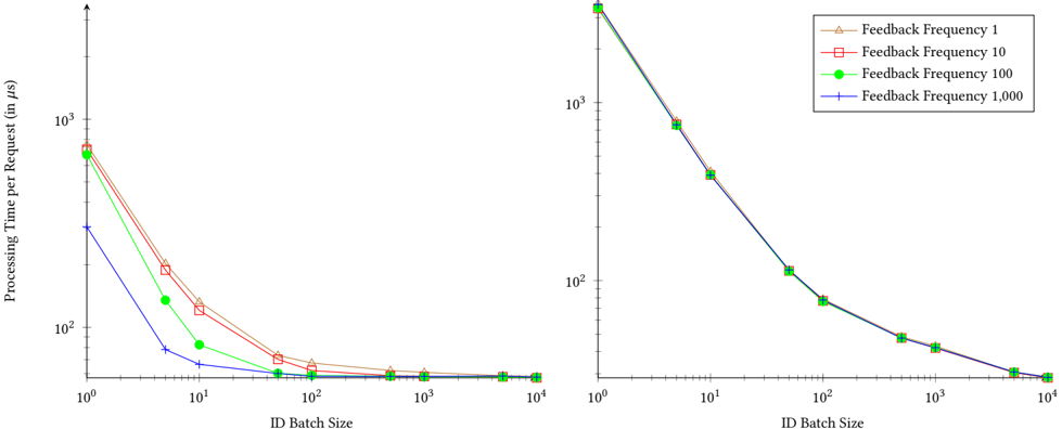
## Line Graph: Processing Time per Request vs. ID Batch Size
### Overview
The image contains two side-by-side line graphs comparing processing time per request (in microseconds) across different ID batch sizes (10⁰ to 10⁴). Both charts use logarithmic scales on the x-axis (batch size) and y-axis (processing time). The left chart shows a broader y-axis range (10² to 10³ μs), while the right chart focuses on a narrower range (10² to 10³ μs). Four data series represent feedback frequencies (1, 10, 100, 1000) with distinct colors and markers.
---
### Components/Axes
- **Left Chart**:
- **Y-axis**: "Processing Time per Request (in μs)" (log scale: 10² to 10³ μs)
- **X-axis**: "ID Batch Size" (log scale: 10⁰ to 10⁴)
- **Legend**: Located on the right, with four entries:
- Feedback Frequency 1 (brown triangles)
- Feedback Frequency 10 (red squares)
- Feedback Frequency 100 (green circles)
- Feedback Frequency 1000 (blue crosses)
- **Right Chart**:
- **Y-axis**: "Processing Time per Request (in μs)" (log scale: 10² to 10³ μs)
- **X-axis**: "ID Batch Size" (log scale: 10⁰ to 10⁴)
- **Legend**: Identical to the left chart, positioned on the right.
---
### Detailed Analysis
#### Left Chart Trends
1. **Feedback Frequency 1 (brown triangles)**:
- Starts at ~10³ μs for batch size 10⁰.
- Gradually declines to ~10² μs at batch size 10⁴.
- Slope is the least steep among all series.
2. **Feedback Frequency 10 (red squares)**:
- Begins at ~10³ μs for batch size 10⁰.
- Drops to ~10² μs at batch size 10².
- Slope is steeper than Frequency 1 but less than Frequency 100.
3. **Feedback Frequency 100 (green circles)**:
- Starts at ~10³ μs for batch size 10⁰.
- Plummets to ~10¹ μs at batch size 10¹.
- Slope is the steepest, indicating rapid improvement.
4. **Feedback Frequency 1000 (blue crosses)**:
- Begins at ~10³ μs for batch size 10⁰.
- Falls to ~10¹ μs at batch size 10¹.
- Slope is nearly identical to Frequency 100, with minimal divergence.
#### Right Chart Trends
- All lines follow the same trajectory as the left chart but are compressed vertically due to the narrower y-axis range (10² to 10³ μs).
- At batch size 10⁰, all frequencies start near 10³ μs.
- By batch size 10², all lines converge near 10² μs, showing diminishing returns at larger batch sizes.
---
### Key Observations
1. **Inverse Relationship**: Processing time decreases exponentially with increasing batch size for all feedback frequencies.
2. **Frequency Impact**: Higher feedback frequencies (1000 > 100 > 10 > 1) achieve lower processing times, especially at smaller batch sizes (10⁰–10¹).
3. **Convergence**: At batch sizes ≥10², processing times for all frequencies plateau near 10² μs, suggesting diminishing returns from increased feedback frequency.
4. **Marker Consistency**: Colors and markers (triangles, squares, circles, crosses) align perfectly with the legend across both charts.
---
### Interpretation
The data demonstrates that **higher feedback frequencies significantly reduce processing time per request**, particularly at smaller batch sizes. However, this improvement plateaus at larger batch sizes (10²+), where system constraints (e.g., parallelization limits, overhead) likely dominate. The right chart emphasizes this convergence, highlighting that beyond a certain batch size, increasing feedback frequency yields minimal gains. This suggests optimizing feedback frequency based on expected batch size ranges for maximum efficiency.