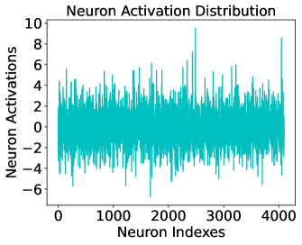
## [Chart Type]: Neuron Activation Distribution
### Overview
The image displays a dense scatter plot or line chart titled "Neuron Activation Distribution." It visualizes the activation values of a large set of neurons, indexed from 0 to over 4000. The data appears as a continuous, noisy signal with a central tendency and several prominent outliers.
### Components/Axes
* **Title:** "Neuron Activation Distribution" (centered at the top).
* **Y-Axis:**
* **Label:** "Neuron Activations"
* **Scale:** Linear, ranging from approximately -6 to 10.
* **Major Ticks:** -6, -4, -2, 0, 2, 4, 6, 8, 10.
* **X-Axis:**
* **Label:** "Neuron Indexes"
* **Scale:** Linear, ranging from 0 to just over 4000.
* **Major Ticks:** 0, 1000, 2000, 3000, 4000.
* **Data Series:** A single, dense series plotted in a teal/cyan color. There is no legend, as only one data type is presented.
* **Plot Area:** The data fills the majority of the chart area, bounded by the axes.
### Detailed Analysis
* **Data Density & Range:** The plot contains thousands of data points, creating a near-solid band of color. The vast majority of neuron activations are concentrated in a band between approximately **-4 and +4**.
* **Central Tendency:** The highest density of points appears centered around the **0** activation line.
* **Outliers & Extremes:**
* **Positive Spikes:** Several distinct spikes extend upward. The most prominent spike reaches a value of approximately **9** (located between neuron indexes 2000 and 3000). Another notable spike reaches approximately **8** (near neuron index 4000).
* **Negative Spikes:** The data extends downward to a minimum of approximately **-6**. Several points cluster near this lower bound.
* **Trend:** There is no discernible upward or downward trend across the neuron indexes. The distribution appears relatively stationary, with the mean and variance remaining consistent from index 0 to 4000. The visual trend is that of **stable, high-variance noise centered on zero**.
### Key Observations
1. **Symmetry:** The distribution is roughly symmetric around zero, though the extreme positive outlier (at ~9) is more pronounced than the extreme negative one (at ~-6).
2. **Homogeneity:** The pattern of activation is remarkably consistent across the entire range of neuron indexes. There are no obvious segments or clusters where the behavior changes fundamentally.
3. **Outlier Significance:** The few spikes reaching beyond ±6 are visually distinct from the main data cloud, indicating a small subset of neurons with exceptionally high or low activation compared to the population.
### Interpretation
This chart demonstrates the activation profile of a neural network layer or population. The data suggests:
* **Normalization:** The activations are centered around zero, which is common in networks using activation functions like tanh or after applying batch normalization.
* **High Variance:** The wide spread (from -6 to 4 for the core mass) indicates significant variability in neuron responses to the given input or dataset.
* **Sparse Extreme Activation:** The presence of isolated, high-magnitude outliers implies that while most neurons have moderate activity, a very small number are "hyper-active" or "hypo-active." This could be a characteristic of the network's learned representation, an artifact of the data, or potentially an indicator of dead or saturated neurons if the values are at the limits of an activation function's range.
* **Lack of Spatial Structure:** The uniformity across neuron indexes suggests the neurons are not ordered in a way that correlates with their activation magnitude (e.g., they are not sorted by activation value). The index is likely an arbitrary identifier.
**In summary, the image provides a factual snapshot of a neural network's internal state, showing a zero-centered, high-variance activation distribution with a few notable extreme values, all consistent across the observed population of over 4000 neurons.**