## Line Chart: Loss vs. Pondering Steps
### Overview
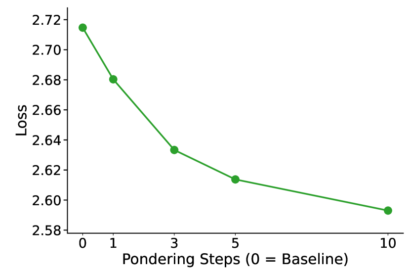
The image is a line chart showing the relationship between "Loss" and "Pondering Steps (0 = Baseline)". The chart displays a decreasing trend in loss as the number of pondering steps increases.
### Components/Axes
* **X-axis:** "Pondering Steps (0 = Baseline)". The axis is marked with values 0, 1, 3, 5, and 10.
* **Y-axis:** "Loss". The axis is marked with values 2.58, 2.60, 2.62, 2.64, 2.66, 2.68, 2.70, and 2.72.
* **Data Series:** A single data series represented by a green line with circular markers at each data point.
### Detailed Analysis
The green line represents the loss at different pondering steps. The line slopes downward, indicating a decrease in loss as the number of pondering steps increases.
* **Pondering Steps = 0 (Baseline):** Loss ≈ 2.715
* **Pondering Steps = 1:** Loss ≈ 2.68
* **Pondering Steps = 3:** Loss ≈ 2.633
* **Pondering Steps = 5:** Loss ≈ 2.613
* **Pondering Steps = 10:** Loss ≈ 2.593
### Key Observations
* The loss decreases sharply from 0 to 3 pondering steps.
* The rate of decrease in loss slows down after 3 pondering steps.
* The lowest loss is observed at 10 pondering steps.
### Interpretation
The chart suggests that increasing the number of pondering steps reduces the loss. However, the marginal benefit of adding more pondering steps diminishes as the number of steps increases. The most significant reduction in loss occurs within the first few pondering steps. The model benefits from pondering, but there are diminishing returns.